What is the Rainbow Scale?
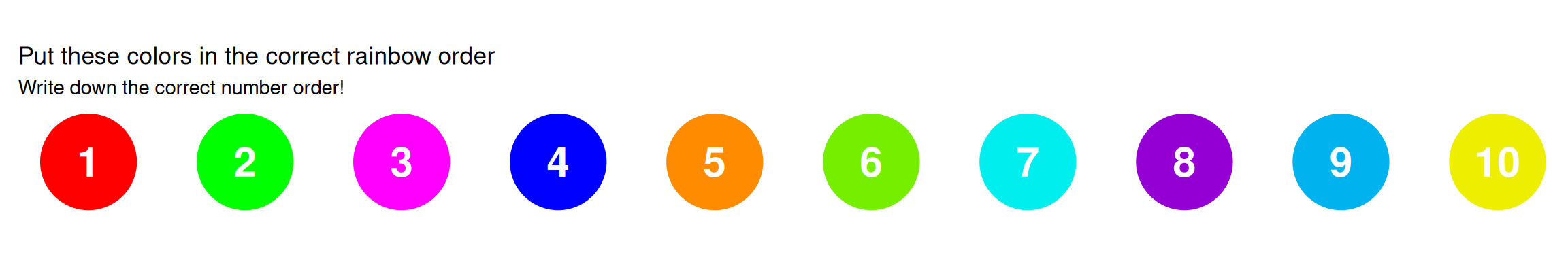
Interactive Challenge: Can you order these colors?
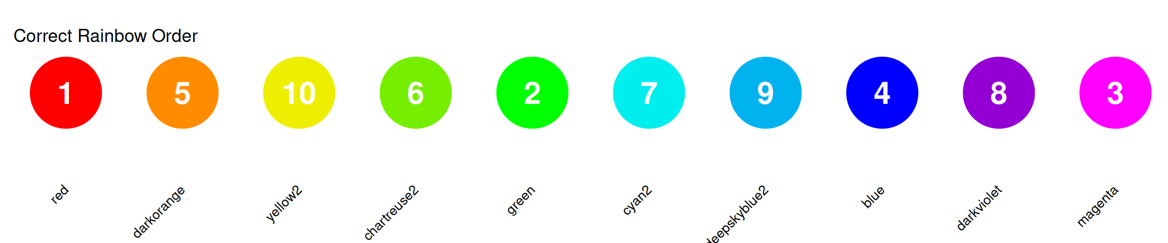
The Correct Rainbow Order
Colors in order: Red → Orange → Yellow → Green → Cyan → Blue → Purple/Magenta
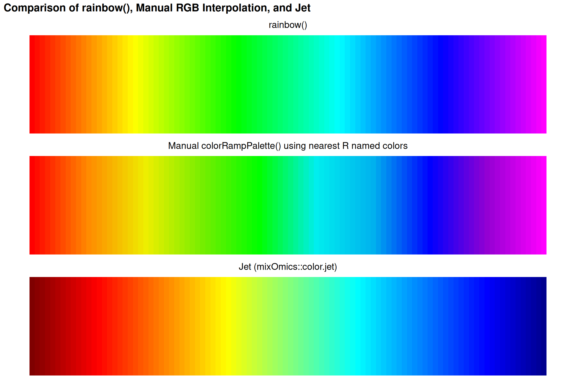
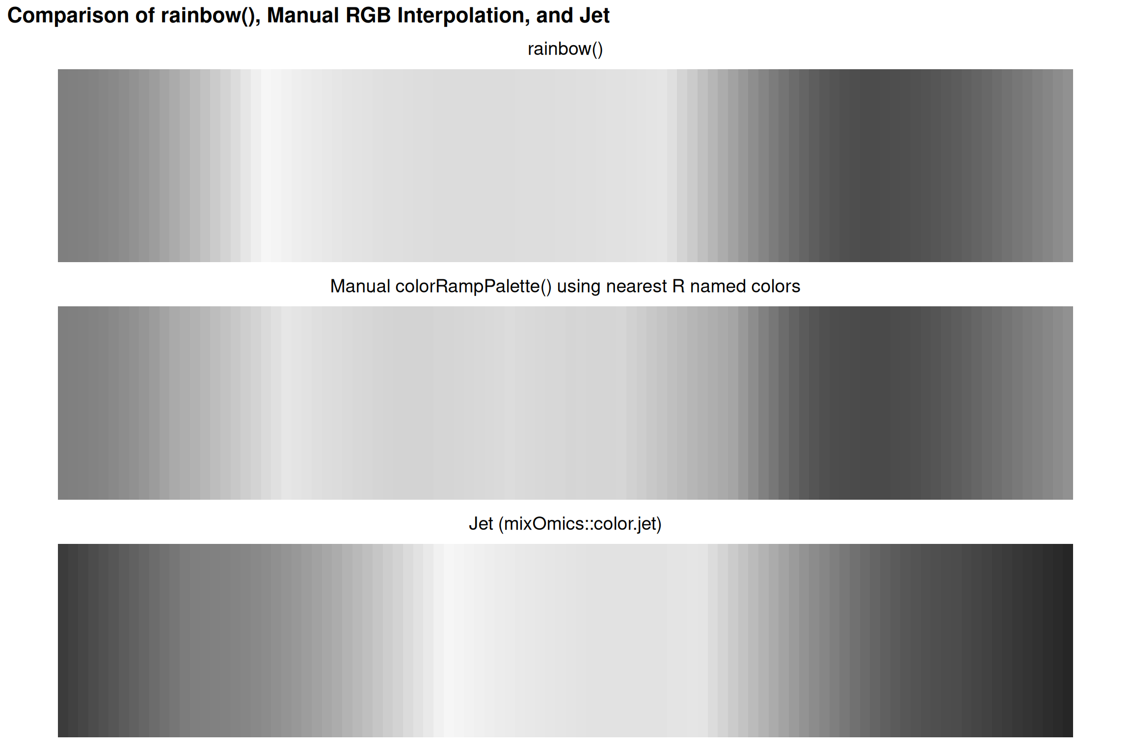
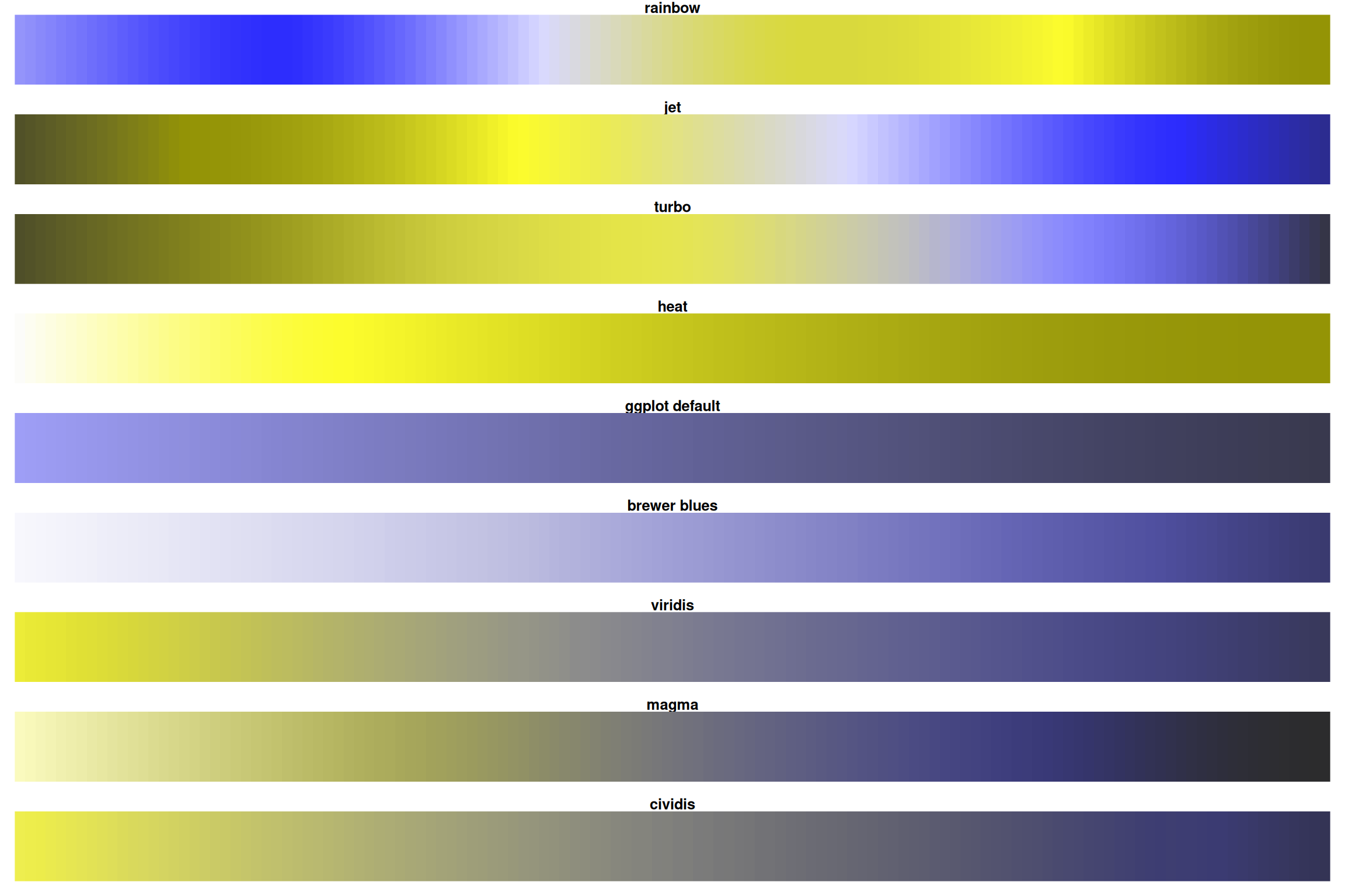
Comparing Rainbow Implementations
Why This Order?
This follows the visible light spectrum by wavelength:
- Red: ~700 nm (longest)
- Violet: ~400 nm (shortest)
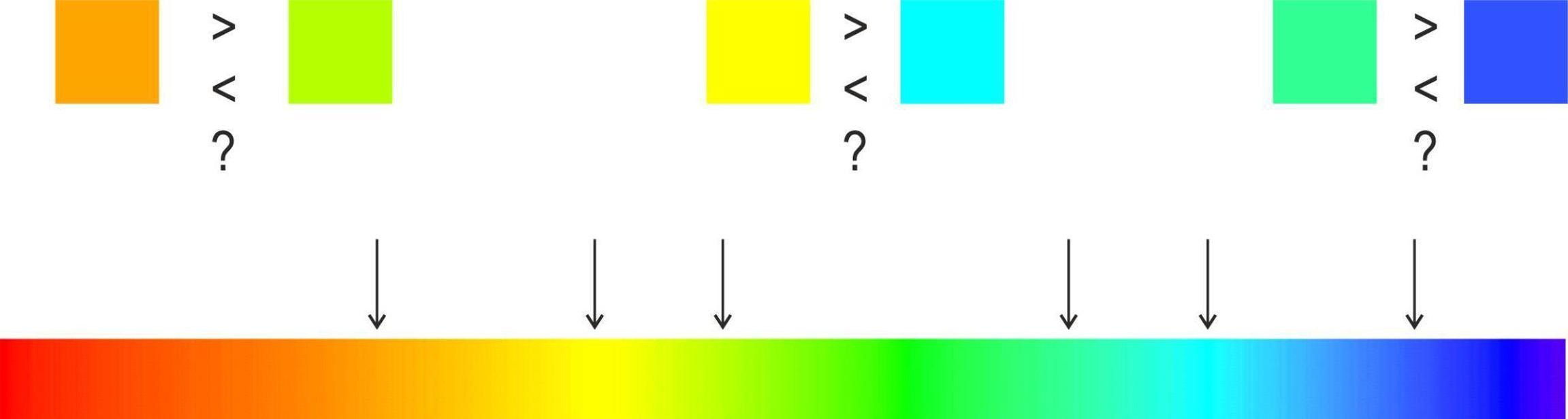
But wavelength order ≠ perceptual order!
A Tale of Two Colormaps
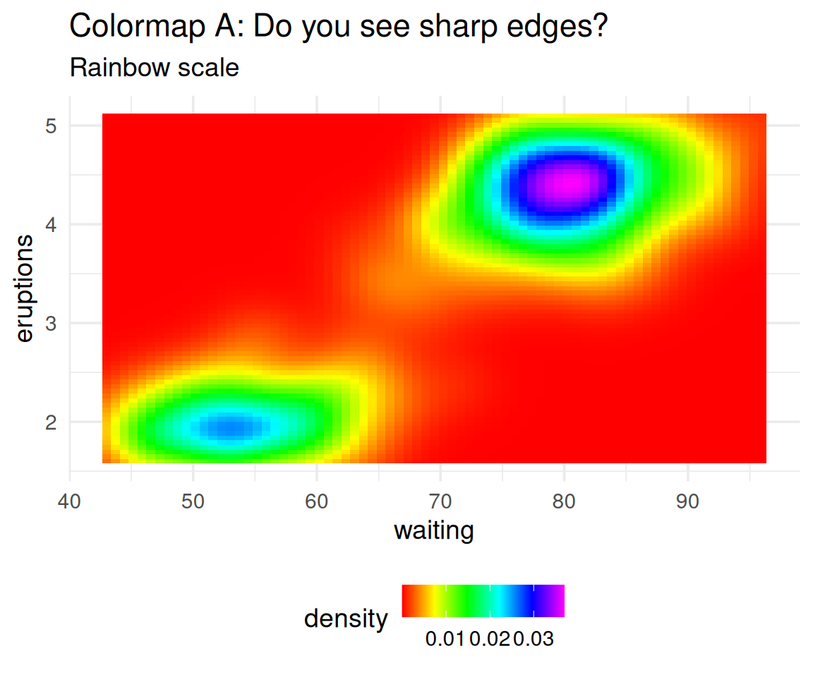
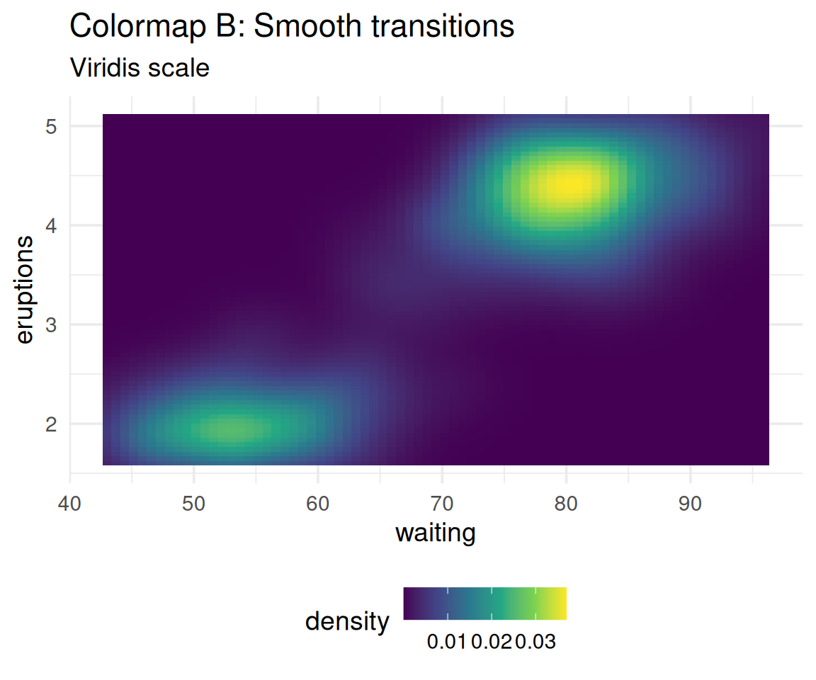
Which one shows the data more accurately?
The data is smooth, yet Colormap A creates false boundaries!
Perceptual Non-Uniformity: Demonstrated
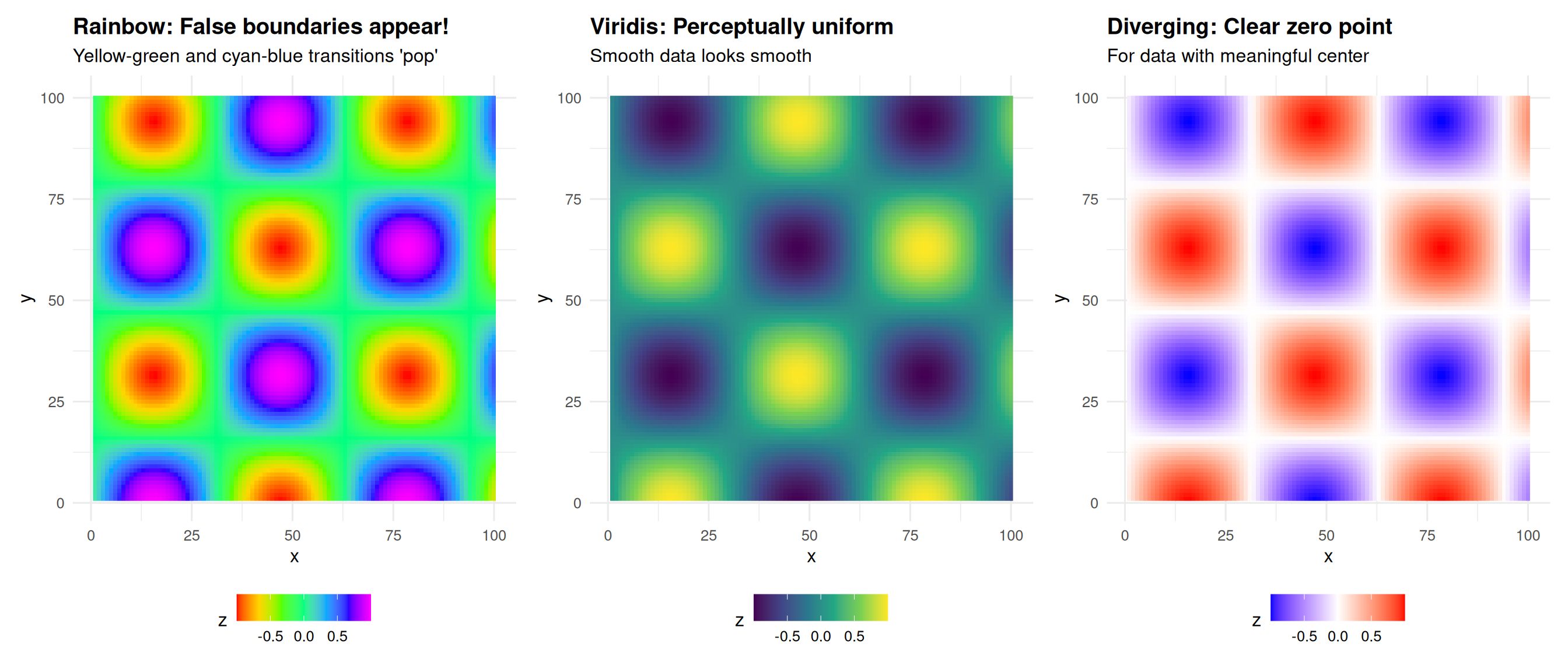
The data is perfectly smooth, yet rainbow creates artificial edges!
Real world consequences
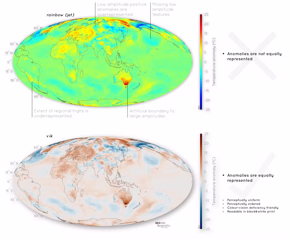
Not just spatial data
Figure from Haseneyer et al. (2011)
Medical Consequences
Lives at Stake
Borkin et al. (2011) - IEEE Visualization
Studied physicians diagnosing heart disease using medical imaging:
- Physicians using jet colormap: More errors, slower diagnosis
- Physicians using perceptually uniform colormaps: Fewer errors, faster
Why?
- Bright yellow appears more “intense” than dark red
- But dark red represents higher values (more critical condition)
- Perceptual bias leads to misdiagnosis
Reference: Borkin et al. (2011)
Comparison: Rainbow vs Better Alternatives
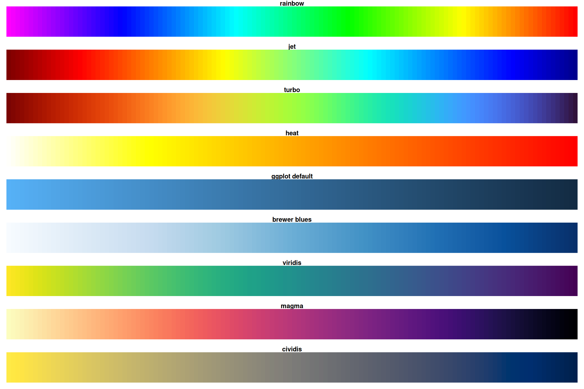
Notice how rainbow and heat have sharp transitions while viridis/magma are smooth!
Desaturated
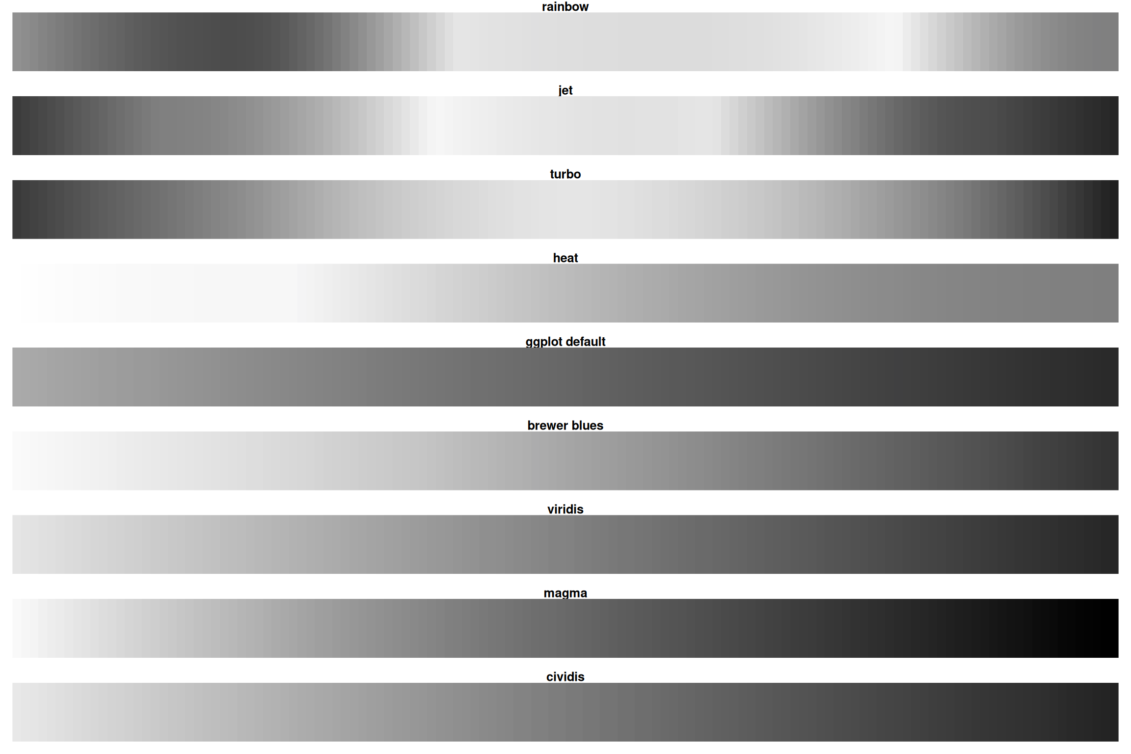
Rainbow loses all information when desaturated! Viridis/magma remain readable.
The Viridis Color Scales
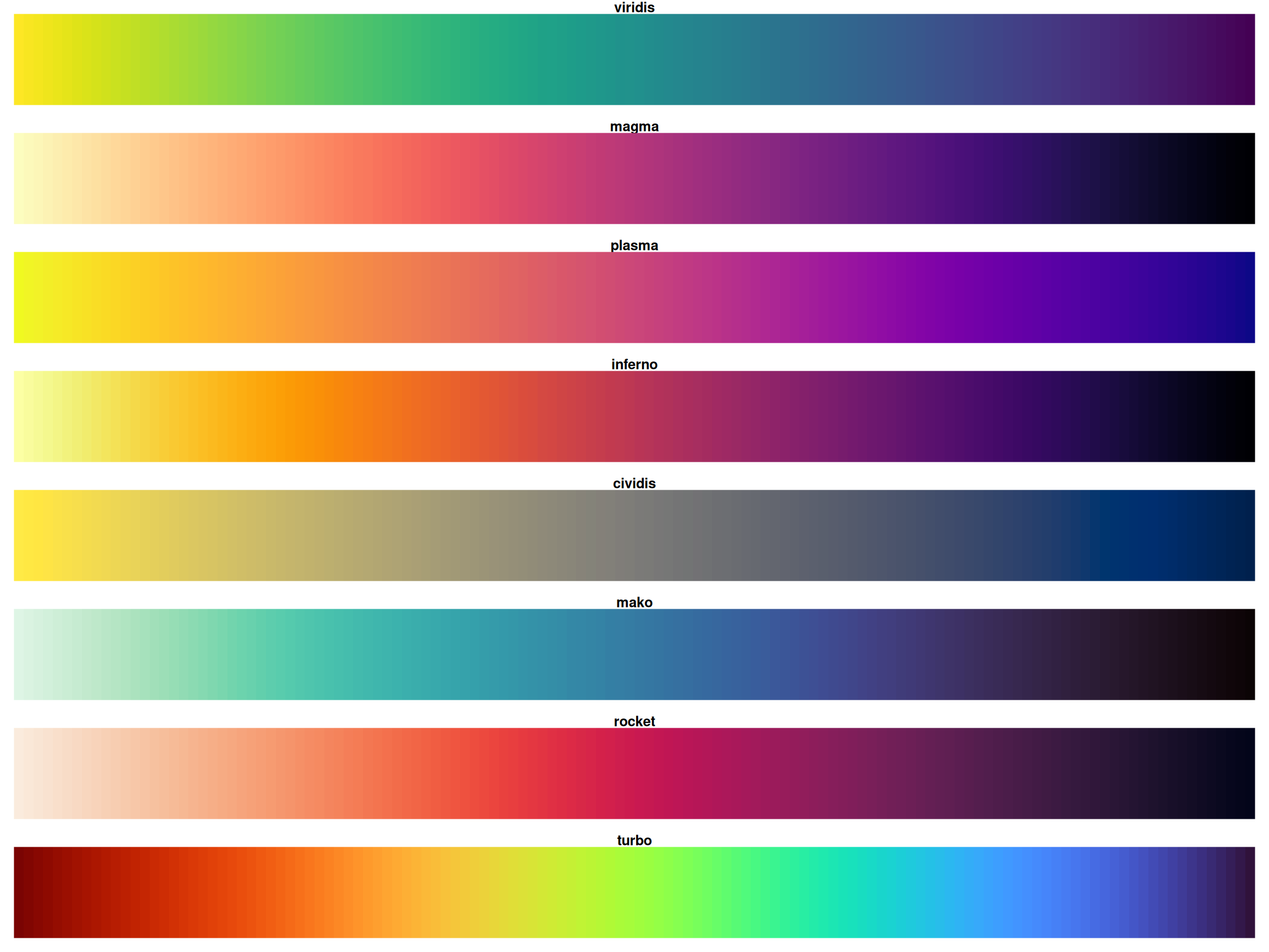
All viridis scales are perceptually uniform
The Viridis Color Scales, desaturated
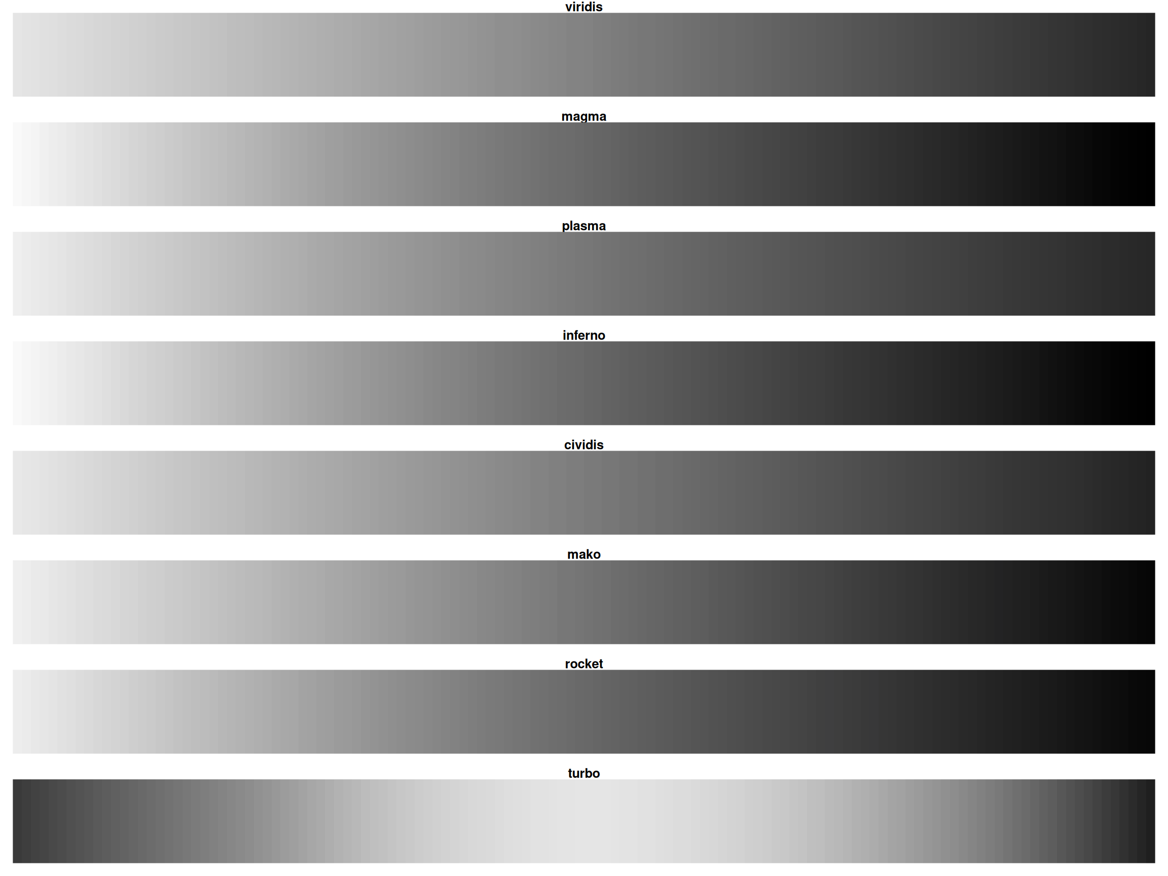
Green-Blind Vision (Deuteranopia)
For ~8% of men, rainbow is nearly useless! Viridis/magma stay distinct.
Viridis Family: Show All Options
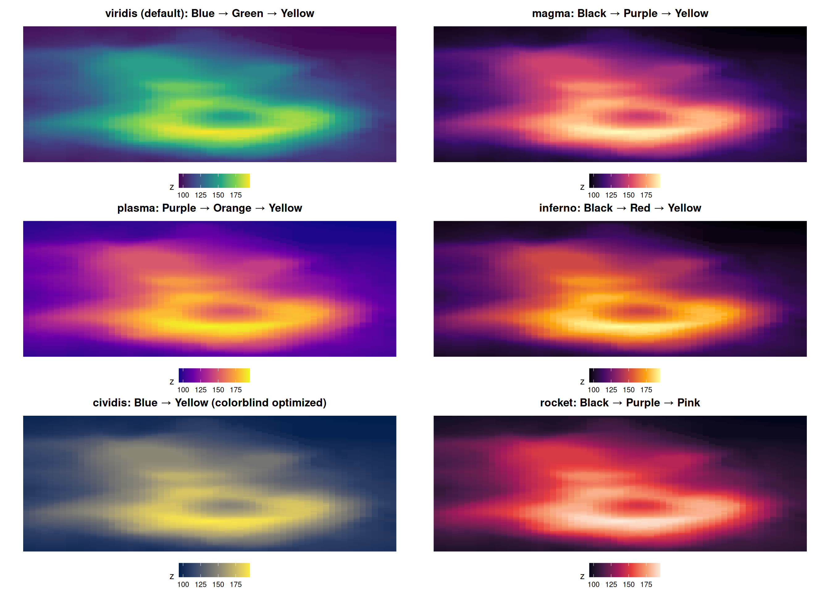
All are perceptually uniform and colorblind-friendly!
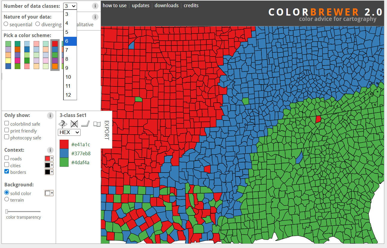
ColorBrewer: All Palettes
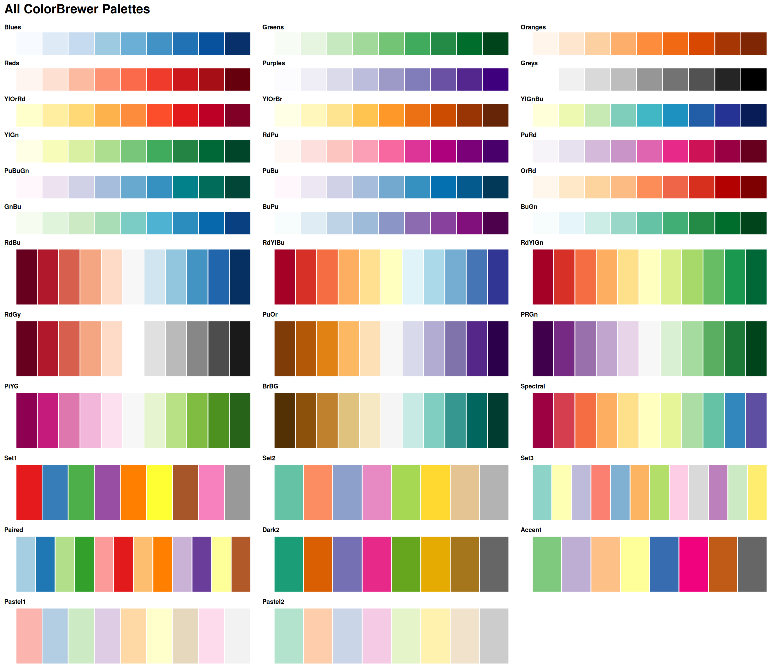
Explore all palettes at: colorbrewer2.org
ColorBrewer Website
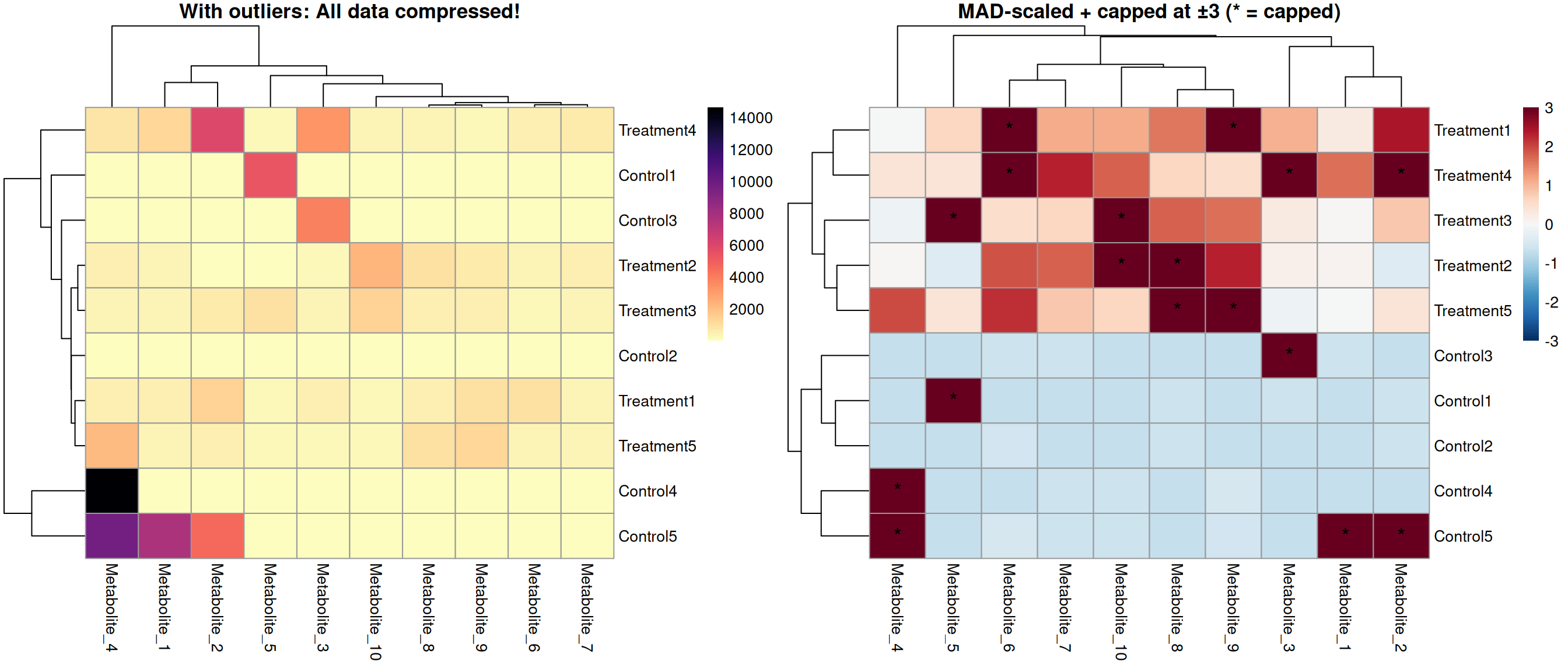
Visual Example: The Outlier Effect
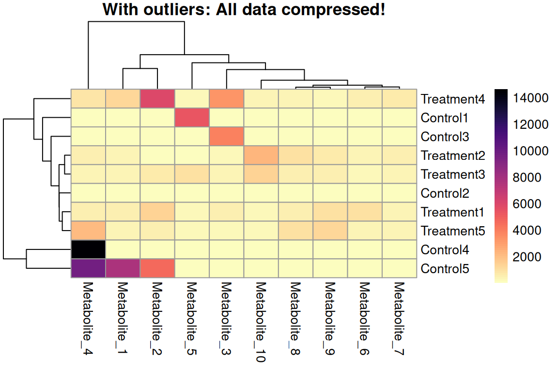
Without Outlier Handling
- Outliers dominate the color scale
- Most data compressed into narrow range
- Group differences invisible
- Patterns lost 😱
Solution 1: Robust MAD Scaling and Cutoffs
# Step 1: Robust scaling using MAD (Median Absolute Deviation)
expr_scaled <- expr_data %>%
  mutate(across(-Sample, scale_mad))

# Step 2: Identify which values will be capped
expr_mat_scaled <- expr_scaled %>% column_to_rownames("Sample") %>% as.matrix()
capped_cells <- (expr_mat_scaled < -3) | (expr_mat_scaled > 3)

# Step 3: Cap at ±3 (meaningful after MAD scaling!)
expr_capped <- expr_scaled %>% mutate(across(-Sample, ~ pmin(pmax(.x, -3), 3)))

# Step 4: Create symmetric breaks centered at 0
max_abs <- max(abs(range(expr_capped[,-1])))
breaks  <- seq(-max_abs, max_abs, length.out = 101)
# Create asterisk markers for capped values (in original order)
asterisk_matrix <- matrix("", nrow = nrow(capped_cells), ncol = ncol(capped_cells))
asterisk_matrix[capped_cells] <- "*"
# Create final plot with asterisk markers
# display_numbers uses the original data order, clustering is applied automatically
p <- pheatmap(expr_capped %>% column_to_rownames("Sample"),
main = "MAD-scaled + capped at ±3 (* = capped)",
color = colorRampPalette(rev(brewer.pal(11, "RdBu")))(100),
breaks = breaks, scale = "none",
display_numbers = asterisk_matrix,
number_color = "black",
fontsize_number = 14,
silent = TRUE)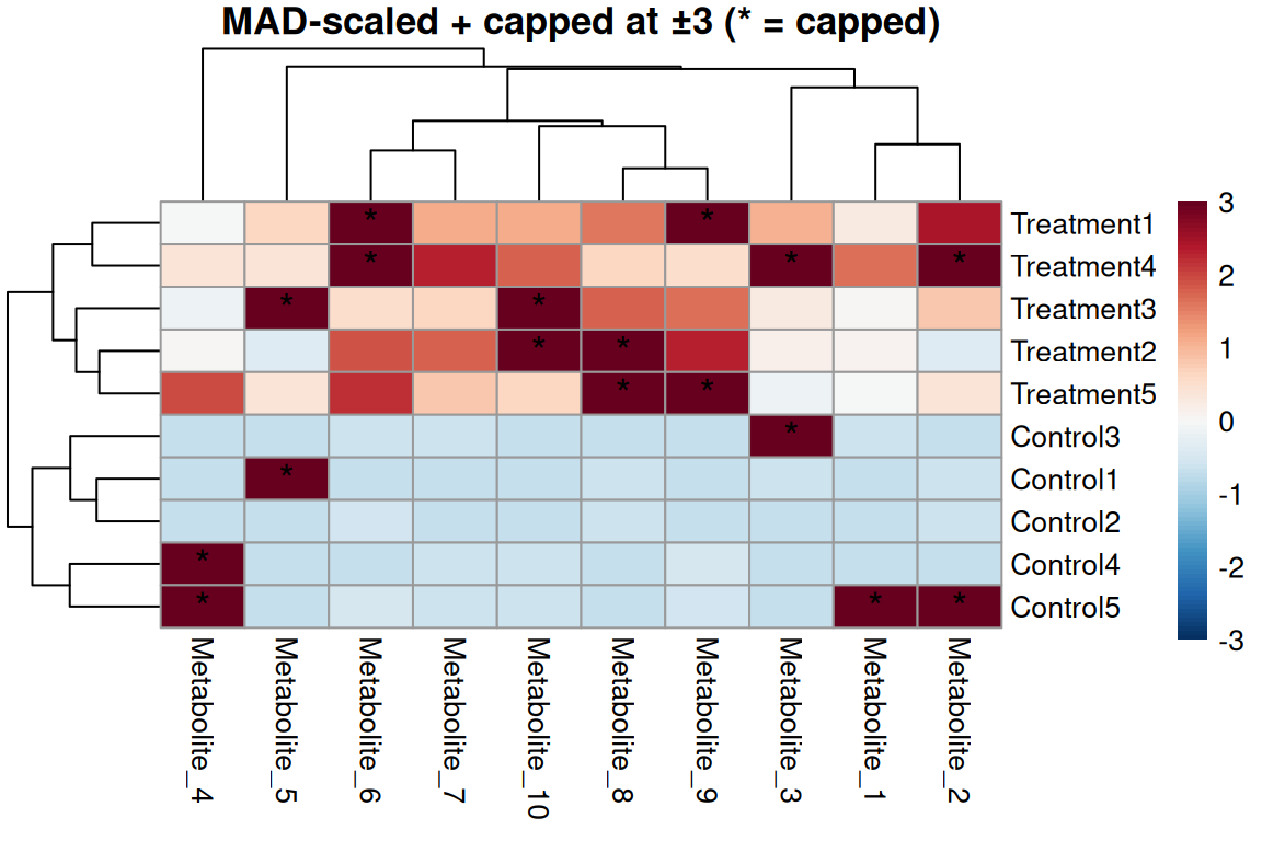
Robust scaling approach
- Use MAD instead of SD - not affected by outliers
- Center by median (robust)
- Scale by MAD (Median Absolute Deviation)
- Then cap at ±3 MAD (~99% of normal data)
- Outliers now exceed threshold!
- Set
scale = "none"(already scaled!)
Solution 2: Range scaling and Quantile-Based cut-off
# Step 1: Identify values outside 5-95 percentiles PER COLUMN
expr_mat_raw <- expr_data %>% column_to_rownames("Sample") %>% as.matrix()
capped_cells_q <- apply(expr_mat_raw, 2, function(x) {
  q_lower <- quantile(x, 0.05, na.rm = TRUE)
  q_upper <- quantile(x, 0.95, na.rm = TRUE)
  (x < q_lower) | (x > q_upper)
})

# Step 2: Cap at 5th and 95th percentiles PER COLUMN (metabolite)
expr_capped <- expr_data %>%
  mutate(across(-Sample, ~ cap_quantiles(.x, lower = 0.05, upper = 0.95)))

# Step 3: Range scaling (min-max normalization to [0,1])
expr_quantile <- expr_capped %>% mutate(across(-Sample, ~ (.x - min(.x)) / (max(.x) - min(.x))))
# Create asterisk markers for capped values (in original order)
asterisk_matrix_q <- matrix("", nrow = nrow(capped_cells_q), ncol = ncol(capped_cells_q))
asterisk_matrix_q[capped_cells_q] <- "*"
# Create final plot with asterisk markers
p <- pheatmap(expr_quantile %>% column_to_rownames("Sample"),
main = "Capped at 5-95 percentiles + range-scaled (* = capped)",
color = rev(viridis::magma(100)),
display_numbers = asterisk_matrix_q,
number_color = "white",
fontsize_number = 14,
silent = TRUE)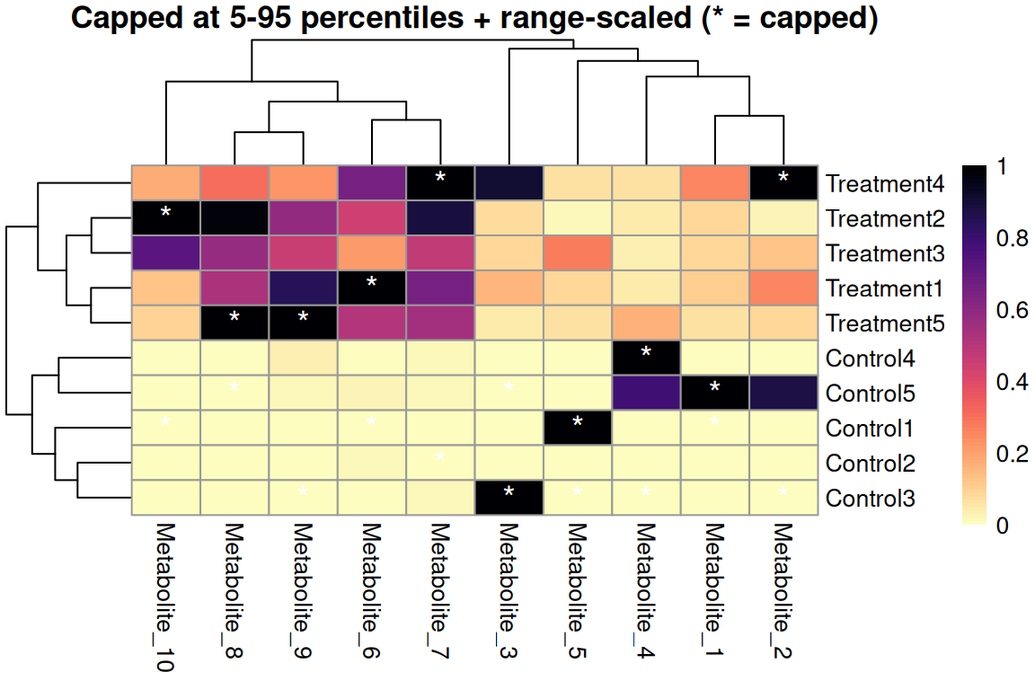
Quantile capping + range scaling
- Cap first to remove outliers per metabolite
- Then range scale to use full [0,1] color scale
- More robust to outliers than variance scaling
- Good for non-normal data
- Common quantiles: 5-95% or 2-98%
Solution 3: Log Transformation
For positive values only (e.g., counts, intensities)
# Log transform BEFORE plotting (metabolomics data is positive-only)
expr_log_sol4 <- expr_data %>%
  mutate(across(-Sample, ~ log2(.x + 1)))  # +1 to handle zeros

p <- pheatmap(expr_log_sol4 %>% column_to_rownames("Sample"),
              main = "Log2 transformed metabolite intensities",
              color = rev(viridis::magma(100)),
silent = TRUE)![]()
For count/intensity data
- Compresses wide ranges
- Add +1 to handle zeros
- Common for RNA-seq, proteomics
- Use log2, log10, or ln
Why Scaling Matters for Clustering
The Problem: High-variance features dominate correlations
Without scaling, features with large values dominate sample correlations!
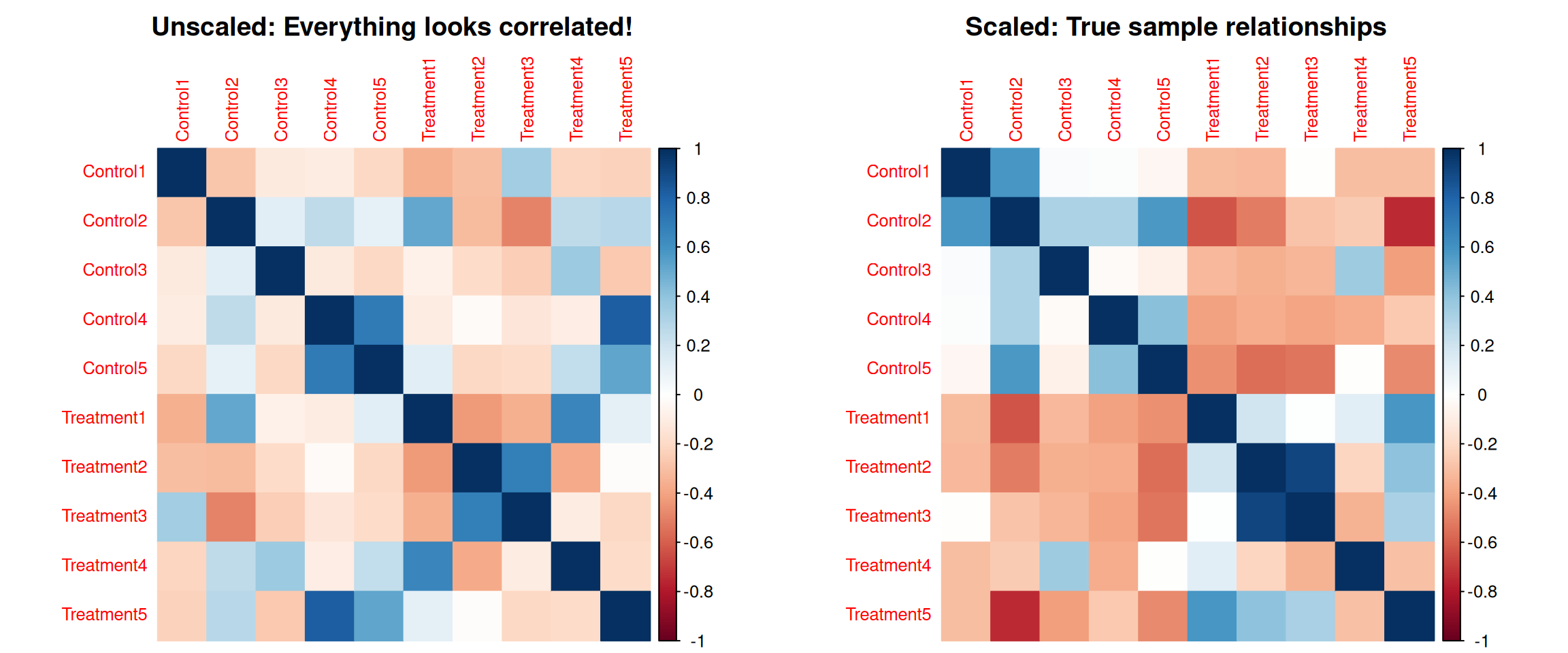
Why Scaling Matters for Clustering (2)
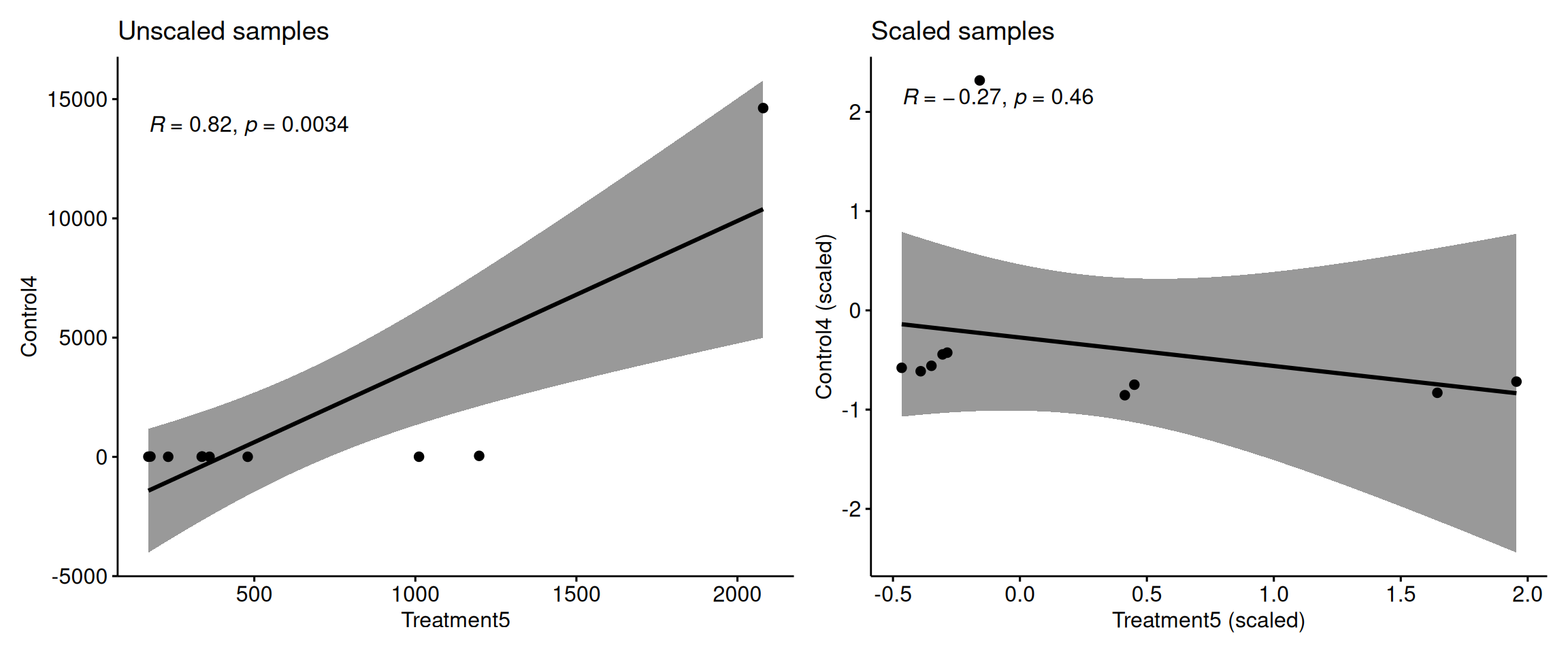
Key point: Without scaling, high-variance metabolites completely dominate the correlation calculation between samples!
Scaling ensures all metabolites contribute equally to sample clustering.
heat.clust with pheatmap
library(massageR)

# Convert tibble to matrix for heat.clust
expr_matrix <- expr_data %>% column_to_rownames("Sample") %>% as.matrix()

# Use heat.clust with robust MAD scaling
z <- heat.clust(expr_matrix,
                scaledim = "column",           # Scale by column
                zlim = c(-3, 3),               # Cap at ±3 MAD
                zlim_select = c("dend", "outdata"),  # Apply to both
                reorder = c(),                 # Reorder dendrograms off for consistency
                distfun = function(x) dist(x),
                hclustfun = function(x) hclust(x, method = "complete"),
                scalefun = scale_mad)          # Use MAD scaling instead of default

max_abs <- max(abs(range(z$data)))
breaks  <- seq(-max_abs, max_abs, length.out = 101)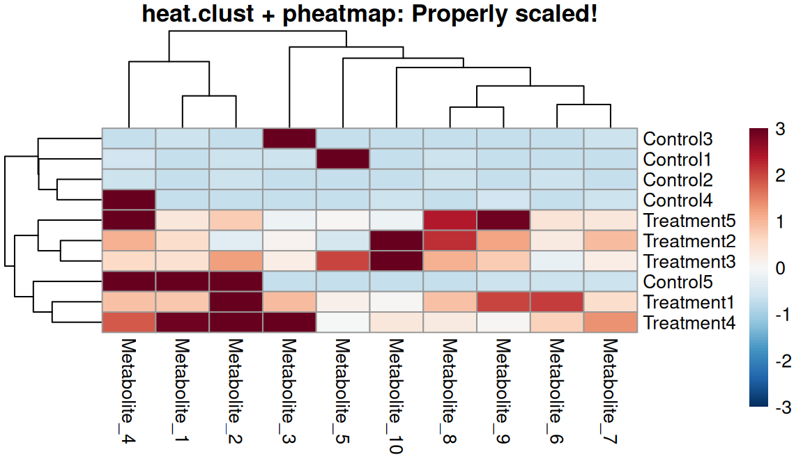
One-step workflow
- Scales data automatically
- Calculates dendrograms on scaled data
- Caps at specified zlim
- Returns everything needed for pheatmap
- Ensures consistency throughout
Comparison: Before and After
What is a Raster Image?
Raster graphics are grids of colored pixels
- Stores individual pixel colors: RGB(255, 128, 64)
- Fixed resolution measured in DPI (Dots Per Inch)
- More pixels = higher resolution = larger file size
- Cannot be scaled up without quality loss

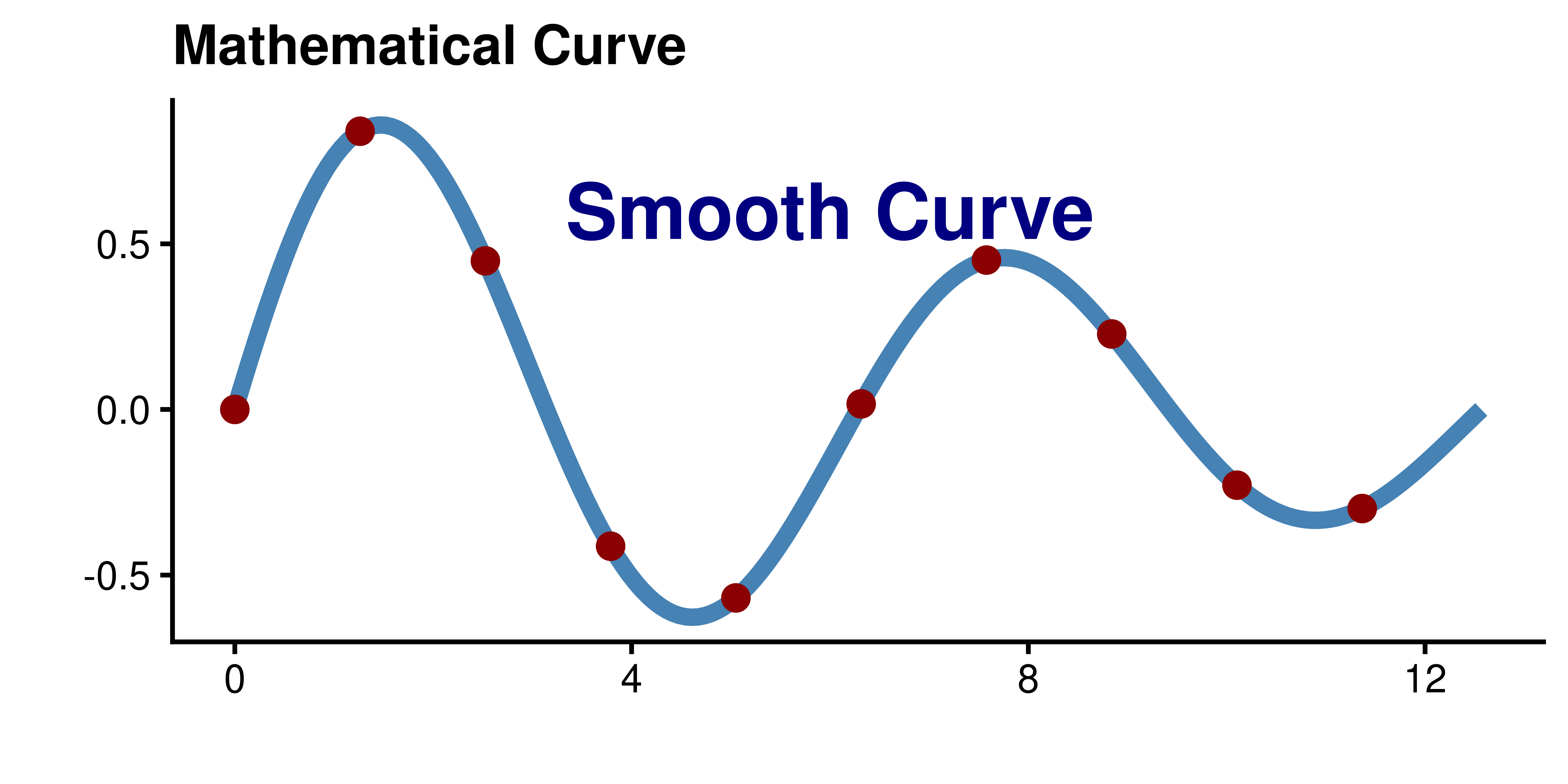
What is a Vector Image?
Vector graphics use mathematical descriptions
- Mathematical formulas define shapes and lines
- “Draw a line from point (0,0) to (10,10)”
- “Create a circle with center (5,5) and radius 3”
- Infinitely scalable without quality loss
Infinite Resolution
Because vectors are mathematical formulas, they can be scaled to any size without losing quality. The curve is defined by equations, not pixels!

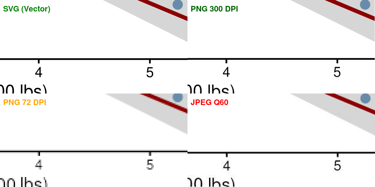
Vector vs. Raster Comparison
Vector vs. Raster Comparison (2)

| Aspect | Vector (PDF, SVG, EPS) | Raster (PNG, TIFF, JPG) |
|---|---|---|
| Definition | Mathematical formulas | Grid of pixels |
| Scalability | Infinite resolution | Fixed resolution (DPI) |
| File Size | Small (formulas compact) | Large (all pixels stored) |
| Best For | Plots, diagrams, text, screenshots of websites | Photos, screenshots |
| Editability | Easy to edit paths | Pixel-level editing only |
| Text Quality | Always crisp | Can become blurry |
JPEG Compression Artifacts

File Format Comparison
Real world horror story
This is the graphical abstract
This was one of the figures
Visual Demonstration


base_size Effect (theme_classic(base_size = x))
base_size = 8

base_size = 11 (default)

base_size = 14

Other elements scale relative to base_size:
axis.title:1.1× base_sizeaxis.text:0.8× base_sizelegend.text:0.8× base_size
Use base_size as the PRIMARY adjustment - only customize individual elements if needed
When you must adjust some sizes individually


The Default Problem
# Default ggplot2 theme
p <- ggplot(mtcars, aes(wt, mpg, color = factor(cyl))) +
  geom_point(size = 3) +
  geom_smooth(method = "lm", se = FALSE) +
  labs(title = "Default theme_gray()",
       x = "Weight (1000 lbs)",
       y = "Miles Per Gallon",
       color = "Cylinders") +
  theme(plot.title = element_text(face = "bold"))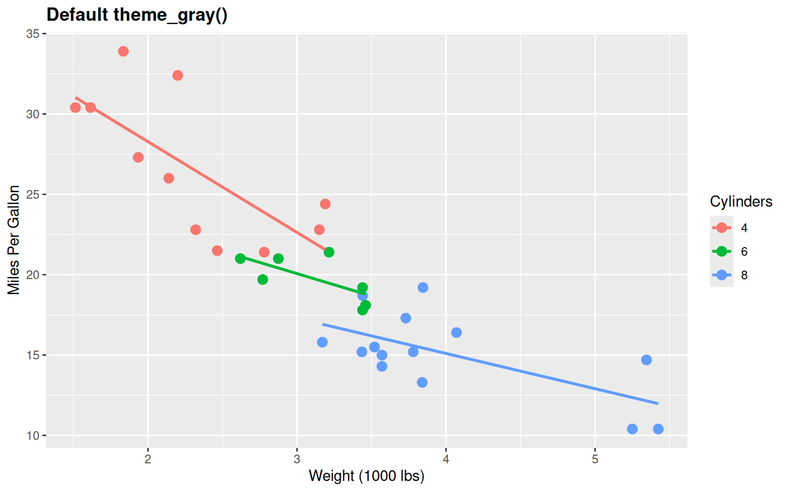
Problems:
- Gray background (wastes ink, unprofessional)
- Too much “chart junk”
- Not publication-ready
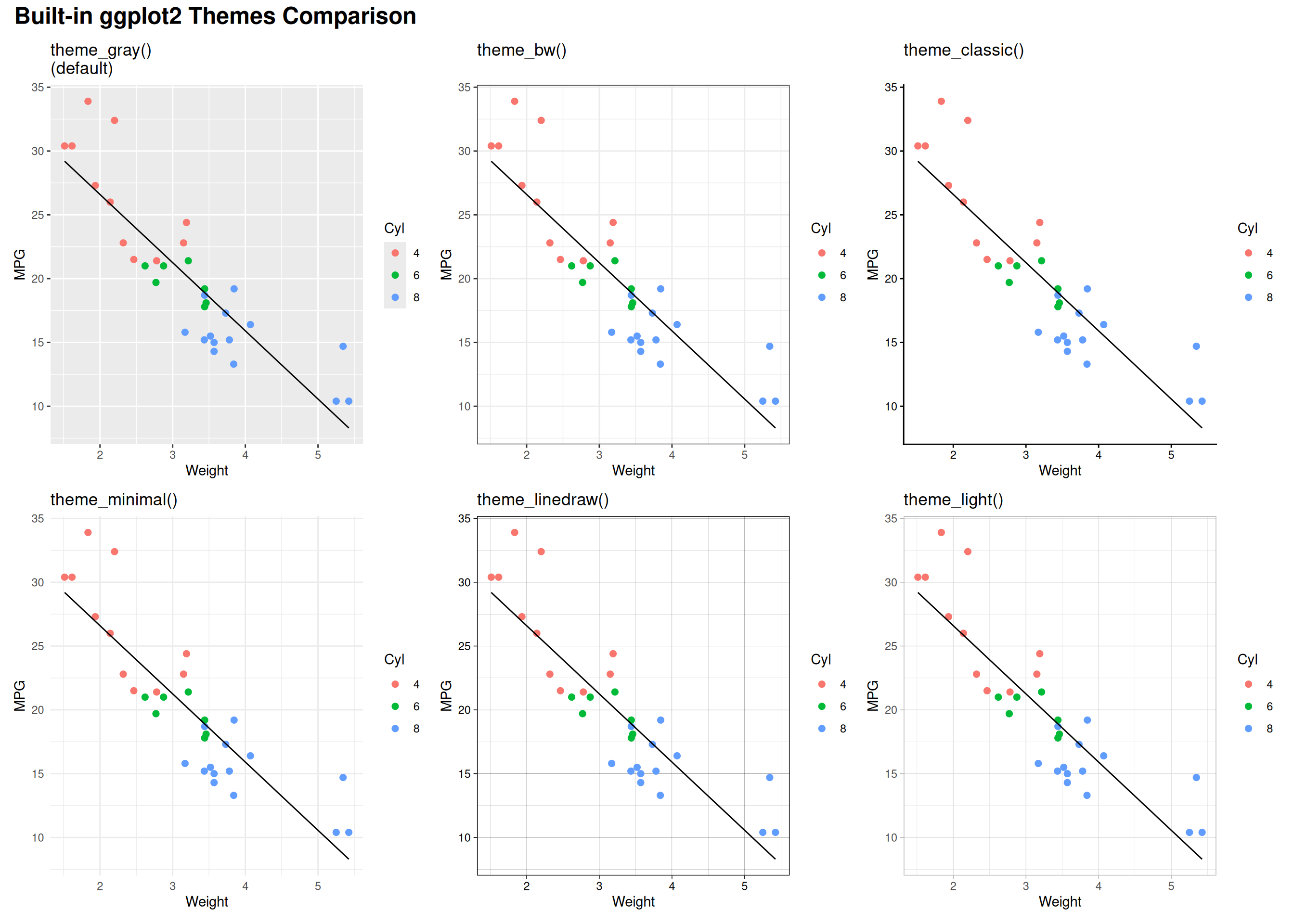
Built-in Theme: theme_bw()
p <- ggplot(mtcars, aes(wt, mpg, color = factor(cyl))) +
  geom_point(size = 3) +
  geom_smooth(method = "lm", se = FALSE) +
  labs(title = "theme_bw() - White background, black border",
       x = "Weight (1000 lbs)",
       y = "Miles Per Gallon",
       color = "Cylinders") +
  theme_bw() +
  theme(plot.title = element_text(face = "bold"))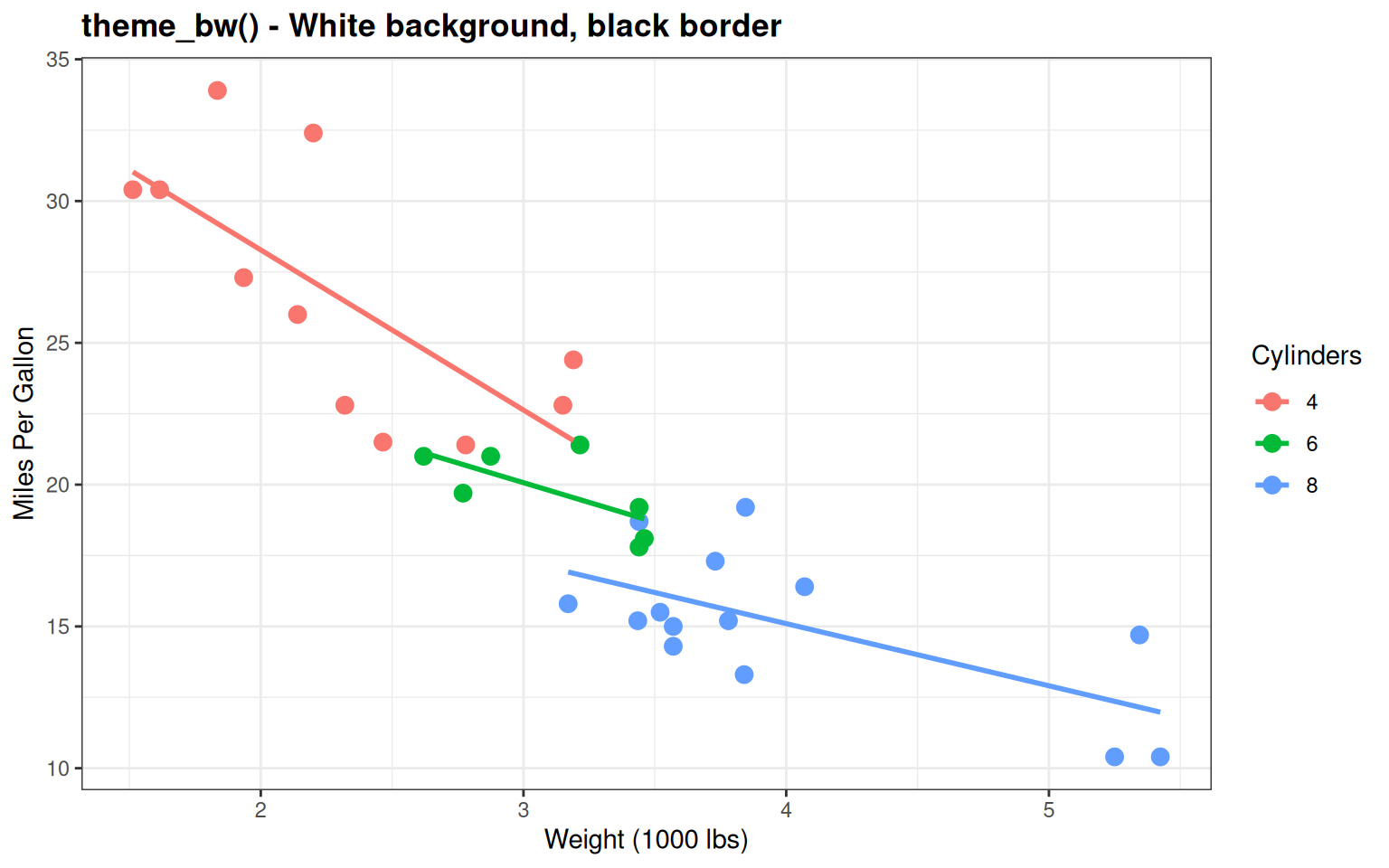
Good for publications - Clean with reference gridlines
Built-in Theme: theme_classic()
p <- ggplot(mtcars, aes(wt, mpg, color = factor(cyl))) +
  geom_point(size = 3) +
  geom_smooth(method = "lm", se = FALSE) +
  labs(title = "theme_classic() - No gridlines, clean axes",
       x = "Weight (1000 lbs)",
       y = "Miles Per Gallon",
       color = "Cylinders") +
  theme_classic() +
  theme(plot.title = element_text(face = "bold"))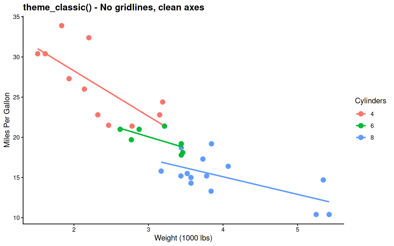
Very minimal - Traditional journal style
Built-in Theme: theme_minimal()
p <- ggplot(mtcars, aes(wt, mpg, color = factor(cyl))) +
  geom_point(size = 3) +
  geom_smooth(method = "lm", se = FALSE) +
  labs(title = "theme_minimal() - Subtle gridlines, modern",
       x = "Weight (1000 lbs)",
       y = "Miles Per Gallon",
       color = "Cylinders") +
  theme_minimal() +
  theme(plot.title = element_text(face = "bold"))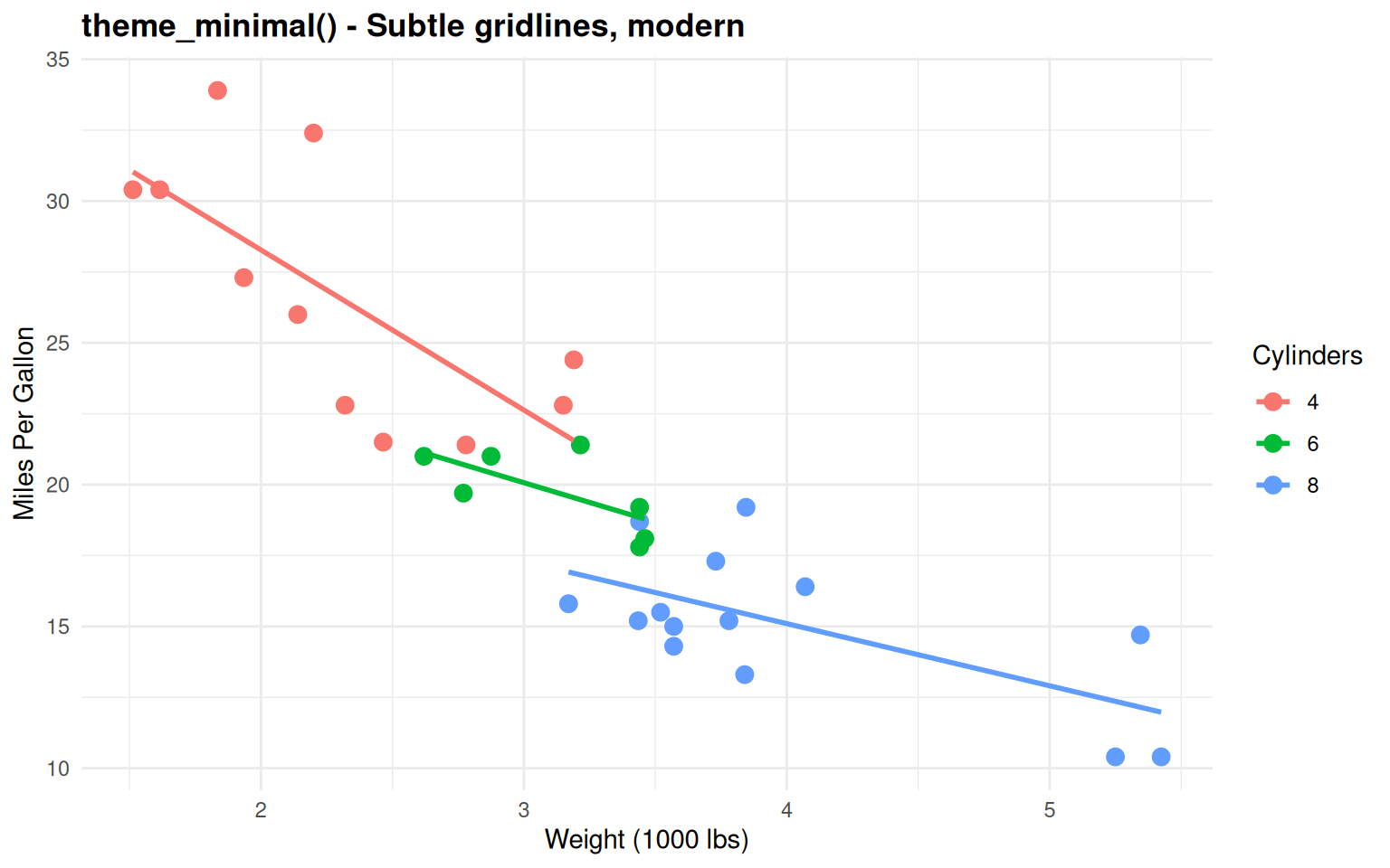
Good balance - Clean with subtle reference lines
Built-in Theme: theme_void()
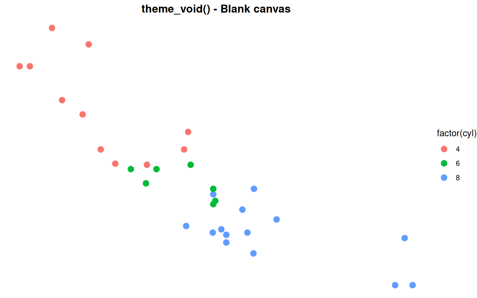
For custom designs - Maps, minimalist graphics
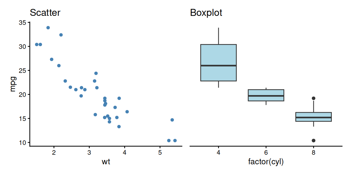
Side-by-Side Comparison
Publication Package: ggpubr
# ggpubr - publication-ready themes and statistical annotations
# install.packages("ggpubr")

ggplot(mtcars, aes(x = factor(cyl), y = mpg)) +
  geom_boxplot(aes(fill = factor(cyl)), alpha = 0.7) +
  geom_jitter(width = 0.2, alpha = 0.5) +
  labs(title = "ggpubr - Publication ready with stats",
       x = "Cylinders",
       y = "Miles Per Gallon") +
  theme_pubr() +
  theme(legend.position = "none",
        plot.title = element_text(face = "bold")) +
  scale_fill_brewer(palette = "Set2")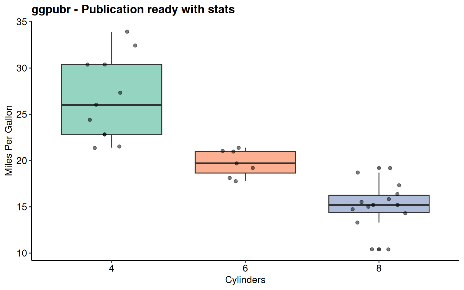
ggpubr Package
Publication-ready themes + statistical annotations
theme_pubr()- Clean publication themetheme_pubclean()- Even more minimalstat_regline_equation()- Automatic regression equationsstat_cor()- Correlation statisticsstat_compare_means()- p-values and significance brackets
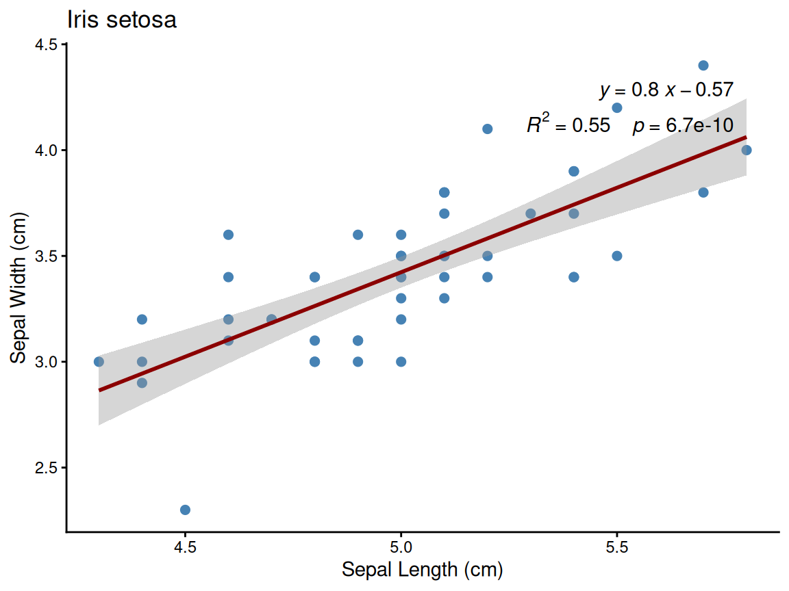
ggpubr: Adding Regression Equations
library(ggpubr)

p <- ggplot(mtcars, aes(x = wt, y = mpg)) +
  geom_point(size = 3, color = "steelblue") +
  geom_smooth(method = "lm", se = TRUE,
              color = "darkred", formula = y ~ x) +

      stat_regline_equation(
      aes(label = after_stat(eq.label)),
      formula = y ~ x,
      label.x.npc = 0.95,  # 95% to the right (relative)
      label.y.npc = 0.95,  # 95% to the top (relative)
      hjust = 1            # right-align text
    ) +
    stat_cor(
      aes(label = paste(after_stat(rr.label), after_stat(p.label), sep = "~~~~")),
      label.x.npc = 0.95, label.y.npc = 0.88, hjust = 1
    ) +

  labs(title = "Linear Regression with Equation",
       x = "Weight (1000 lbs)",
       y = "Miles Per Gallon") +
  theme_pubr()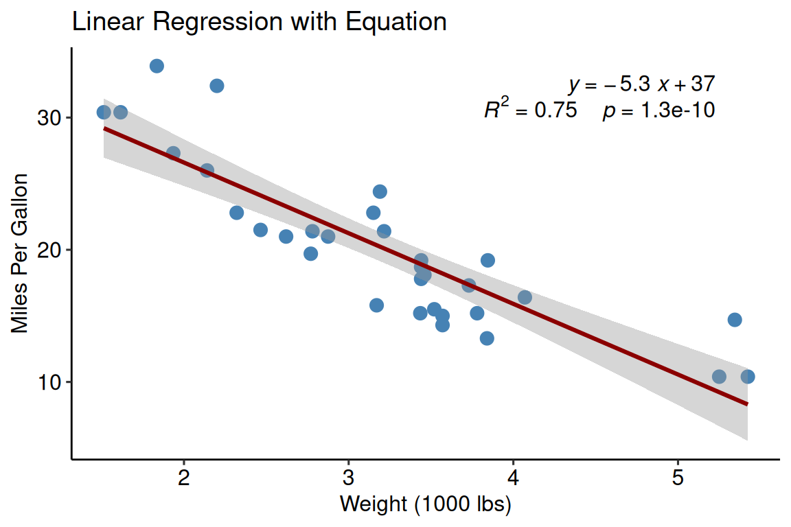
Key function: stat_regline_equation()
- Automatically calculates and displays equation
- Shows R² value
- Customizable position and formatting
- Works with facets
ggpubr: Pairwise Comparisons
# Automatically generate all pairwise comparisons
dose_levels <- levels(factor(ToothGrowth$dose))
my_comparisons <- combn(dose_levels, 2, simplify = FALSE)

p <- ggboxplot(ToothGrowth,
               x = "dose", y = "len", color = "dose", palette = "jco") +
  stat_compare_means(
                      comparisons = my_comparisons,
                      method = "t.test",
                      p.adjust.method = "BH"  # Benjamini-Hochberg (FDR) correction
                    ) +
  stat_compare_means(
                      method = "anova",
                      label.y = 50
                    ) +
  labs(title = "Pairwise Comparisons with Multiple Testing Correction",
       x = "Dose (mg/day)",
       y = "Tooth Length")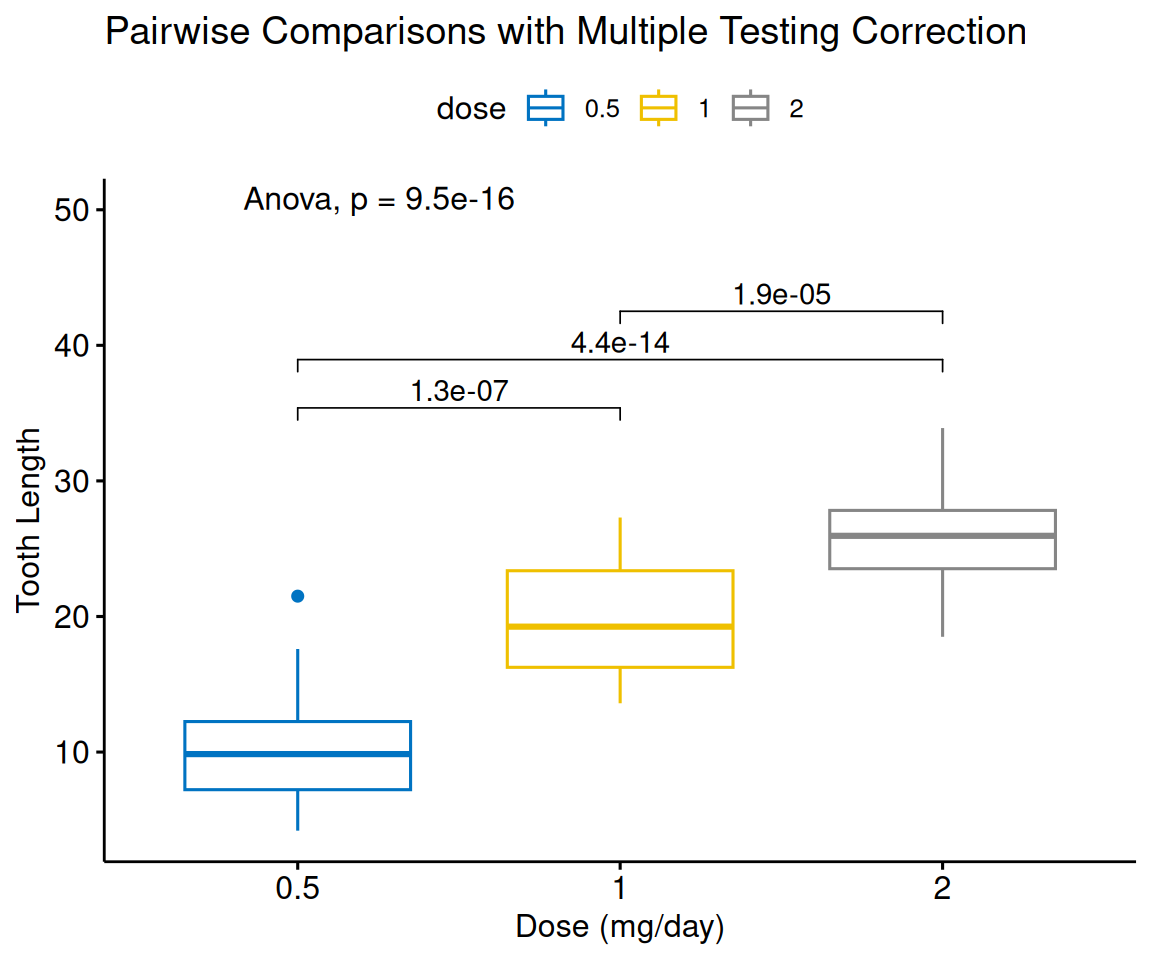
combn(levels, 2)generates all pairs automaticallymethod = "t.test"for pairwise tests (ormethod = "tukey_hsd"for Tukey’s HSD)p.adjust.method = "BH"for multiple testing correction (“holm”, “bonferroni”, “hochberg”, “BY”, “fdr”)method = "anova"for overall test- Automatic significance brackets
Modern Typography: hrbrthemes
ggplot(mtcars, aes(wt, mpg, color = factor(cyl))) +
  geom_point(size = 3) +
  geom_smooth(method = "lm", se = FALSE, formula = y ~ x) +
  facet_wrap(~gear, labeller = label_both) +
  labs(title = "hrbrthemes::theme_ipsum() - Modern typography",
       subtitle = "Clean, professional, with excellent fonts and facets",
       x = "Weight (1000 lbs)",
       y = "Miles Per Gallon",
       color = "Cylinders") +
  theme_ipsum() +
  scale_color_ipsum()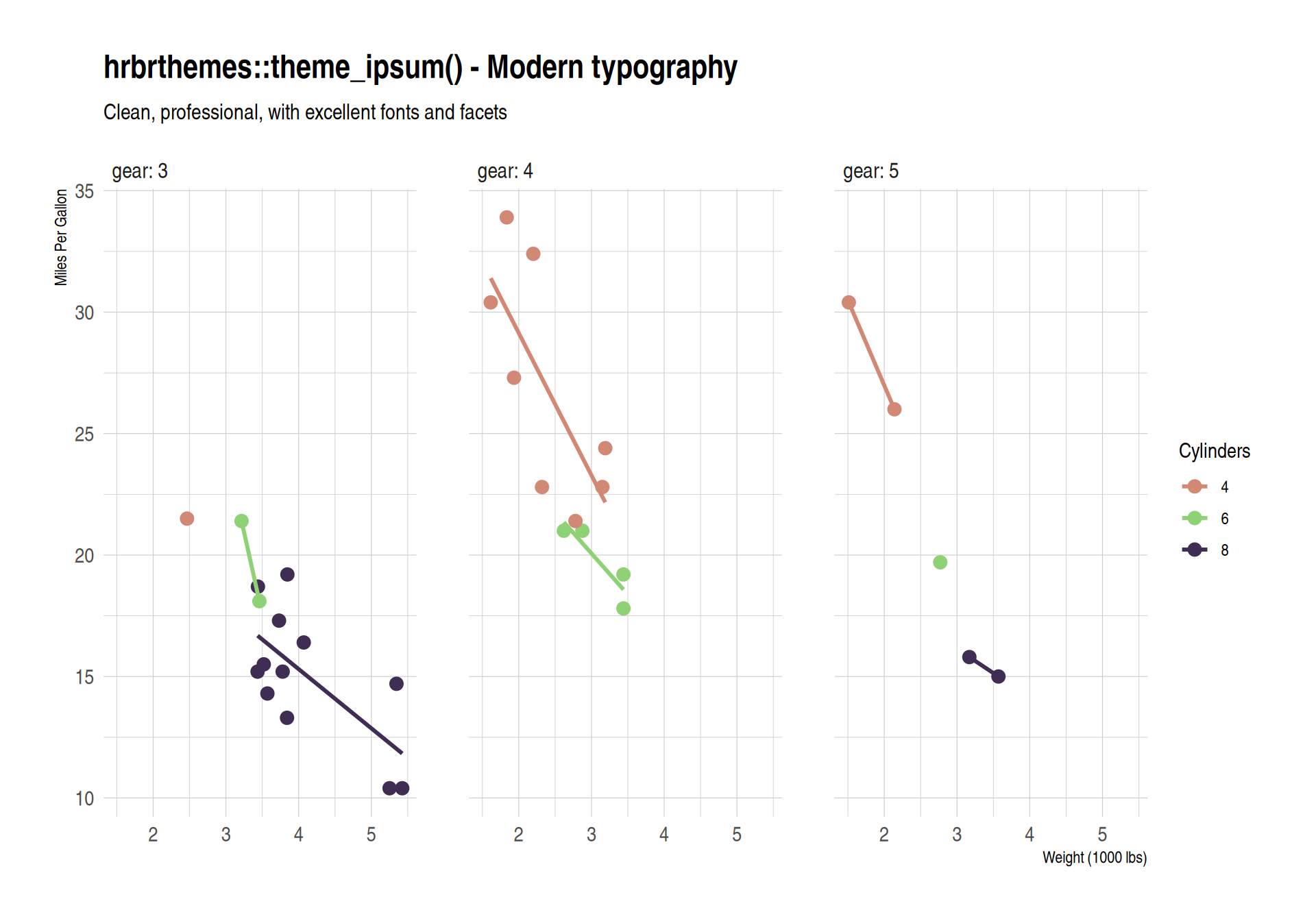
hrbrthemes Package
Modern professional typography
- Uses high-quality fonts (requires font installation)
theme_ipsum()- Modern, clean, professionaltheme_ipsum_rc()- Roboto Condensed font- Excellent for presentations and reports
- Works beautifully with facets
- May require:
extrafont::font_import()
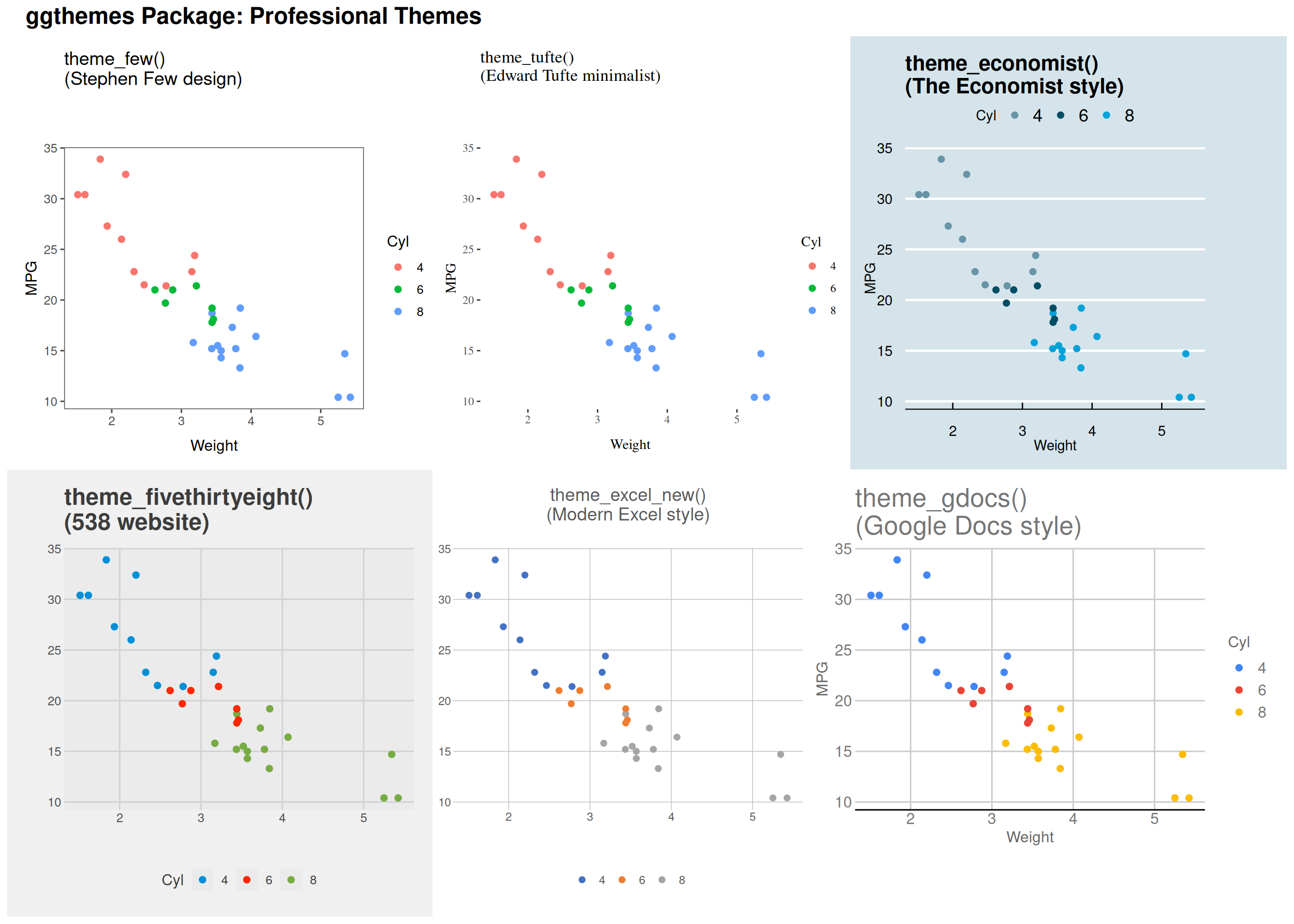
Specialized Themes: ggthemes
Setting Global Theme
Set once, apply to all plots:
# At top of script
theme_set(theme_bw(base_size = 12))

# Now all plots use theme_bw
# automatically
p1 <- ggplot(mtcars, aes(wt, mpg)) +
  geom_point() +
  labs(title = "Plot 1")

p2 <- ggplot(iris, aes(Sepal.Length, Sepal.Width)) +
  geom_point(aes(color = Species)) +
  labs(title = "Plot 2")

p3 <- ggplot(faithful, aes(eruptions)) +
  geom_histogram(bins = 30, fill = "steelblue") +
  labs(title = "Plot 3")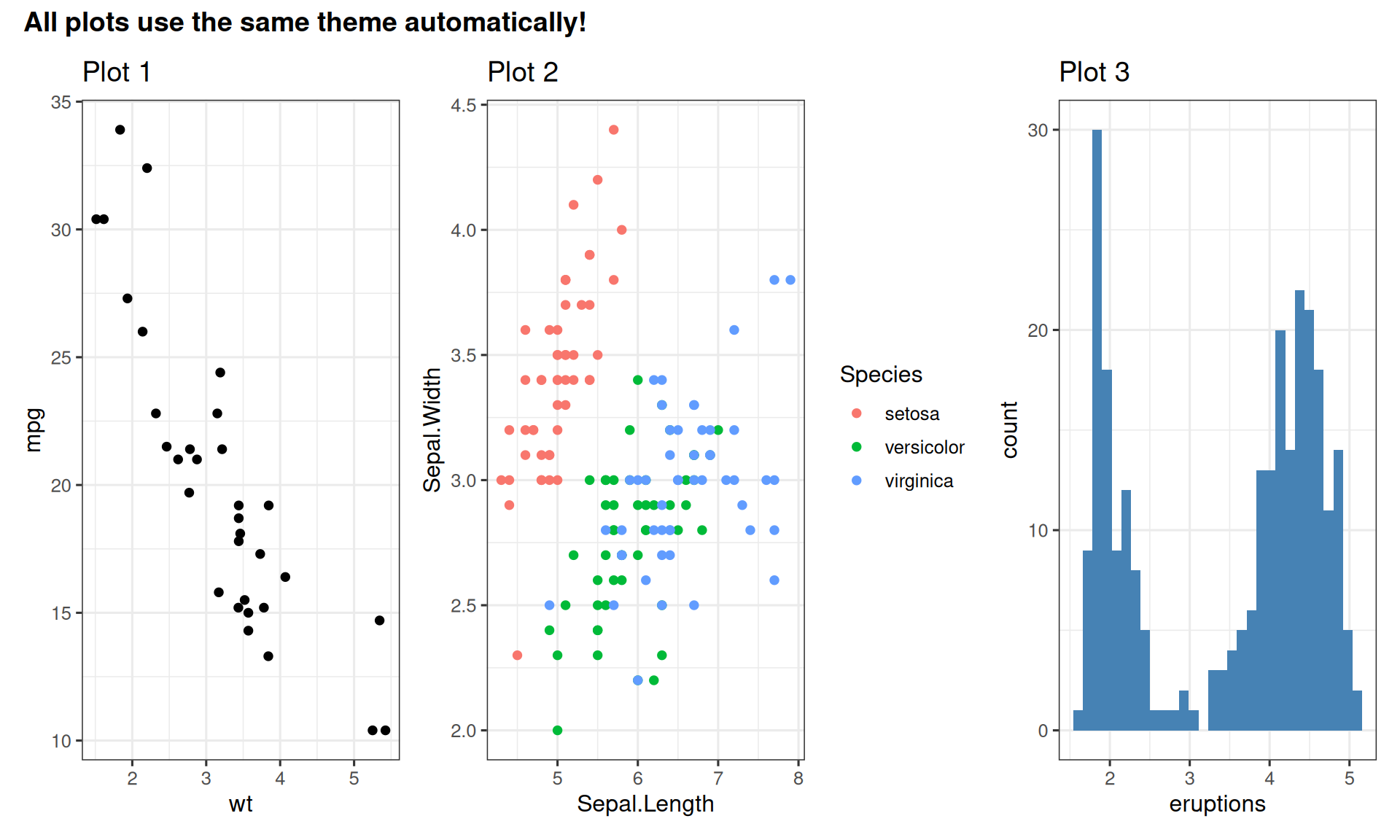
Theme Elements You Can Customize
p <- ggplot(mtcars, aes(x = factor(cyl), y = mpg, fill = factor(cyl))) +
  geom_boxplot(alpha = 0.7) +
  facet_wrap(~gear, labeller = label_both) +
  labs(title = "Customized Theme Elements",
       x = "Cylinders",
       y = "Miles Per Gallon",
       fill = "Cylinders") +
  theme_minimal() +
  theme(
    # Axis elements
    axis.title = element_text(size = 12, face = "bold", color = "navy"),
    axis.text = element_text(size = 10, color = "gray30"),
    # Legend
    legend.position = "bottom",
    legend.title = element_text(face = "bold"),
    legend.background = element_rect(fill = "gray95", color = "gray50"),
    # Panel
    panel.grid.major = element_line(color = "gray80", linewidth = 0.3),
    panel.grid.minor = element_blank(),
    panel.background = element_rect(fill = "white"),
    # Facet strips
    strip.background = element_rect(fill = "steelblue", color = "navy"),
    strip.text = element_text(color = "white", face = "bold", size = 11),
    # Plot
    plot.title = element_text(size = 16, face = "bold", hjust = 0.5),
    plot.background = element_rect(fill = "white", color = NA)
  ) +
  scale_fill_brewer(palette = "Set2")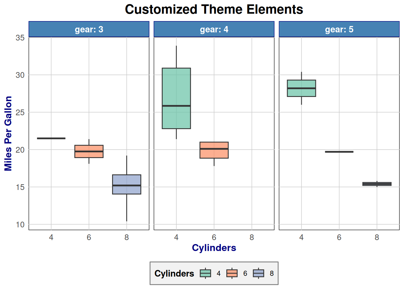
Customizable elements:
axis.title,axis.text- Axis labelslegend.position- “top”, “bottom”, “left”, “right”, “none”panel.grid- Gridlinesplot.background,panel.background- Backgroundsstrip.background,strip.text- Facet labels
Batch Saving: Result
# A tibble: 3 × 3
  Species    data               plot
  <fct>      <list>             <list>
1 setosa     <tibble [50 × 4]>  <gg>
2 versicolor <tibble [50 × 4]>  <gg>
3 virginica  <tibble [50 × 4]>  <gg>
Each row contains:
- Species name
- Nested data for that species
- A ggplot object with regression
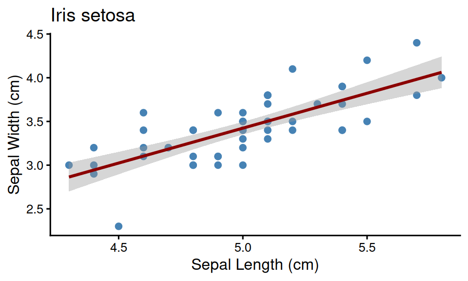
Example: Setosa species plot
Batch Saving Multiple Plots
Make a plotting function ::: {.cell}
make_species_plot <- function(data, species) {
  ggplot(data, aes(x = Sepal.Length, y = Sepal.Width)) +
    geom_point(size = 2, color = "steelblue") +
    geom_smooth(method = "lm", se = TRUE, color = "darkred", formula = y ~ x) +
    labs(title = glue("Iris {species}"), x = "Sepal Length (cm)", y = "Sepal Width (cm)") +
    theme_classic(base_size = 12)
}
Nest data per Species ::: {.cell}
Write out to separate file per Species
::::
# A tibble: 3 × 3
  Species    data              plot
  <fct>      <list>            <list>
1 setosa     <tibble [50 × 4]> <ggplt2::>
2 versicolor <tibble [50 × 4]> <ggplt2::>
3 virginica <tibble [50 × 4]> <ggplt2::># A tibble: 6 × 4
Sepal.Length Sepal.Width Petal.Length Petal.Width
<dbl> <dbl> <dbl> <dbl>
1 5.1 3.5 1.4 0.2
2 4.9 3 1.4 0.2
3 4.7 3.2 1.3 0.2
4 4.6 3.1 1.5 0.2
5 5 3.6 1.4 0.2
6 5.4 3.9 1.7 0.4
::::
Inkscape Basics
Opening PDFs/SVGs:
- File → Open → Select PDF or SVG
- Each plot element is now editable
Useful tools:
- Selection tool (F1): Move and resize
- Text tool (F8): Edit or add text
- Align and Distribute (Ctrl+Shift+A)
- Guides (drag from rulers): Align elements precisely
Tips:
- Group related elements (Ctrl+G)
- Lock layers to prevent accidental edits
- Use layers for complex figures
Handling Missing Fonts:
Keep the font names! Don’t substitute - preserves original font info and prevents text reflow issues
Cropping Canvas to Remove Whitespace
The Page Tool approach:
- Select the objects you want to keep (or Select All (Ctrl+A))
- Use Edit → Resize Page to Selection (or Ctrl+Shift+R)
- This resizes the canvas to fit your selection
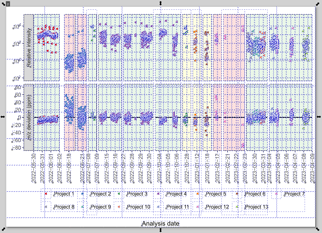
Hidden Objects from R Plots!
R exports contain many invisible/empty objects that prevent proper cropping!
The frustrating whack-a-mole:
- Press Ctrl+A (Select All) to reveal hidden objects
- You’ll see many white/empty rectangles
- Delete these empty objects first before resizing page
- Otherwise canvas includes invisible whitespace
Why clipping doesn’t work:
- Object → Clip → Set can destroy plot elements
- Don’t use clipping - delete empty objects instead
Example: Before and After Editing
Original R output

After editing in Inkscape

Changes made:
- Cropped whitespace
- Added annotations
- Made legend more compact
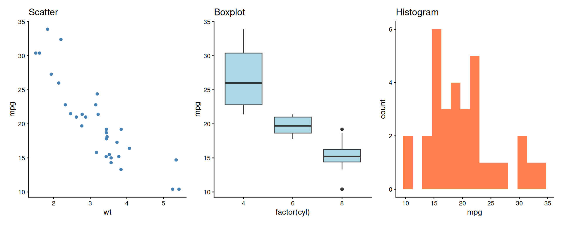
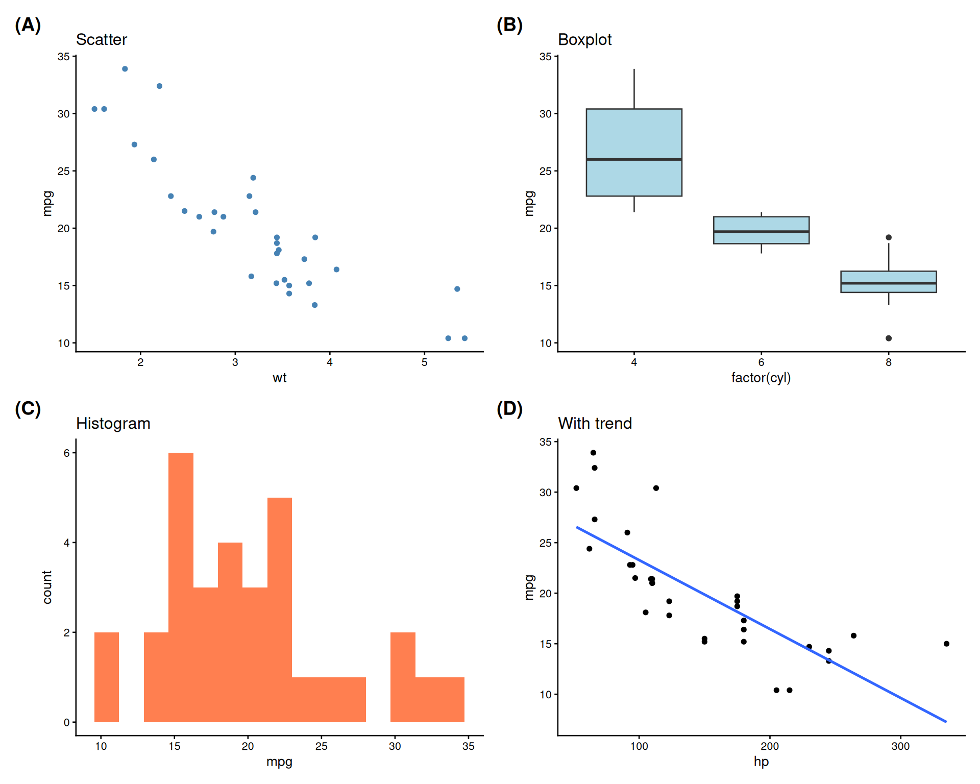
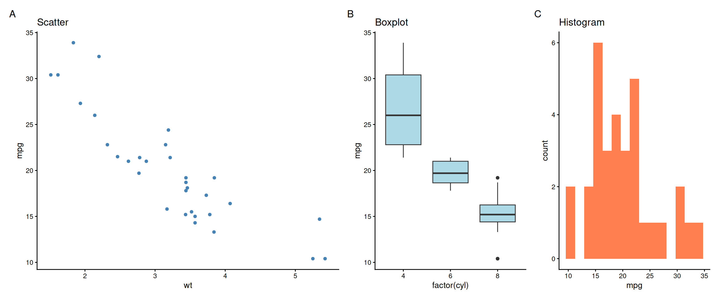
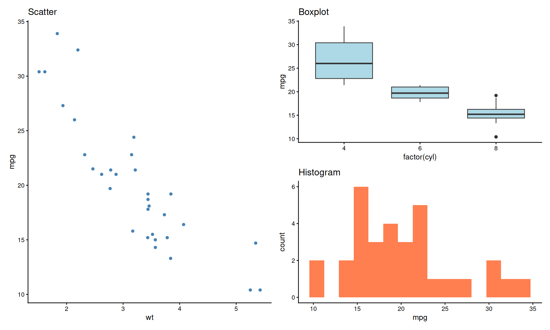
patchwork: Side by Side
A better alternative to manual composition!
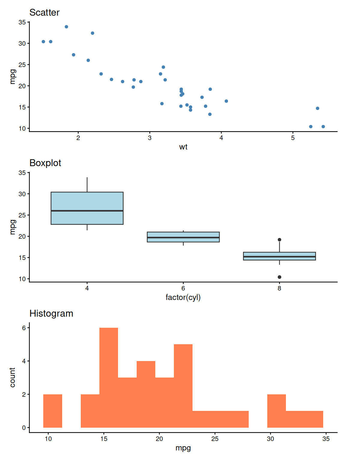
patchwork: Stacked Layout
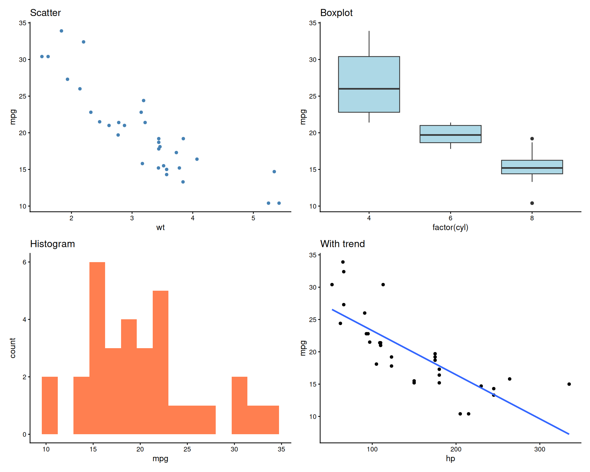
patchwork: Grid Layout
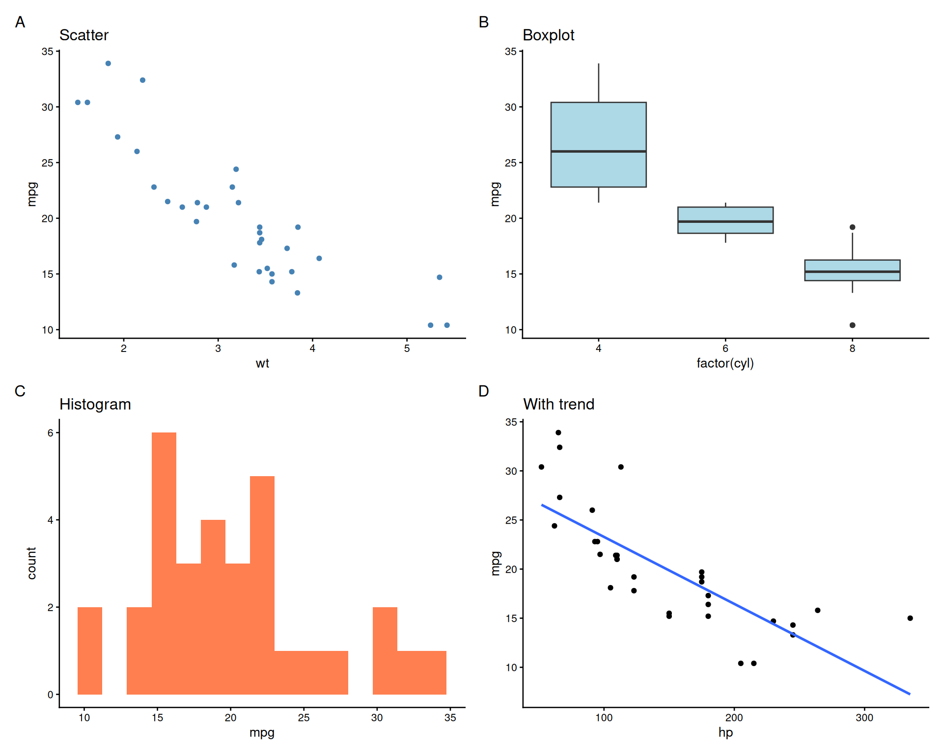
Adding Panel Labels (A, B, C…)
Customizing Panel Labels
Unequal Panel Sizes
Nested Layouts
Shared Legends with plot_layout()
# Create plots with same color mapping
pa <- ggplot(mtcars, aes(wt, mpg, color = factor(cyl))) +
  geom_point() + theme_classic(base_size = 10)
pb <- ggplot(mtcars, aes(hp, mpg, color = factor(cyl))) +
  geom_point() + theme_classic(base_size = 10)

pa + pb +
  plot_layout(guides = 'collect') +
  plot_annotation(tag_levels = 'A')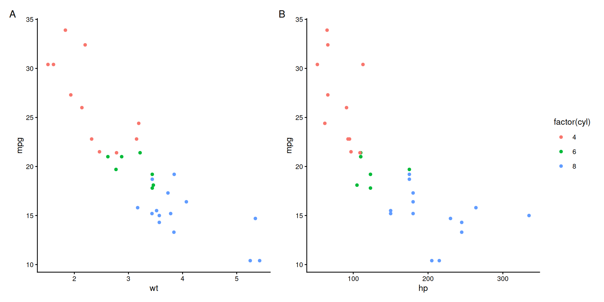
Shared Axes with plot_layout()
- Default behavior: Each plot keeps its own axes
collect_x: Remove duplicate x-axes when plots are stacked vertically (same x-scale)collect_y: Remove duplicate y-axes when plots are side-by-side (same y-scale)collect: Remove both x and y axes (same scales in both directions)- Apply to groups where it makes sense before combining
The Problem: Alphabetical Ordering
# Create data with logical categories
category_df <- data.frame(
  category = c("Low", "Medium", "High", "Very High", "Low", "High"),
  value = c(10, 20, 15, 30, 12, 25)
)

# R defaults to alphabetical!
p1 <- ggplot(category_df, aes(x = category, y = value)) +
  geom_col(fill = "coral") +
  theme_classic(base_size = 12) +
  labs(title = "Alphabetical (Wrong!)")
# Specify levels explicitly
category_df$category <- factor(category_df$category,
levels = c("Low", "Medium", "High", "Very High"))
# Now plots use logical order!
p2 <- ggplot(category_df, aes(x = category, y = value)) +
geom_col(fill = "steelblue") +
theme_classic(base_size = 12) +
labs(title = "Logical Order (Correct!)")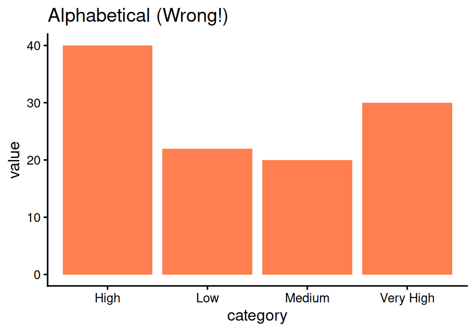
Random order makes no sense!
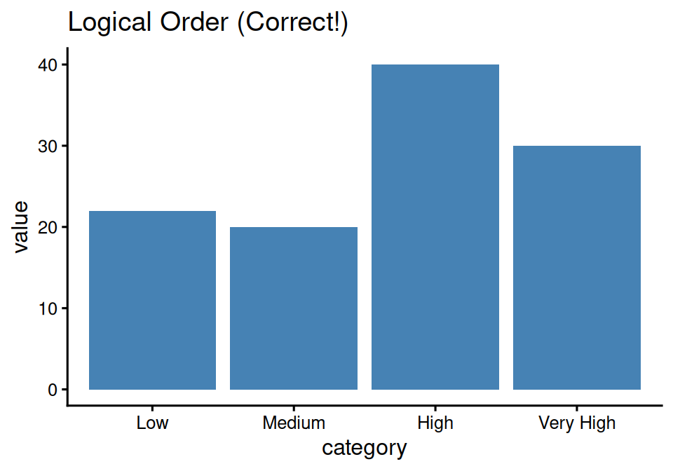
Much better - order makes sense!
Solution: forcats Package
Part of tidyverse, designed for factor manipulation
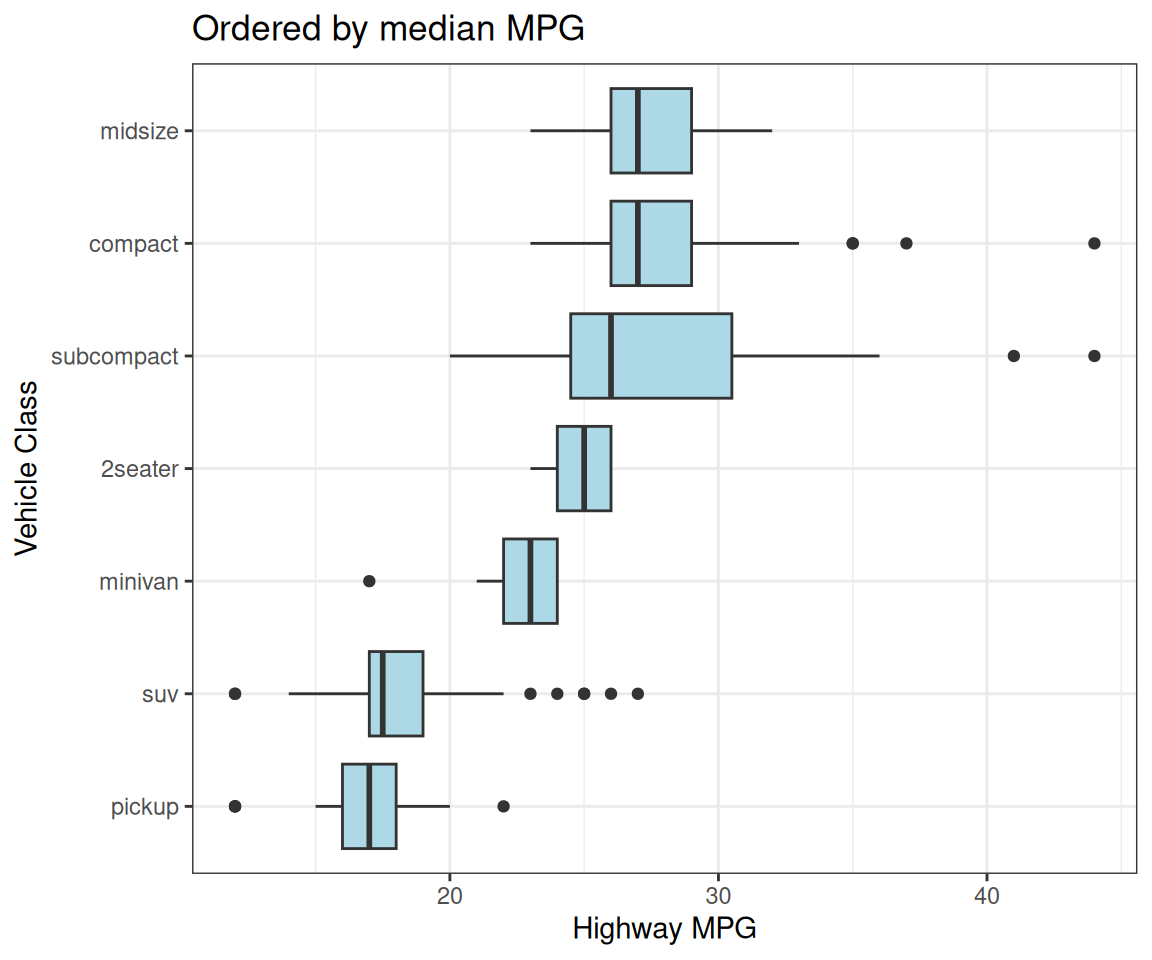
fct_reorder(): Order by Another Variable
# Order diamond cuts by mean price
p <- diamonds %>%
  group_by(cut) %>%
  summarise(mean_price = mean(price)) %>%
  ggplot(aes(x = fct_reorder(cut, mean_price),
             y = mean_price,
             fill = cut)) +
  geom_col(show.legend = FALSE) +
  coord_flip() +
  labs(x = "Diamond Cut",
       y = "Mean Price ($)",
       title = "Cuts ordered by average price")
Bars ordered by length!
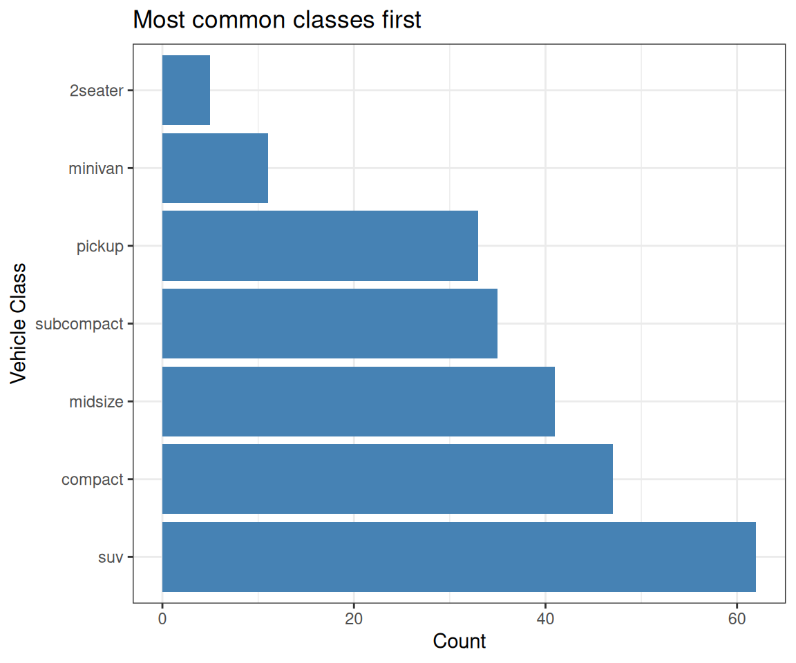
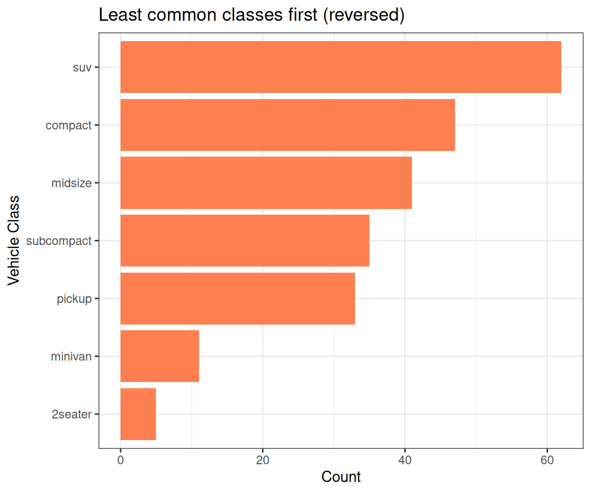
fct_infreq(): Order by Frequency
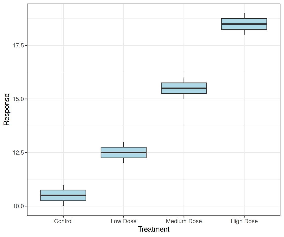
fct_inorder(): Order by Appearance
# Create data with specific order
treatment_data <- data.frame(
  treatment = c("Control", "Low Dose",
                "Medium Dose", "High Dose",
                "Control", "Low Dose",
                "Medium Dose", "High Dose"),
  response = c(10, 12, 15, 18,
               11, 13, 16, 19)
)

# Keep order as they appear in data
p <- ggplot(treatment_data,
       aes(x = fct_inorder(treatment),
           y = response)) +
  geom_boxplot(fill = "lightblue") +
  labs(x = "Treatment", y = "Response")
Preserves the order from your data!
Natural Sorting: var1, var2, …, var10
The problem with alphabetical sorting:
# Create data with numbered variables
var_data <- data.frame(
  variable = rep(c("var1", "var2", "var10", "var20"), each = 5),
  value = rnorm(20, mean = rep(c(10, 15, 20, 25), each = 5), sd = 2)
)

# Alphabetical order: var1, var10, var2, var20 (wrong!)
p <- ggplot(var_data, aes(x = variable, y = value)) +
  geom_boxplot(fill = "coral") +
  labs(title = "Alphabetical: var1, var10, var2, var20")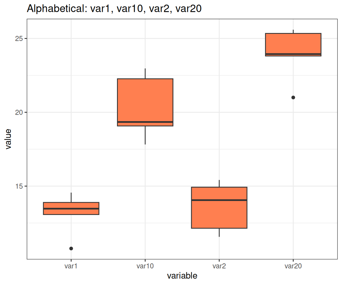
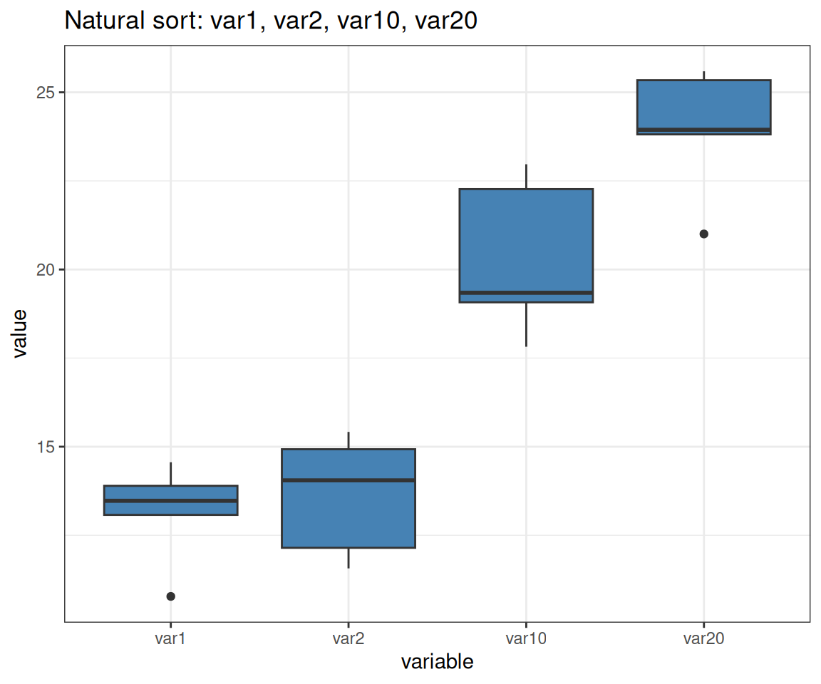
Natural Sorting: The Solution
# Use gtools::mixedsort() for natural/alphanumeric sorting
library(gtools)

var_data$variable <- factor(var_data$variable,
                            levels = mixedsort(unique(var_data$variable)))

# Natural order: var1, var2, var10, var20 (correct!)
p <- ggplot(var_data, aes(x = variable, y = value)) +
  geom_boxplot(fill = "steelblue") +
  labs(title = "Natural sort: var1, var2, var10, var20")
Note: forcats::fct_inseq() only works if factor levels are purely numeric strings (e.g., “1”, “2”, “10”), not mixed alphanumeric like “var1”, “var10”
fct_rev(): Reverse Order
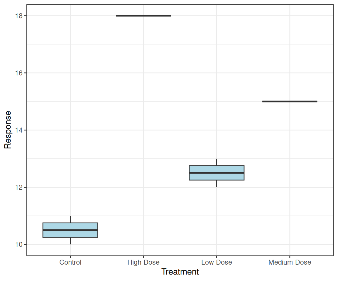
fct_relevel(): Move Specific Levels
# Move "Control" to front for treatment groups
treatment_data <- data.frame(
  treatment = c("Low Dose", "High Dose", "Control",
                "Medium Dose", "Low Dose", "Control"),
  response = c(12, 18, 10, 15, 13, 11)
)

p <- treatment_data %>%
  mutate(treatment = fct_relevel(treatment, "Control")) %>%
  ggplot(aes(treatment, response)) +
  geom_boxplot(fill = "lightblue") +
  labs(x = "Treatment", y = "Response")
Control always shown first
Common in experimental data!
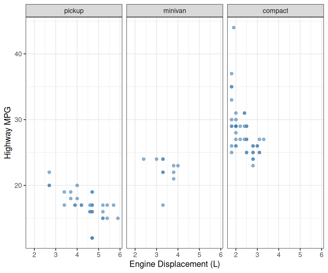
Facet Ordering
# Order facets by median highway mpg for each vehicle class
p <- mpg %>%
  filter(class %in% c("pickup", "minivan", "compact")) %>%
  mutate(class = fct_reorder(class, hwy, median)) %>%
  ggplot(aes(x = displ, y = hwy)) +
  geom_point(color = "steelblue", alpha = 0.6) +
  facet_wrap(~class) +
  labs(x = "Engine Displacement (L)", y = "Highway MPG")
Facet panels in meaningful order!
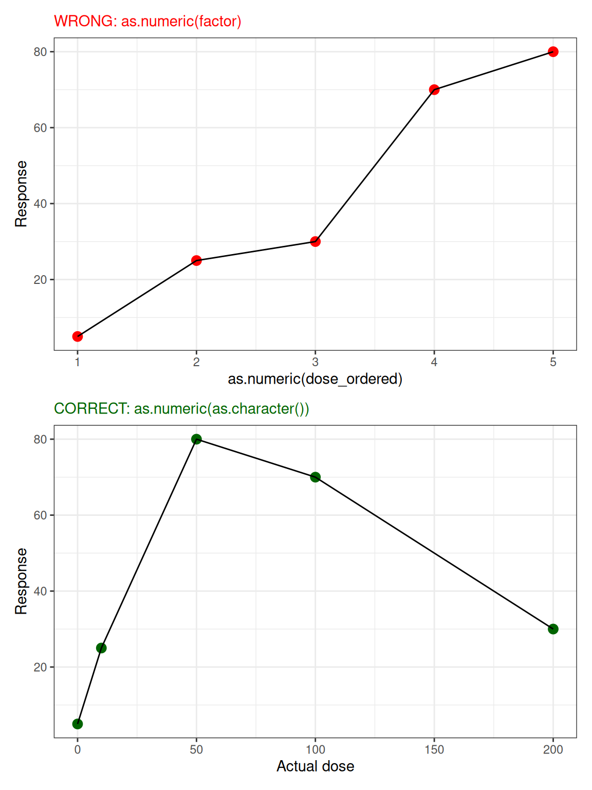
⚠️ Numeric Factors After Reordering
# A tibble: 5 × 5
  dose  response dose_ordered wrong correct
  <fct>    <dbl> <fct>        <dbl>   <dbl>
1 0            5 0                1       0
2 10          25 10               2      10
3 50          80 50               5      50
4 100         70 100              4     100
5 200         30 200              3     200