Introduction
This vignette covers the first step in the xcms metabolomics data analysis workflow: visualizing raw MS data before any processing. These visualizations help you:
- Assess data quality before analysis
- Understand the structure of your LC-MS acquisition
- Identify potential issues early
- Visualize MS/MS (DDA) experiment coverage
xcms Workflow Context
┌───────────────────────────────┐
│ 1. RAW DATA VISUALIZATION     | ← YOU ARE HERE
├────────────────────────────-──┤
│ 2. Peak Detection             │
│ 3. Peak Correspondence        │
│ 4. Retention Time Alignment   │
│ 5. Feature Grouping           │
└──────────────────────────----─┘
Functions Covered
| Function | Purpose | Input Type |
|---|---|---|
gplot(XcmsExperiment) |
Visualize full MS data |
XcmsExperiment, XCMSnExp
|
gplotPrecursorIons() |
Visualize MS/MS precursors |
MsExperiment with MS2 |
Setup
Part 1: Full MS Data Visualization
Overview
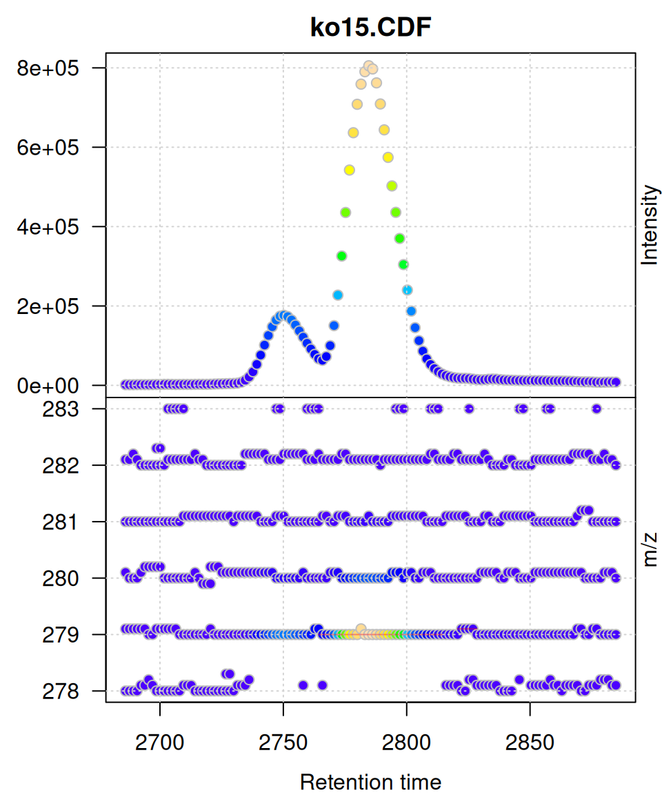
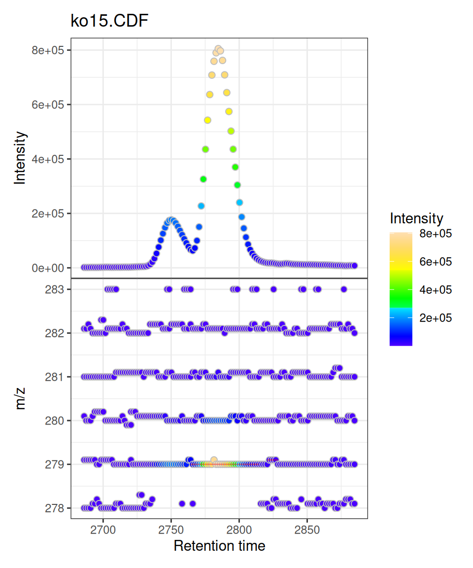
The gplot() method for XcmsExperiment and XCMSnExp objects creates a two-panel visualization:
- Upper panel: Base Peak Intensity (BPI) chromatogram vs retention time
- Lower panel: m/z vs retention time scatter plot
Both panels use intensity-based coloring, and detected peaks (if any) are automatically overlaid as rectangles.
Data Preparation
We’ll use pre-processed test data from xcms:
# Load pre-processed data
xdata <- loadXcmsData("faahko_sub2")

# Check data
cat("Samples:", length(xdata), "\n")
#> Samples: 3
cat("Total peaks detected:", nrow(chromPeaks(xdata)), "\n")
#> Total peaks detected: 248
For visualization, we’ll filter to a specific retention time and m/z region:
# Filter to focused region
mse <- filterRt(xdata, rt = c(2785-100, 2785+100))
mse <- filterMzRange(mse, mz = c(278, 283))
Basic Usage
Single Sample Visualization
gplot(mse[1])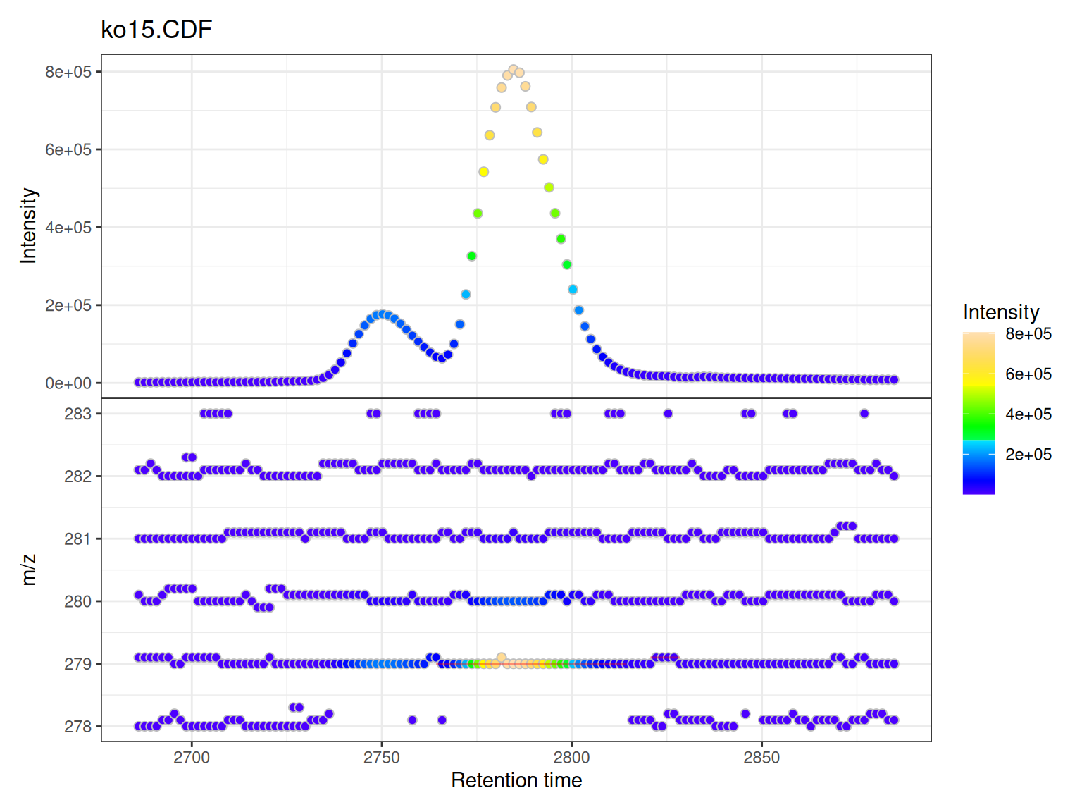
Understanding the Two Panels
Upper Panel: BPI Chromatogram
The Base Peak Intensity (BPI) shows the maximum intensity at each retention time across all m/z values in the filtered range.
- Each point represents one retention time
- Y-axis shows the maximum intensity observed at that time
- Color indicates intensity magnitude
- Useful for identifying retention time regions with strong signals
Lower Panel: m/z vs RT Scatter
The m/z vs retention time scatter shows the complete mass spectral data:
- X-axis: retention time
- Y-axis: m/z values
- Each point represents one data point (mass peak) from the raw spectra
- Color indicates intensity of that specific m/z at that retention time
- Shows the full two-dimensional structure of the LC-MS data
Peak Overlays
If chromatographic peaks have been detected (via findChromPeaks()), they are automatically overlaid as rectangles showing:
- Peak retention time boundaries (left/right edges)
- Peak m/z boundaries (top/bottom edges)
- Semi-transparent red color by default
Multiple Samples
When visualizing multiple samples, gplot() creates a vertically stacked layout:
# Plot all three samples
gplot(mse)
Customization
Custom Colors
gplot(mse[1],
      col = "blue",           # Point border color
      peakCol = "red")        # Peak rectangle color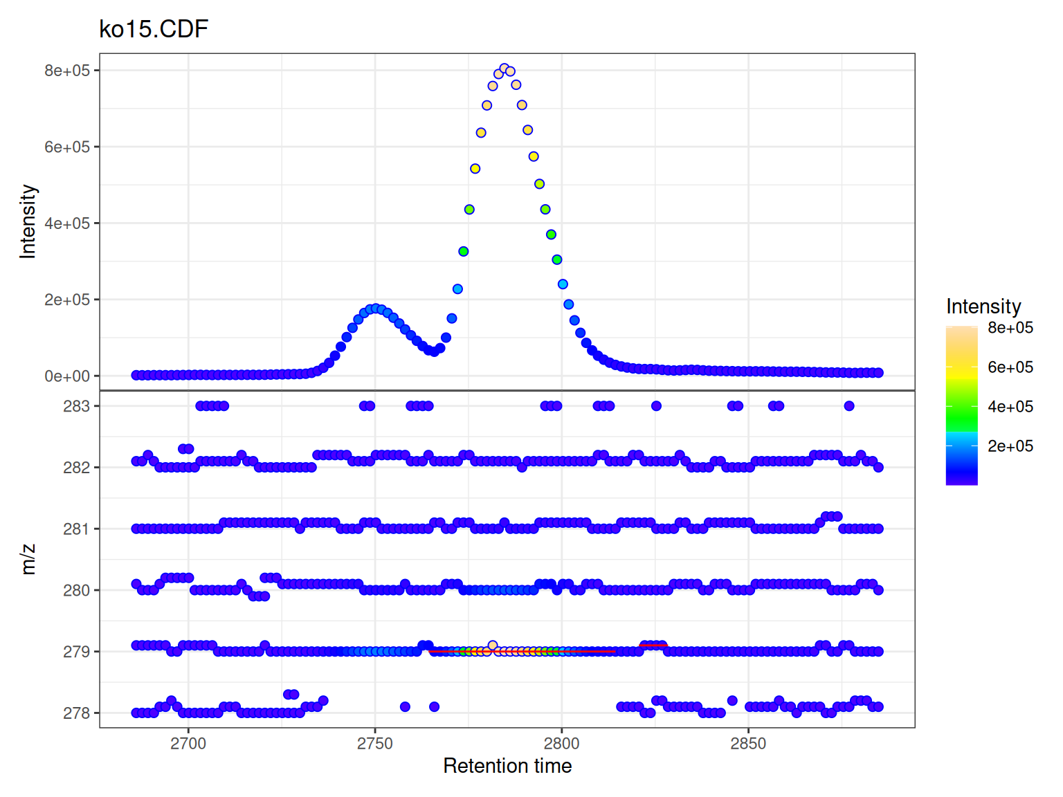
Custom Color Ramps
The intensity coloring uses a color ramp function. The viridis scales are reversed to follow MS convention (low=dark, high=bright):
library(viridisLite)

# Create reversed versions for MS convention (low=dark, high=bright)
viridis_rev <- function(n) rev(viridis(n))
magma_rev <- function(n) rev(magma(n))
plasma_rev <- function(n) rev(plasma(n))

p1 <- gplot(mse[1], colramp = viridis_rev) + ggtitle("Viridis")
p2 <- gplot(mse[1], colramp = magma_rev) + ggtitle("Magma")
p3 <- gplot(mse[1], colramp = plasma_rev) + ggtitle("Plasma")

(p1 | p2 | p3)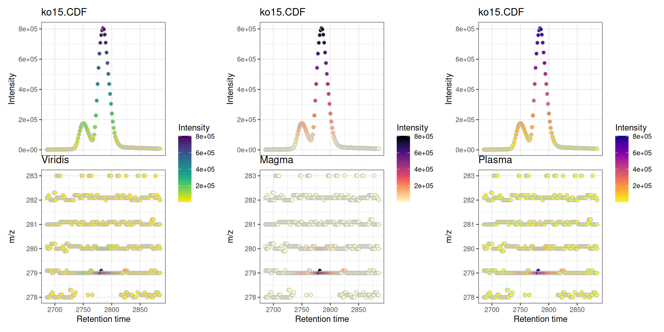
Custom Titles
# Plot shows sample names from data automatically
gplot(mse)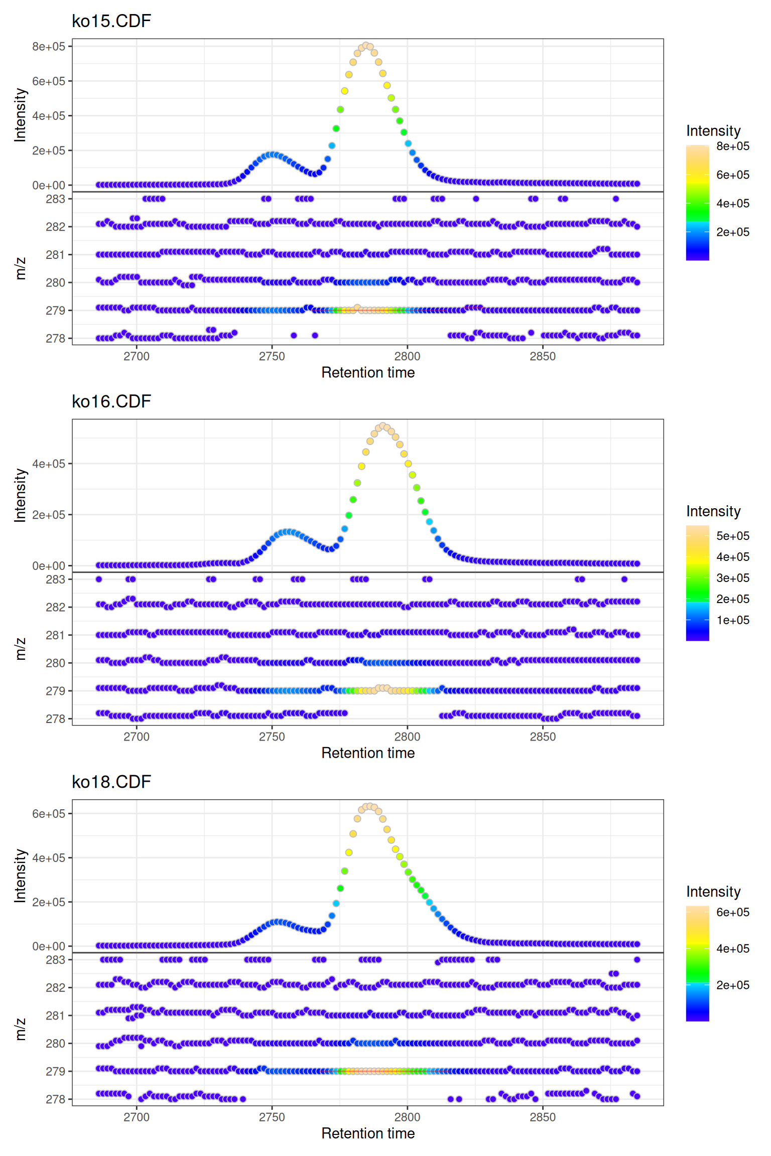
Interactive Visualization
Convert to interactive plotly for data exploration:
Accessing Individual Panels:
Since gplot() returns a patchwork object combining two panels, you can access and make each panel interactive separately:
This is useful when you want to customize each panel independently or embed them separately in reports.
Part 2: MS/MS Precursor Ion Visualization
Overview
The gplotPrecursorIons() function visualizes precursor ions selected for fragmentation in MS/MS (tandem mass spectrometry) experiments. This is particularly useful for:
- Assessing DDA (Data-Dependent Acquisition) performance
- Visualizing MS/MS coverage across the chromatographic run
- Quality control of MS/MS experiments
- Understanding which compounds were fragmented
What are Precursor Ions?
In MS/MS experiments, the mass spectrometer:
- Performs MS1 scans to detect all ions
- Selects specific ions (precursors) based on criteria (intensity, exclusion lists, etc.)
- Fragments these precursors and records MS2 spectra
The gplotPrecursorIons() function plots where and which precursor ions were selected across the LC-MS run.
Loading DDA Data
We’ll use example DDA data from the MsDataHub package:
# Load DDA MS/MS data
fl <- MsDataHub::PestMix1_DDA.mzML()

pest_dda <- readMsExperiment(fl)

# Check data structure
pest_dda
#> Object of class MsExperiment
#>  Spectra: MS1 (4627) MS2 (2975)
#>  Experiment data: 1 sample(s)
#>  Sample data links:
#>   - spectra: 1 sample(s) to 7602 element(s).
Basic Precursor Ion Visualization
Default Plot
p <- gplotPrecursorIons(pest_dda)
p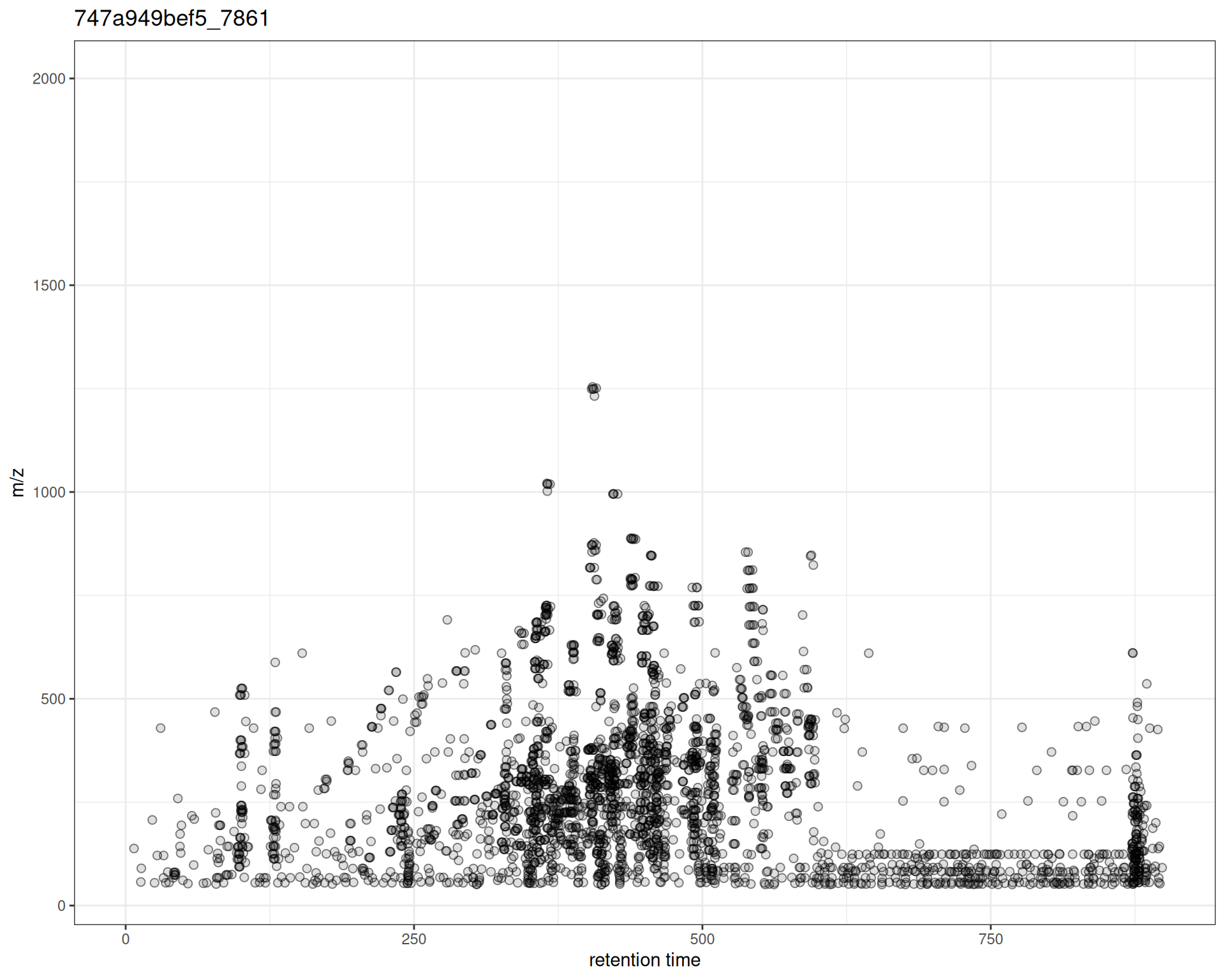
The plot shows:
- X-axis: Retention time when MS2 spectrum was acquired
- Y-axis: m/z of the precursor ion selected for fragmentation
- Points: Each precursor ion
Interpretation
From this plot, you can see:
- Distribution of MS/MS events across the chromatographic run
- m/z range of fragmented ions
- Density patterns - where fragmentation was most active
- Coverage gaps - RT or m/z regions without MS/MS data
Customization
Custom Colors and Symbols
p_custom <- gplotPrecursorIons(
  pest_dda,
  pch = 16,                    # filled circle
  col = "#E41A1C"              # point color
) +
  labs(
    x = "Retention Time (s)",
    y = "Precursor m/z"
  )

p_custom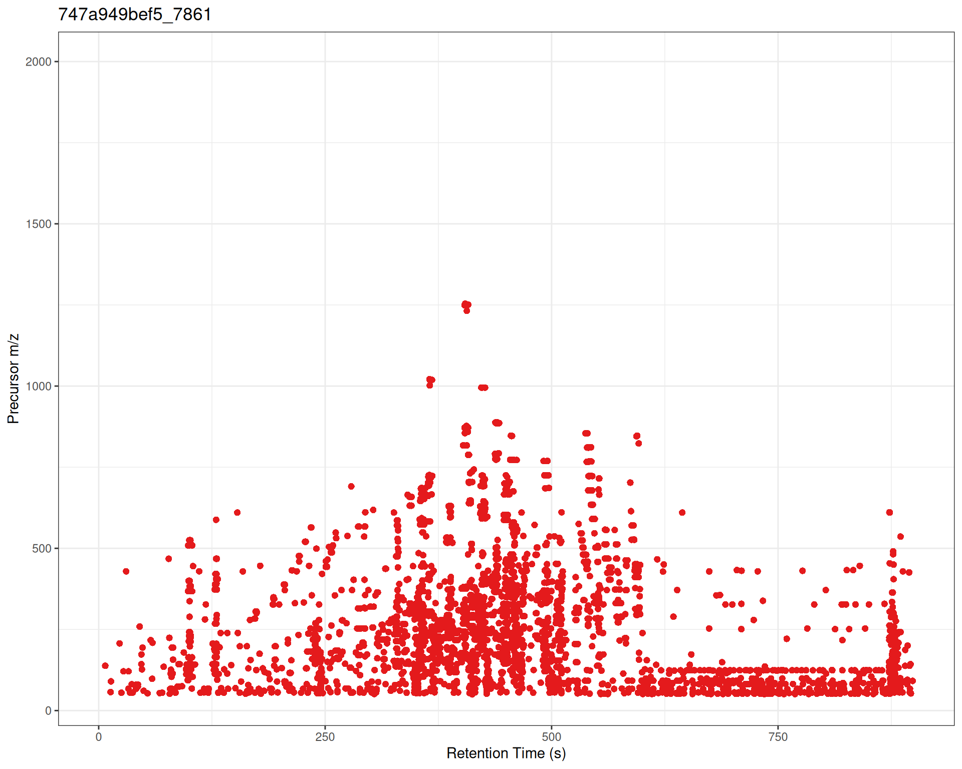
Adding ggplot2 Layers
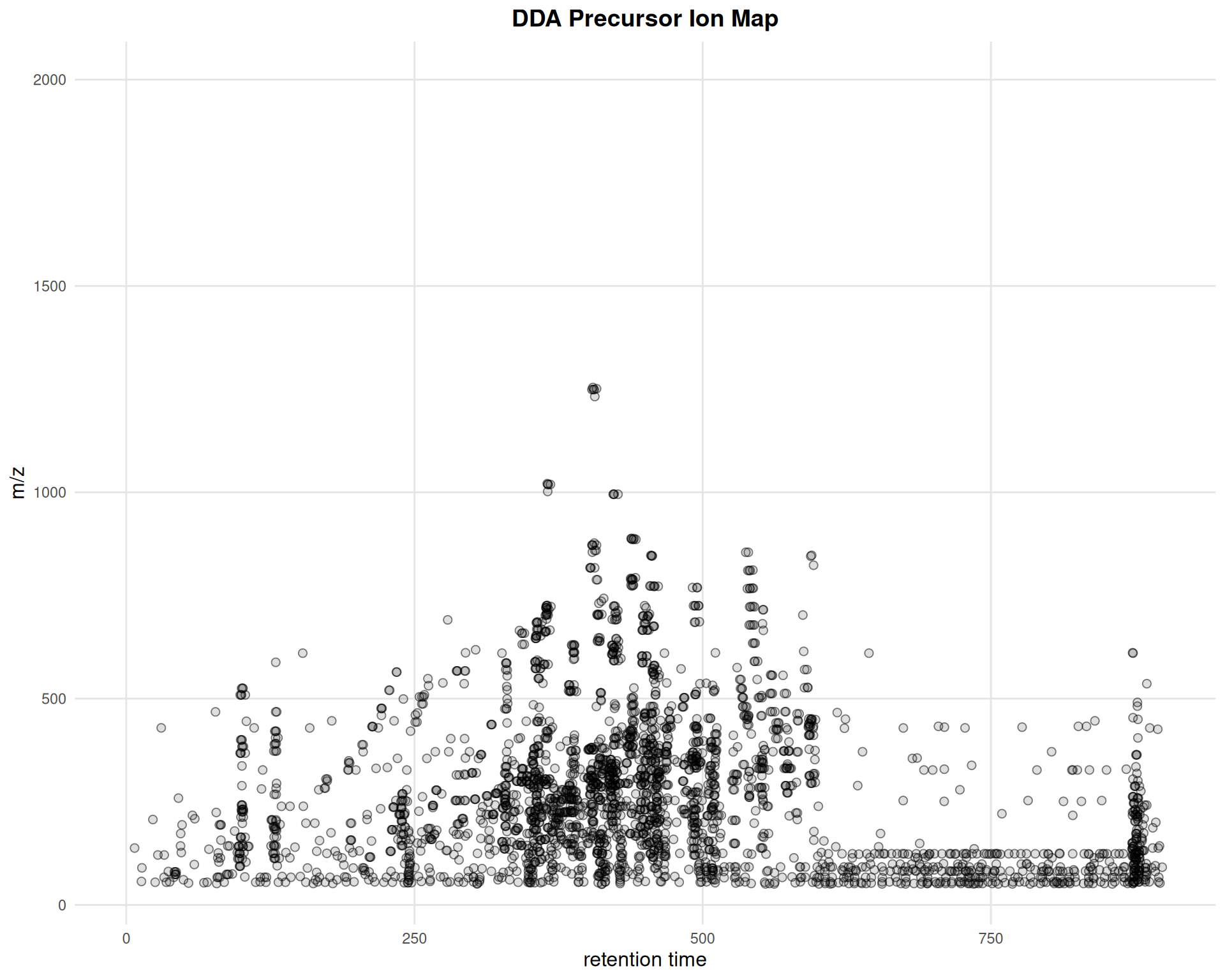
gplotPrecursorIons(pest_dda) +
  ggtitle("DDA Precursor Ion Map") +
  theme_minimal() +
  theme(
    plot.title = element_text(hjust = 0.5, face = "bold", size = 14),
    axis.title = element_text(size = 12),
    panel.grid.major = element_line(color = "gray90"),
    panel.grid.minor = element_blank()
  )
Interactive Precursor Visualization
p_interactive <- gplotPrecursorIons(pest_dda)
ggplotly(p_interactive)
Summary
When to Use
- Before any processing: Assess raw data quality
- Method development: Evaluate acquisition parameters
- Quality control: Ensure expected coverage and signals
- DDA experiments: Verify MS/MS performance
Next Steps
After visualizing and assessing your raw data, proceed to:
→ Step 2: Peak Detection - Detect chromatographic peaks in your data
Comparison with Original xcms
gplot(XcmsExperiment) vs plot()
gplotPrecursorIons() vs plotPrecursorIons()
Original xcms
plotPrecursorIons(pest_dda)
xcmsVis ggplot2
gplotPrecursorIons(pest_dda)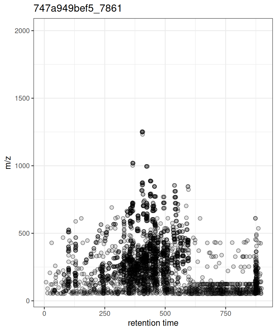
Session Info
sessionInfo()
#> R version 4.6.0 (2026-04-24)
#> Platform: x86_64-pc-linux-gnu
#> Running under: Ubuntu 24.04.4 LTS
#>
#> Matrix products: default
#> BLAS:   /usr/lib/x86_64-linux-gnu/openblas-pthread/libblas.so.3
#> LAPACK: /usr/lib/x86_64-linux-gnu/openblas-pthread/libopenblasp-r0.3.26.so;  LAPACK version 3.12.0
#>
#> locale:
#>  [1] LC_CTYPE=C.UTF-8       LC_NUMERIC=C           LC_TIME=C.UTF-8
#>  [4] LC_COLLATE=C.UTF-8     LC_MONETARY=C.UTF-8    LC_MESSAGES=C.UTF-8
#>  [7] LC_PAPER=C.UTF-8       LC_NAME=C              LC_ADDRESS=C
#> [10] LC_TELEPHONE=C         LC_MEASUREMENT=C.UTF-8 LC_IDENTIFICATION=C
#>
#> time zone: UTC
#> tzcode source: system (glibc)
#>
#> attached base packages:
#> [1] stats     graphics  grDevices utils     datasets  methods   base
#>
#> other attached packages:
#>  [1] viridisLite_0.4.3   MsDataHub_1.12.0    patchwork_1.3.2
#>  [4] plotly_4.12.0       ggplot2_4.0.3       MsExperiment_1.14.0
#>  [7] ProtGenerics_1.44.0 xcmsVis_0.99.11     xcms_4.10.0
#> [10] BiocParallel_1.46.0 BiocStyle_2.40.0
#>
#> loaded via a namespace (and not attached):
#>   [1] RColorBrewer_1.1-3          jsonlite_2.0.0
#>   [3] MultiAssayExperiment_1.38.0 magrittr_2.0.5
#>   [5] farver_2.1.2                MALDIquant_1.22.3
#>   [7] rmarkdown_2.31              fs_2.1.0
#>   [9] vctrs_0.7.3                 memoise_2.0.1
#>  [11] htmltools_0.5.9             S4Arrays_1.12.0
#>  [13] progress_1.2.3              AnnotationHub_4.2.0
#>  [15] curl_7.1.0                  SparseArray_1.12.2
#>  [17] mzID_1.50.0                 htmlwidgets_1.6.4
#>  [19] plyr_1.8.9                  httr2_1.2.2
#>  [21] impute_1.86.0               cachem_1.1.0
#>  [23] igraph_2.3.1                lifecycle_1.0.5
#>  [25] iterators_1.0.14            pkgconfig_2.0.3
#>  [27] Matrix_1.7-5                R6_2.6.1
#>  [29] fastmap_1.2.0               MatrixGenerics_1.24.0
#>  [31] clue_0.3-68                 digest_0.6.39
#>  [33] pcaMethods_2.4.0            AnnotationDbi_1.74.0
#>  [35] S4Vectors_0.50.0            ExperimentHub_3.2.0
#>  [37] crosstalk_1.2.2             GenomicRanges_1.64.0
#>  [39] RSQLite_2.4.6               labeling_0.4.3
#>  [41] filelock_1.0.3              Spectra_1.22.0
#>  [43] httr_1.4.8                  abind_1.4-8
#>  [45] compiler_4.6.0              bit64_4.8.0
#>  [47] withr_3.0.2                 doParallel_1.0.17
#>  [49] S7_0.2.2                    PTMods_1.0.0
#>  [51] DBI_1.3.0                   MASS_7.3-65
#>  [53] rappdirs_0.3.4              DelayedArray_0.38.1
#>  [55] mzR_2.46.0                  tools_4.6.0
#>  [57] PSMatch_1.16.0              otel_0.2.0
#>  [59] glue_1.8.1                  QFeatures_1.22.0
#>  [61] grid_4.6.0                  cluster_2.1.8.2
#>  [63] reshape2_1.4.5              generics_0.1.4
#>  [65] gtable_0.3.6                preprocessCore_1.74.0
#>  [67] tidyr_1.3.2                 data.table_1.18.2.1
#>  [69] hms_1.1.4                   MetaboCoreUtils_1.20.1
#>  [71] XVector_0.52.0              BiocGenerics_0.58.0
#>  [73] BiocVersion_3.23.1          foreach_1.5.2
#>  [75] pillar_1.11.1               stringr_1.6.0
#>  [77] limma_3.68.1                dplyr_1.2.1
#>  [79] BiocFileCache_3.2.0         lattice_0.22-9
#>  [81] bit_4.6.0                   tidyselect_1.2.1
#>  [83] Biostrings_2.80.0           knitr_1.51
#>  [85] IRanges_2.46.0              Seqinfo_1.2.0
#>  [87] SummarizedExperiment_1.42.0 stats4_4.6.0
#>  [89] xfun_0.57                   Biobase_2.72.0
#>  [91] statmod_1.5.1               MSnbase_2.37.0
#>  [93] matrixStats_1.5.0           stringi_1.8.7
#>  [95] lazyeval_0.2.3              yaml_2.3.12
#>  [97] evaluate_1.0.5              codetools_0.2-20
#>  [99] MsCoreUtils_1.24.0          tibble_3.3.1
#> [101] BiocManager_1.30.27         cli_3.6.6
#> [103] affyio_1.82.0               Rcpp_1.1.1-1.1
#> [105] MassSpecWavelet_1.78.0      dbplyr_2.5.2
#> [107] png_0.1-9                   XML_3.99-0.23
#> [109] parallel_4.6.0              blob_1.3.0
#> [111] prettyunits_1.2.0           AnnotationFilter_1.36.0
#> [113] MsFeatures_1.20.0           scales_1.4.0
#> [115] affy_1.90.0                 ncdf4_1.24
#> [117] purrr_1.2.2                 crayon_1.5.3
#> [119] rlang_1.2.0                 vsn_3.80.0
#> [121] KEGGREST_1.52.0