1 Color Gradients
1.1 Introduction
Color choice is one of the most critical—and most commonly mishandled—aspects of data visualization. The rainbow color scale, despite its popularity, is fundamentally flawed and can mislead readers. This chapter explains why and shows you better alternatives.
Learning Objectives
By the end of this chapter, you will:
- Understand why rainbow color scales are problematic
- Learn about perceptually uniform color scales
- Know when to use viridis, ColorBrewer, and diverging scales
- Be able to test your color choices for accessibility
1.2 What is the Rainbow Scale?
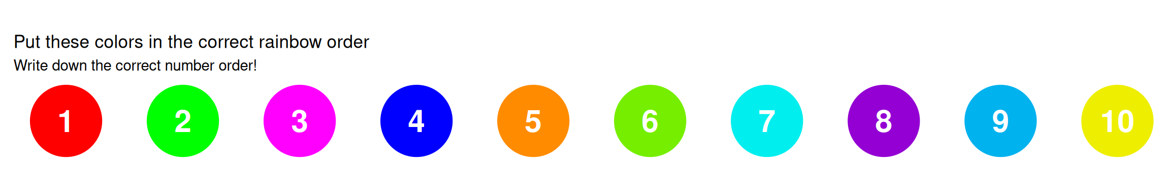
Interactive Challenge: Can you order these colors?
1.3 The Correct Rainbow Order
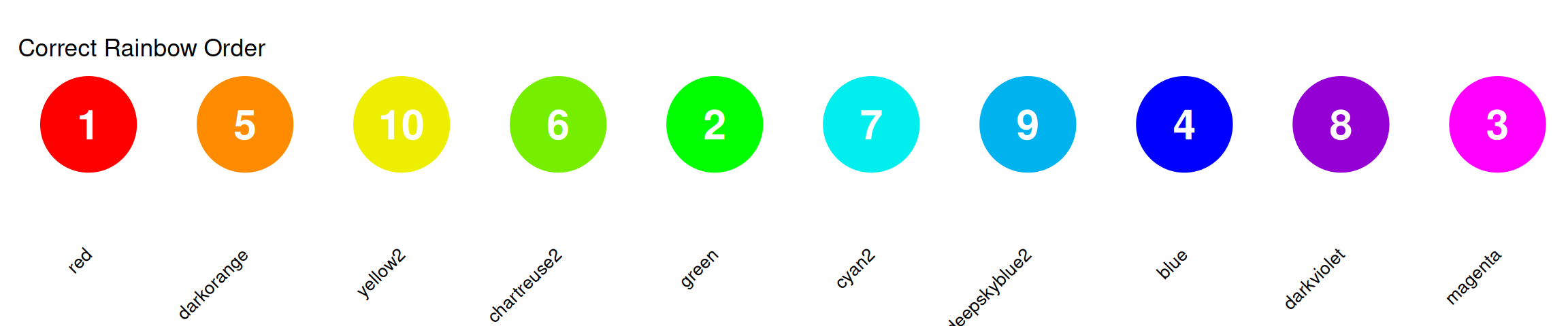
Colors in order: Red → Orange → Yellow → Green → Cyan → Blue → Purple/Magenta
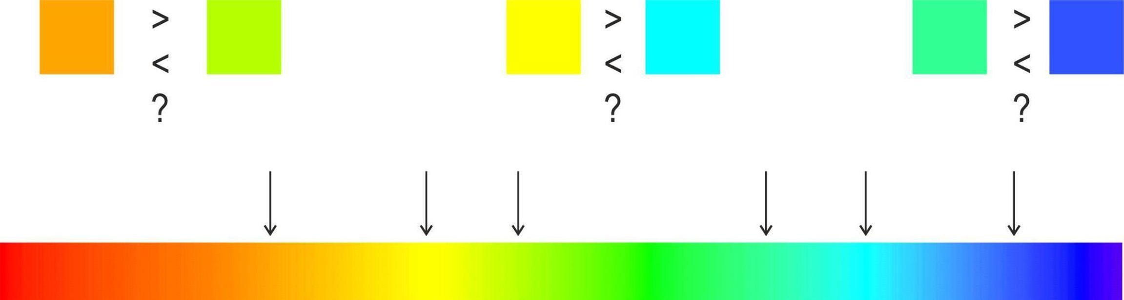
Figure from Gołębiowska and Çöltekin (2022)
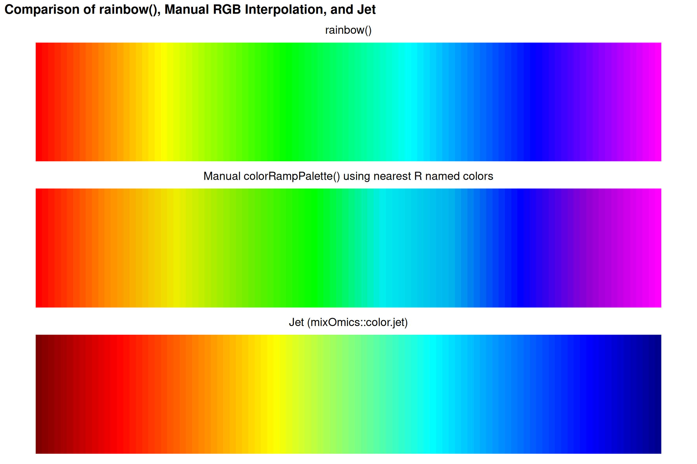
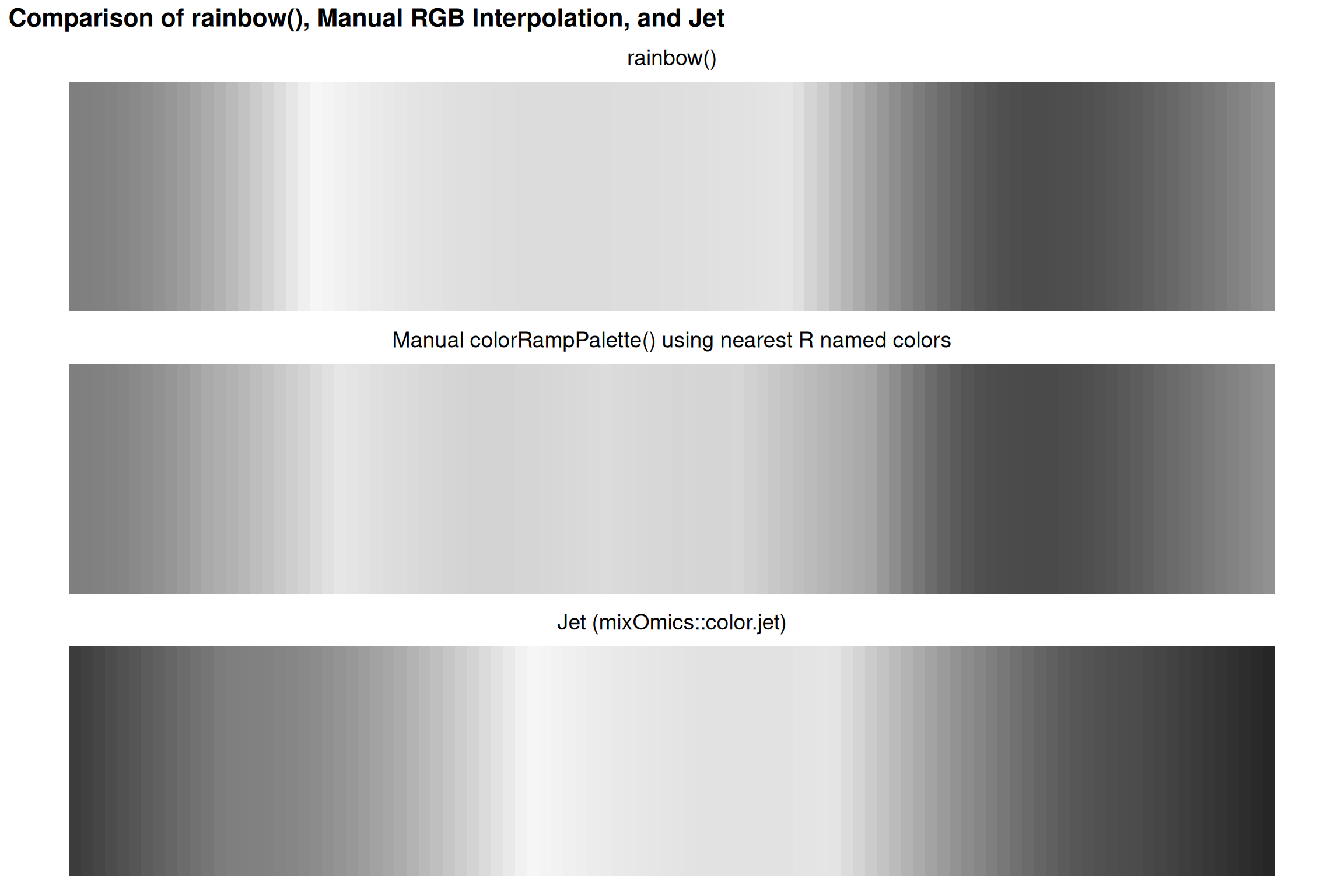
1.4 Comparing Rainbow Implementations
Why This Order?
This follows the visible light spectrum by wavelength:
- Red: ~700 nm (longest)
- Violet: ~400 nm (shortest)
But wavelength order ≠ perceptual order!
1.5 A Tale of Two Colormaps
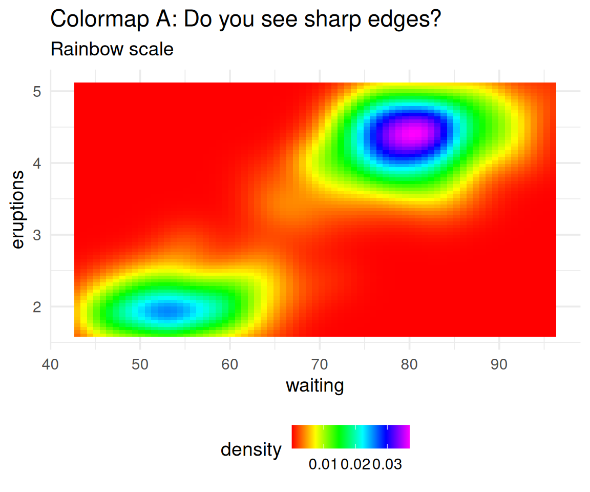
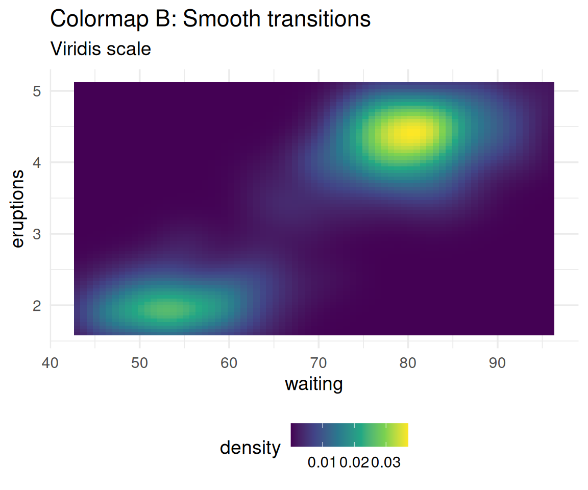
Which one shows the data more accurately?
The data is smooth, yet Colormap A creates false boundaries!
1.6 Perceptual Non-Uniformity: Demonstrated
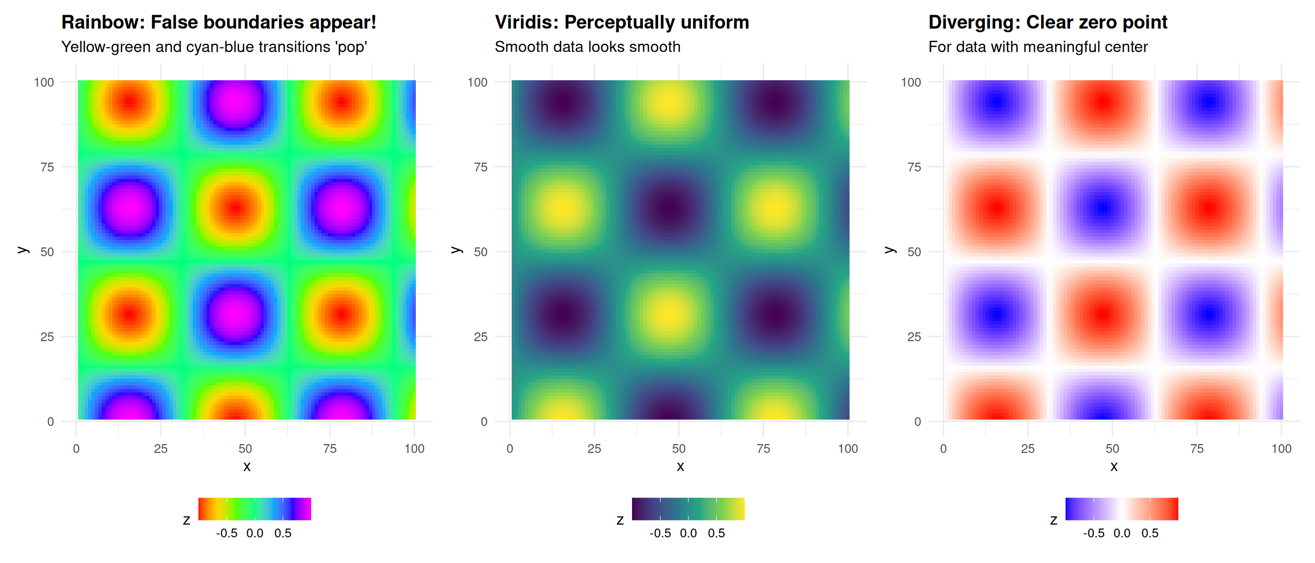
The data is perfectly smooth, yet rainbow creates artificial edges!
1.7 Real world consequences
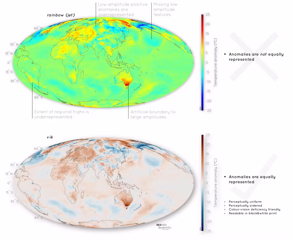
Image from Heron, Crameri, and Shephard (2021)
1.8 Not just spatial data
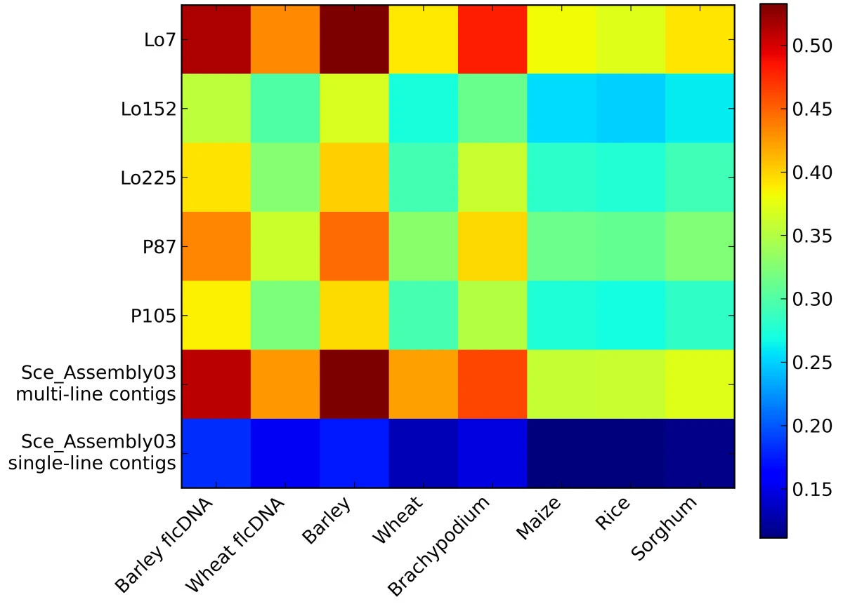
Figure from Haseneyer et al. (2011)
1.9 Medical Consequences
Lives at Stake
Borkin et al. (2011) - IEEE Visualization
Studied physicians diagnosing heart disease using medical imaging:
- Physicians using jet colormap: More errors, slower diagnosis
- Physicians using perceptually uniform colormaps: Fewer errors, faster
Why?
- Bright yellow appears more “intense” than dark red
- But dark red represents higher values (more critical condition)
- Perceptual bias leads to misdiagnosis
Reference: Borkin et al. (2011)
Figure from Borkin et al. (2011)
1.10 Comparison: Rainbow vs Better Alternatives
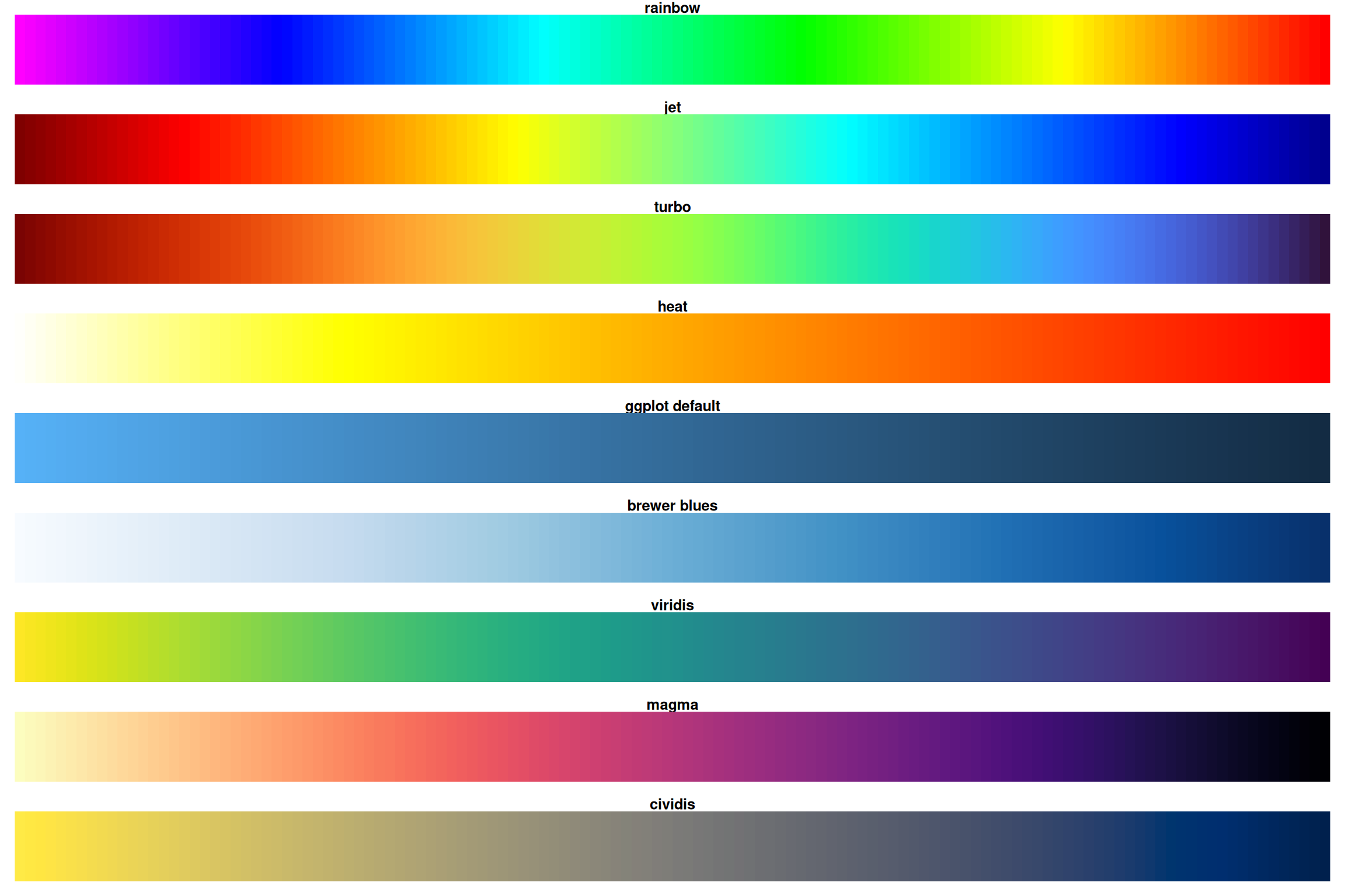
Notice how rainbow and heat have sharp transitions while viridis/magma are smooth!
1.11 Desaturated
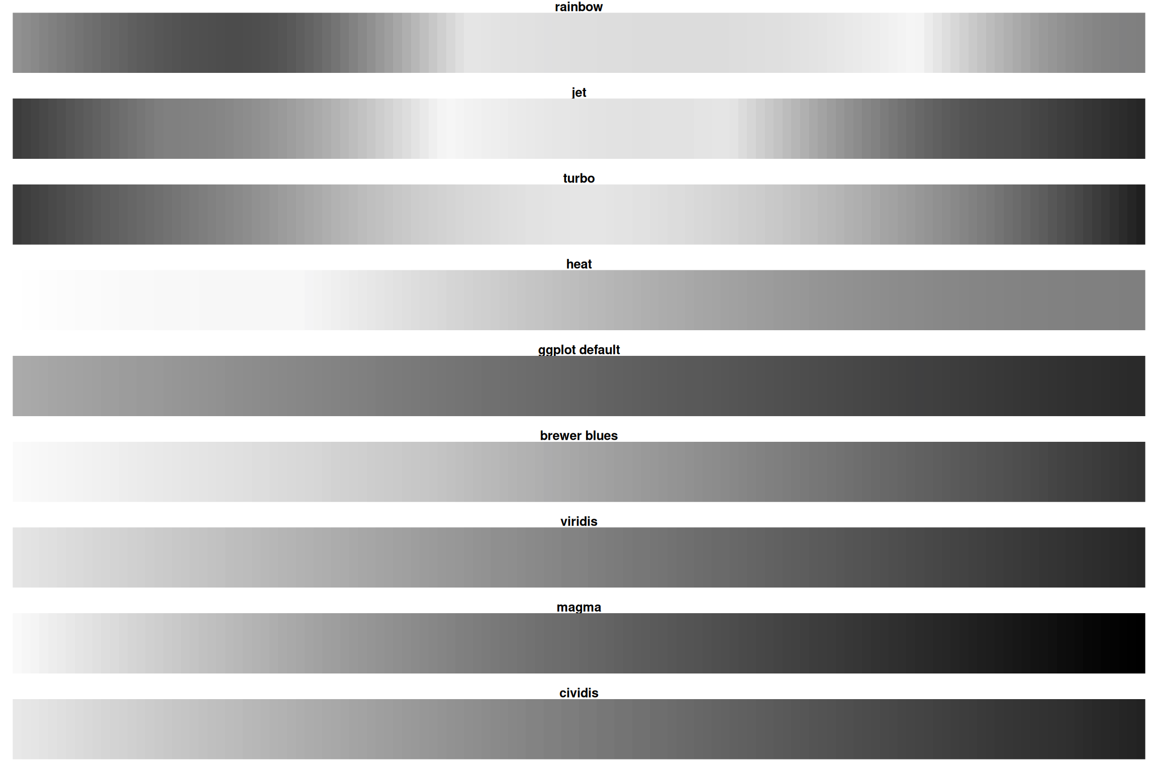
Rainbow loses all information when desaturated! Viridis/magma remain readable.
1.12 The Viridis Color Scales
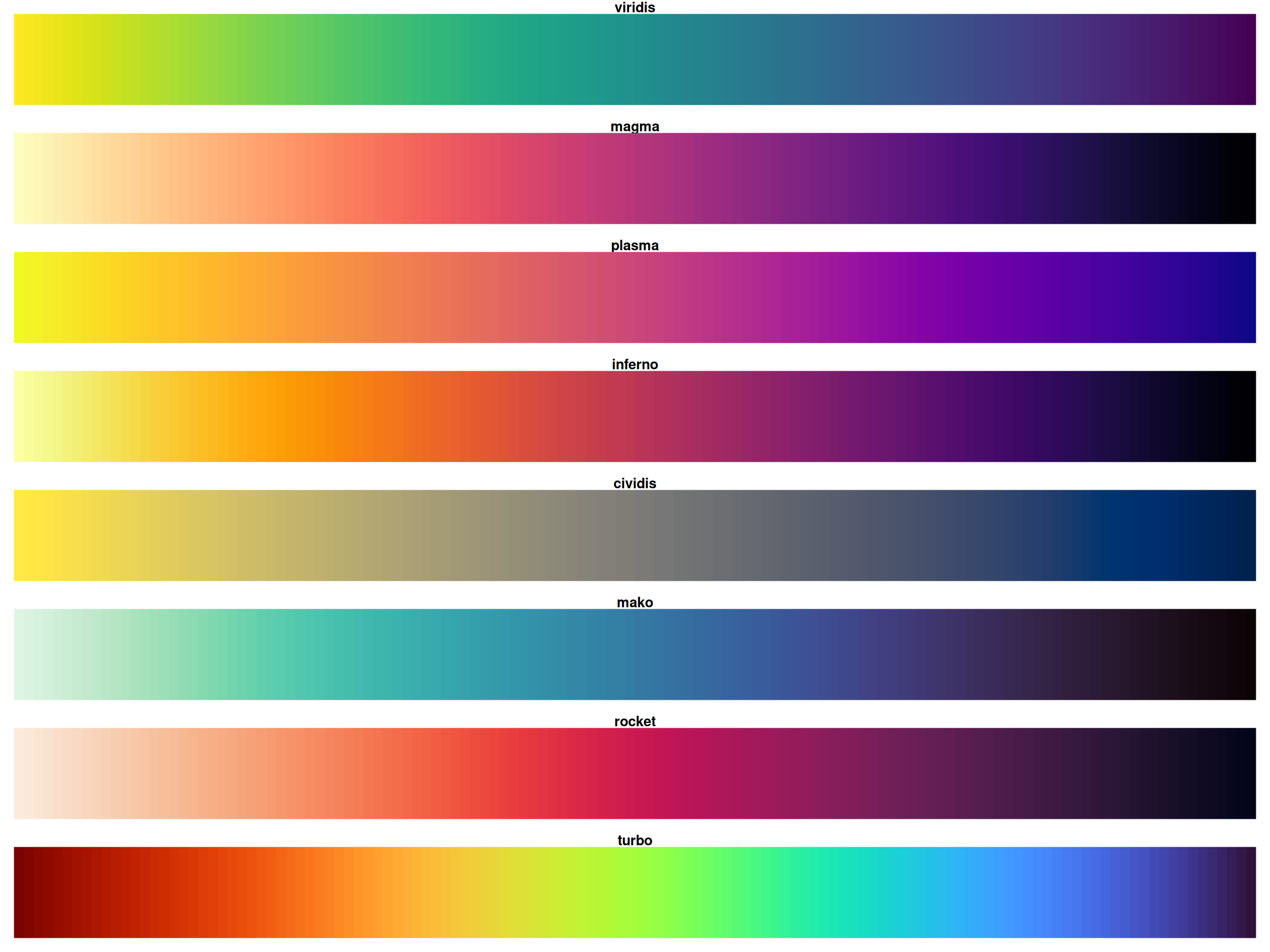
All viridis scales are perceptually uniform
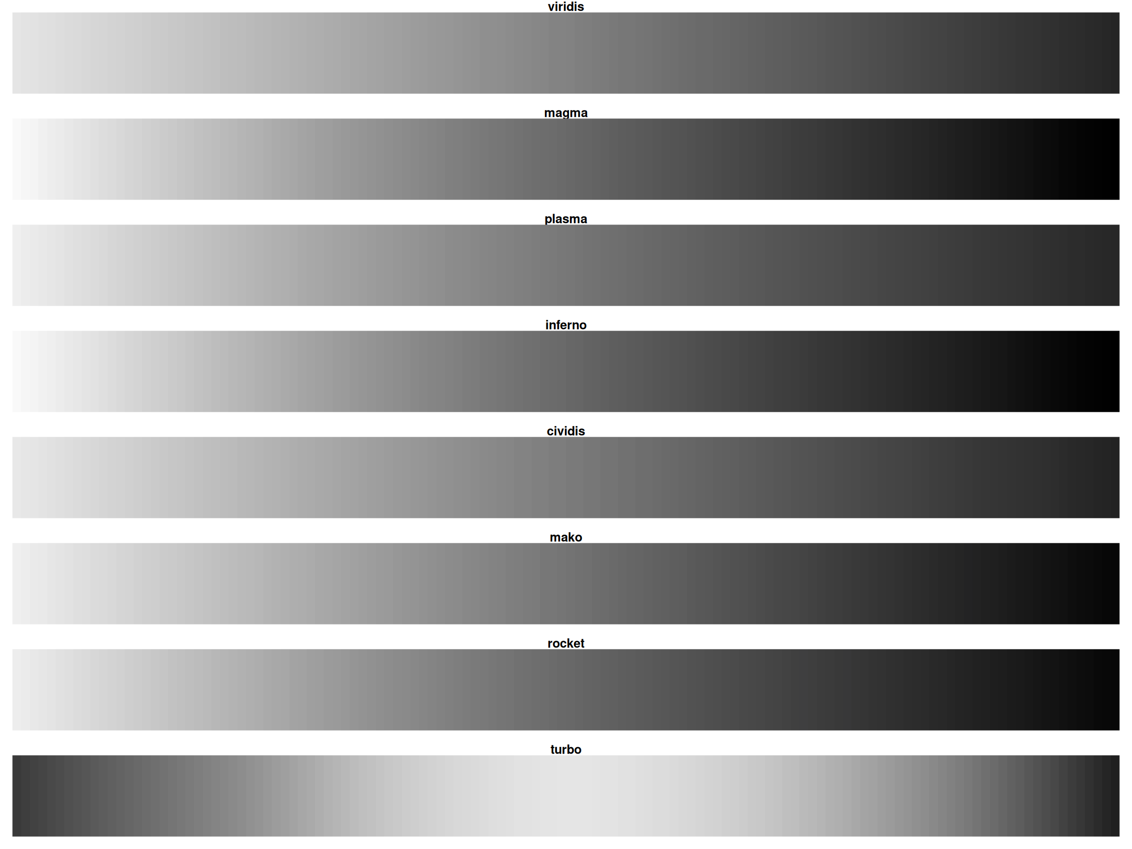
1.13 The Viridis Color Scales, desaturated
1.14 Green-Blind Vision (Deuteranopia)
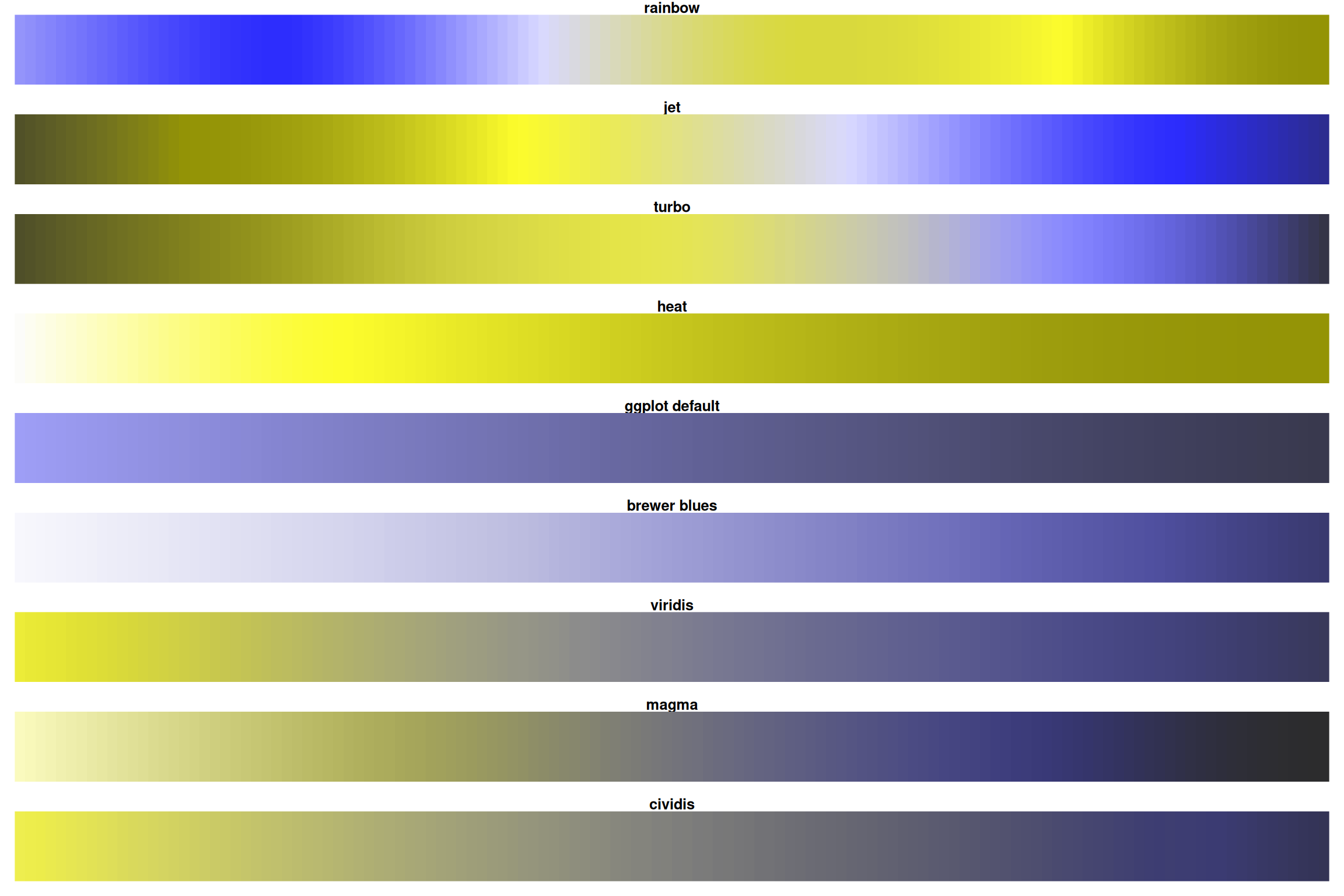
For ~8% of men, rainbow is nearly useless! Viridis/magma stay distinct.
1.15 Color Scale Comparison: Pros and Cons
|
Rainbow
|
Jet
|
Turbo
|
Heat
|
ggplot default
|
Brewer Blues
|
Viridis
|
Magma
|
Cividis
|
|
|---|---|---|---|---|---|---|---|---|---|
| Perceptually uniform | ❌ | ❌ | ✅ | ❌ | ✅ | ✅ | ✅ | ✅ | ✅ |
| Colorblind safe | ❌ | ❌ | ❌ | ❌ | ✅ | ✅ | ✅ | ✅ | ✅ |
| B&W/grayscale safe | ❌ | ❌ | ❌ | ❌ | ✅ | ✅ | ✅ | ✅ | ✅ |
| Good on projectors | ⚠️ | ⚠️ | ✅ | ⚠️ | ✅ | ✅ | ✅ | ✅ | ✅ |
| Print friendly | ❌ | ❌ | ✅ | ❌ | ✅ | ✅ | ✅ | ✅ | ✅ |
| Engaging colors | ✅ | ✅ | ✅ | ⚠️ | ⚠️ | ⚠️ | ✅ | ✅ | ⚠️ |
| Wide color range | ✅ | ✅ | ✅ | ⚠️ | ⚠️ | ⚠️ | ✅ | ✅ | ⚠️ |
| Recommendation | ❌ AVOID | ❌ AVOID | ⚠️ Careful | ❌ AVOID | OK | Good | ✅ DEFAULT | ✅ Great | ✅ Great |
1.16 Viridis Family: Show All Options
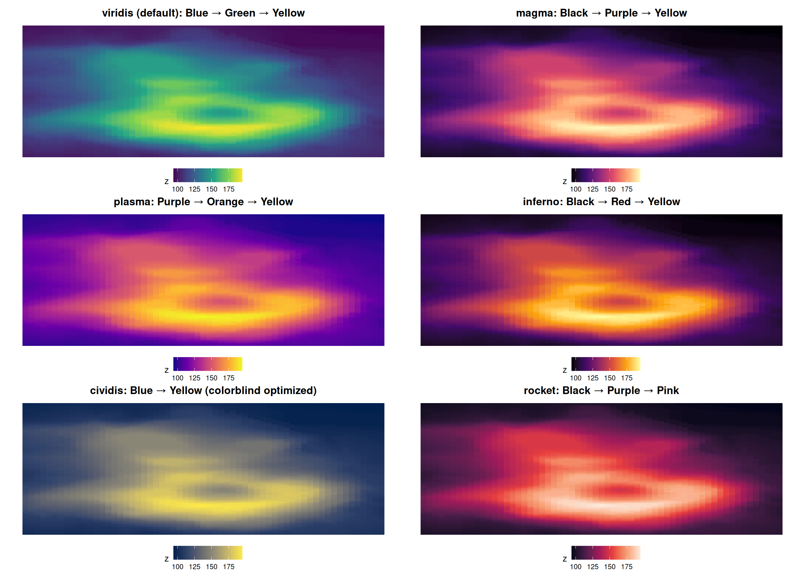
All are perceptually uniform and colorblind-friendly!
1.17 Recommendation for continous scales
For most use cases: Use Viridis (or Magma/Plasma variants)
When to use something else:
- Diverging data (has meaningful center): ColorBrewer diverging (RdBu, RdYlBu)
- High colorblind audience: Cividis
- Print-only publication: Brewer Blues or Greens
Never use: Rainbow or Jet
2 Colors for qualitative data
2.1 ColorBrewer: All Palettes
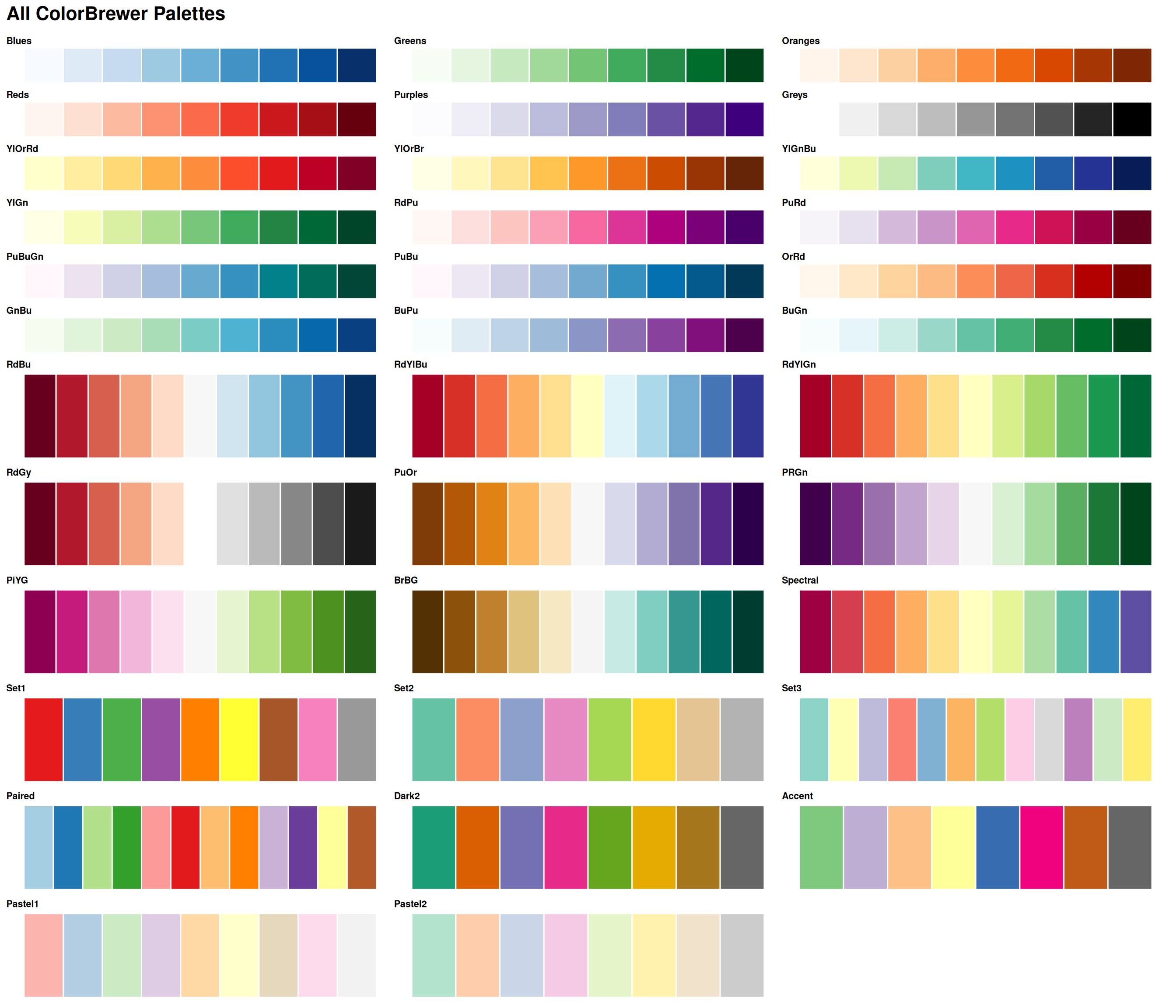
Explore all palettes at: colorbrewer2.org
2.2 ColorBrewer Website
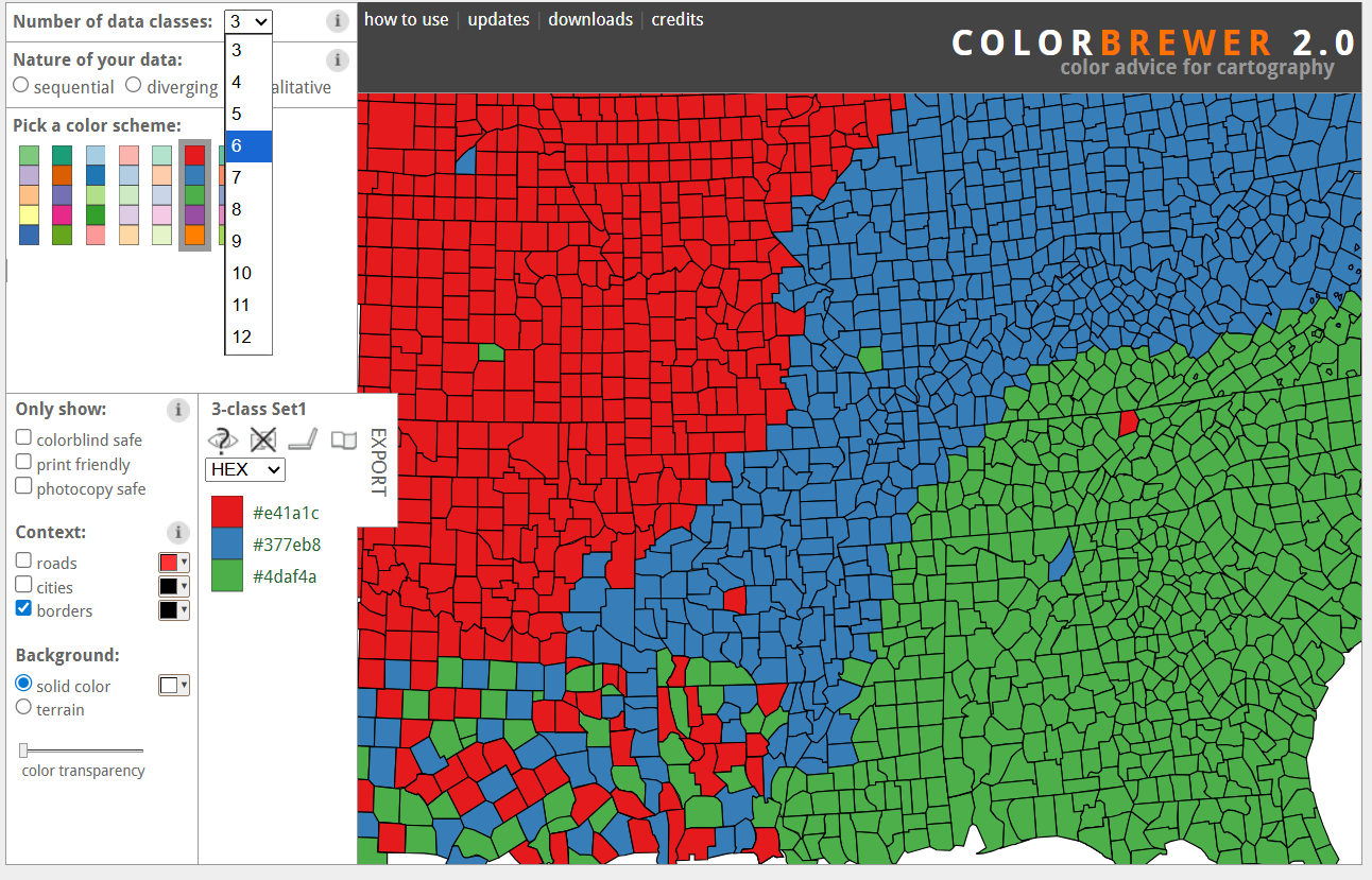
Screenshot from colorbrewer2.org. Used under fair use for educational purposes.
2.3 Yellow Color Warning
The Yellow Problem
Even though ColorBrewer includes yellow in some palettes (e.g., “YlOrRd”, “RdYlBu”, “Set1”):
Yellow has serious issues:
- Poor printing: Yellow can be nearly invisible on white paper
- Projection problems: On projected slides, yellow often washes out
- Low contrast: Yellow text on white background is unreadable
- Photocopying: Disappears when photocopied in B&W
Recommendation:
- For presentations: Avoid yellow-heavy palettes
- For print: Use darker yellows or oranges instead
- For text: NEVER use yellow text on light backgrounds
Removing yellow from Set1:
library(RColorBrewer)

# Set1 has yellow as the 6th color
set1_colors <- brewer.pal(9, "Set1")
set1_colors
# [1] "#E41A1C" "#377EB8" "#4DAF4A" "#984EA3" "#FF7F00" "#FFFF33" "#A65628" "#F781BF" "#999999"

# Remove yellow (position 6)
set1_no_yellow <- set1_colors[-6]

# Use in ggplot2
scale_color_manual(values = set1_no_yellow)
2.4 Recommendations Summary
Best Practices for Color
- Continuous data: Viridis family
scale_fill_viridis_c()orscale_color_viridis_c()- Options: “viridis”, “magma”, “plasma”, “inferno”, “cividis”
- Diverging data (meaningful center): ColorBrewer
scale_fill_distiller(palette = "RdBu")for continuousscale_fill_gradient2()for custom diverging
- Categorical/qualitative data:
- Viridis:
scale_fill_viridis_d()orscale_color_viridis_d() - ColorBrewer:
scale_fill_brewer(palette = "Set2")(up to 8-12 categories)
- Viridis:
- AVOID:
- ❌ Rainbow/jet colormaps
- ❌ Red-green combinations (colorblind issue)
- ❌ Yellow text or yellow-heavy palettes (visibility issue)
- ALWAYS TEST:
- ✅ Grayscale conversion
- ✅ Colorblind simulation
- ✅ Print preview
2.5 Quick Reference: Code Examples
library(ggplot2)

# --- CONTINUOUS DATA ---

# Viridis continuous (best default)
ggplot(data, aes(x, y, fill = continuous_var)) +
  geom_raster() +
  scale_fill_viridis_c(option = "viridis")  # or "magma", "plasma", "cividis"

# ColorBrewer sequential continuous
ggplot(data, aes(x, y, fill = continuous_var)) +
  geom_raster() +
  scale_fill_distiller(palette = "Blues")  # or "YlOrRd", "Greens", etc.

# --- DIVERGING DATA (meaningful center) ---

# ColorBrewer diverging
ggplot(data, aes(x, y, fill = fold_change)) +
  geom_raster() +
  scale_fill_distiller(palette = "RdBu", direction = 1)

# Custom diverging
ggplot(data, aes(x, y, fill = fold_change)) +
  geom_raster() +
  scale_fill_gradient2(low = "blue", mid = "white", high = "red", midpoint = 0)

# --- CATEGORICAL/QUALITATIVE DATA ---

# Viridis discrete
ggplot(data, aes(x, y, color = category)) +
  geom_point() +
  scale_color_viridis_d(option = "viridis")

# ColorBrewer qualitative
ggplot(data, aes(x, y, color = category)) +
  geom_point() +
  scale_color_brewer(palette = "Set2")  # or "Dark2", "Paired", etc.
2.6 Summary
Key Takeaways
- Never use rainbow or jet for scientific figures - they create false boundaries
- Use viridis family as your default for continuous data (perceptually uniform, colorblind-safe)
- Use diverging scales when data has a meaningful center point (zero, neutral)
- Test for colorblindness using simulation tools before publishing
- Check grayscale conversion - your figures may be printed in black and white
- Avoid yellow in palettes for print and presentations (low contrast)
2.7 Exercises
Try It Yourself
- Take one of your existing plots that uses rainbow colors
- Replace it with
scale_fill_viridis_c() - Use
colorspace::desaturate()to check how it looks in grayscale - Use Coblis to simulate colorblindness
- Compare the results - can you see the difference?
2.8 Further Reading
- Crameri, Shephard, and Heron (2020) - The misuse of colour in science communication
- Gołębiowska and Çöltekin (2022) - What’s wrong with the rainbow?
- Viridis package documentation
- ColorBrewer website