Attaching package: 'dplyr'The following objects are masked from 'package:stats':
filter, lagThe following objects are masked from 'package:base':
intersect, setdiff, setequal, unionHeatmaps are ubiquitous in omics research for visualizing large-scale data matrices. However, one of the most common mistakes is using default scaling, which allows outliers to compress all meaningful variation into an indistinguishable range of colors. This chapter shows you how to properly handle scaling and outliers in heatmaps, and reveals a critical bug in many R heatmap functions.
By the end of this chapter, you will:
massageR::heat.clust() for proper integrated scalingScenario: Metabolomics data (log2-transformed)
What happens with default scaling?
The extreme outlier compresses the color scale for all other values!
Attaching package: 'dplyr'The following objects are masked from 'package:stats':
filter, lagThe following objects are masked from 'package:base':
intersect, setdiff, setequal, union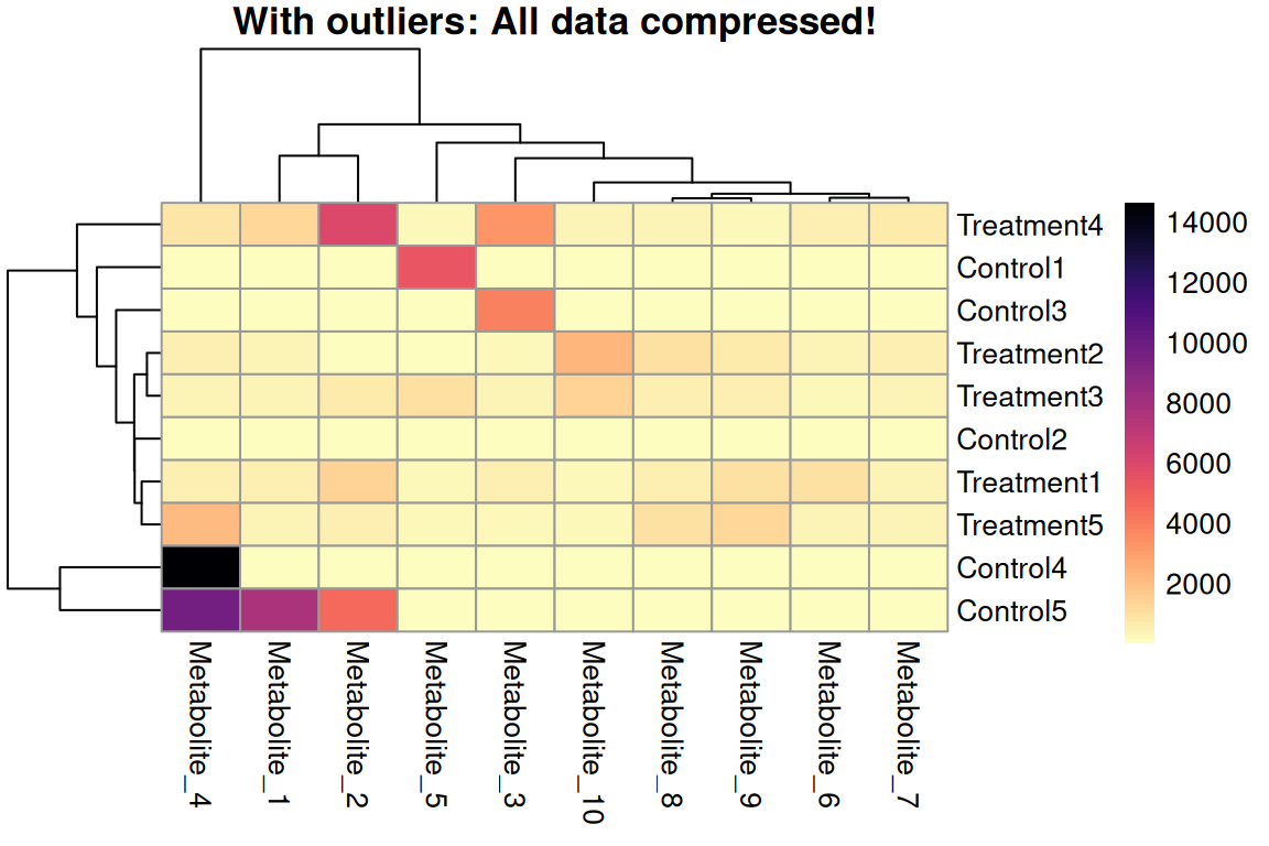
Without Outlier Handling
# Step 1: Robust scaling using MAD (Median Absolute Deviation)
expr_scaled <- expr_data %>%
  mutate(across(-Sample, scale_mad))

# Step 2: Identify which values will be capped
expr_mat_scaled <- expr_scaled %>% column_to_rownames("Sample") %>% as.matrix()
capped_cells <- (expr_mat_scaled < -3) | (expr_mat_scaled > 3)

# Step 3: Cap at ±3 (meaningful after MAD scaling!)
expr_capped <- expr_scaled %>% mutate(across(-Sample, ~ pmin(pmax(.x, -3), 3)))

# Step 4: Create symmetric breaks centered at 0
max_abs <- max(abs(range(expr_capped[,-1])))
breaks  <- seq(-max_abs, max_abs, length.out = 101)
# Create asterisk markers for capped values (in original order)
asterisk_matrix <- matrix("", nrow = nrow(capped_cells), ncol = ncol(capped_cells))
asterisk_matrix[capped_cells] <- "*"
# Create final plot with asterisk markers
# display_numbers uses the original data order, clustering is applied automatically
p <- pheatmap(expr_capped %>% column_to_rownames("Sample"),
main = "MAD-scaled + capped at ±3 (* = capped)",
color = colorRampPalette(rev(brewer.pal(11, "RdBu")))(100),
breaks = breaks, scale = "none",
display_numbers = asterisk_matrix,
number_color = "black",
fontsize_number = 14,
silent = TRUE)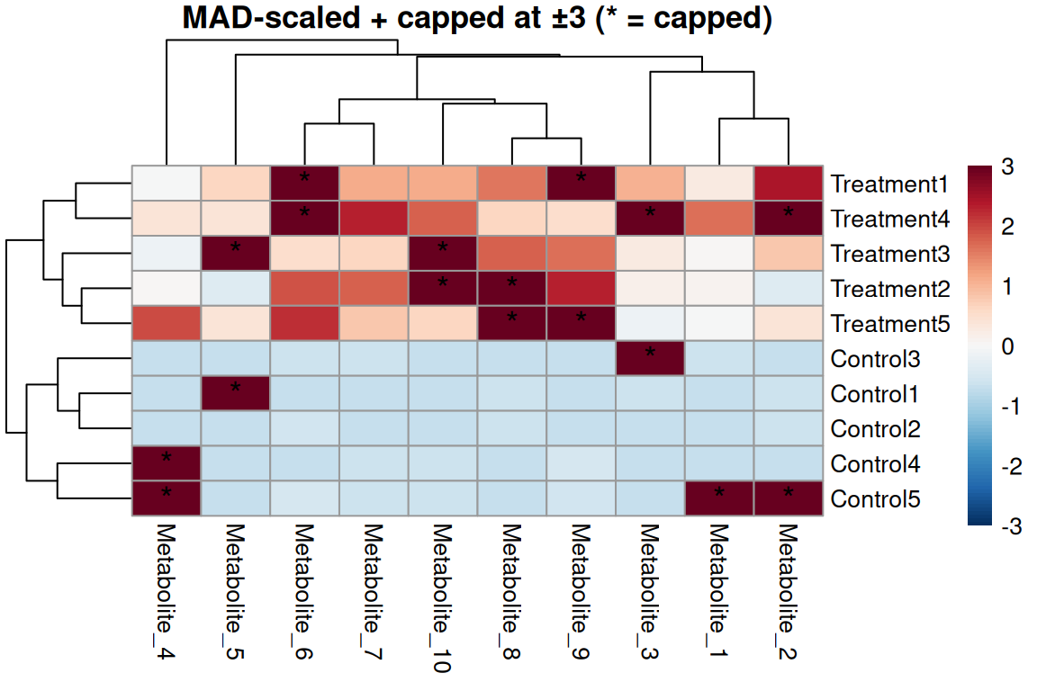
Robust scaling approach
scale = "none" (already scaled!)# Step 1: Identify values outside 5-95 percentiles PER COLUMN
expr_mat_raw <- expr_data %>% column_to_rownames("Sample") %>% as.matrix()
capped_cells_q <- apply(expr_mat_raw, 2, function(x) {
q_lower <- quantile(x, 0.05, na.rm = TRUE)
q_upper <- quantile(x, 0.95, na.rm = TRUE)
(x < q_lower) | (x > q_upper)
})
# Step 2: Cap at 5th and 95th percentiles PER COLUMN (metabolite)
expr_capped <- expr_data %>%
mutate(across(-Sample, ~ cap_quantiles(.x, lower = 0.05, upper = 0.95)))
# Step 3: Range scaling (min-max normalization to [0,1])
expr_quantile <- expr_capped %>% mutate(across(-Sample, ~ (.x - min(.x)) / (max(.x) - min(.x))))# Create asterisk markers for capped values (in original order)
asterisk_matrix_q <- matrix("", nrow = nrow(capped_cells_q), ncol = ncol(capped_cells_q))
asterisk_matrix_q[capped_cells_q] <- "*"
# Create final plot with asterisk markers
p <- pheatmap(expr_quantile %>% column_to_rownames("Sample"),
main = "Capped at 5-95 percentiles + range-scaled (* = capped)",
color = rev(viridis::magma(100)),
display_numbers = asterisk_matrix_q,
number_color = "white",
fontsize_number = 14,
silent = TRUE)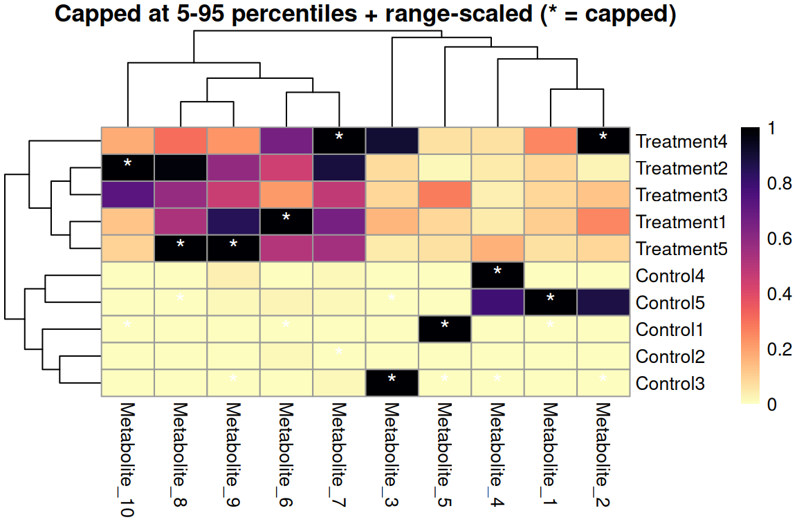
Quantile capping + range scaling
For positive values only (e.g., counts, intensities)
# Log transform BEFORE plotting (metabolomics data is positive-only)
expr_log_sol4 <- expr_data %>%
  mutate(across(-Sample, ~ log2(.x + 1)))  # +1 to handle zeros

p <- pheatmap(expr_log_sol4 %>% column_to_rownames("Sample"),
              main = "Log2 transformed metabolite intensities",
              color = rev(viridis::magma(100)),
silent = TRUE)![]()
For count/intensity data
Critical R bug: Functions like heatmap(), heatmap.2(), and heatplot() have a dangerous inconsistency:
scale parameter affects color visualizationResult: Dendrograms cluster on unscaled data while colors show scaled data!
P.S: pheatmap() seems to apply scaling and cropping before clustering!
The Problem: High-variance features dominate correlations
Without scaling, features with large values dominate sample correlations!
corrplot 0.95 loaded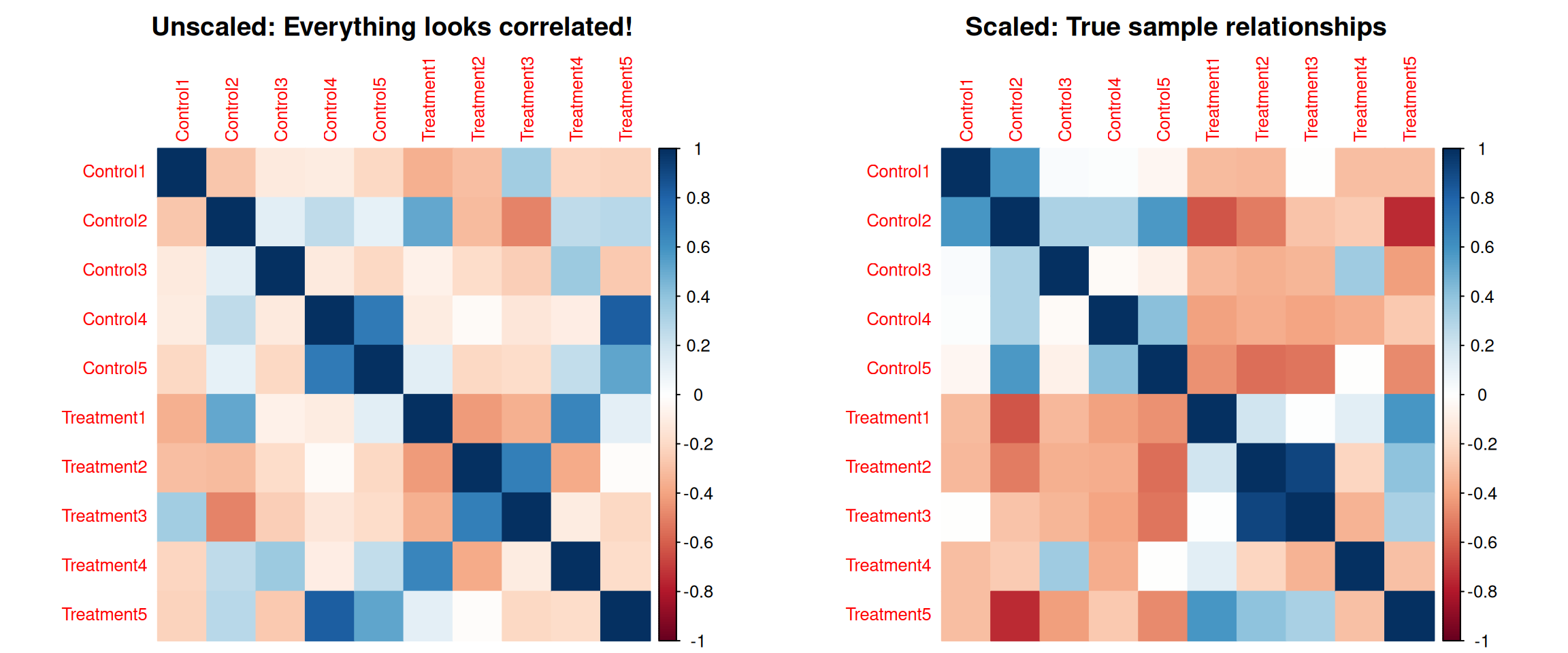
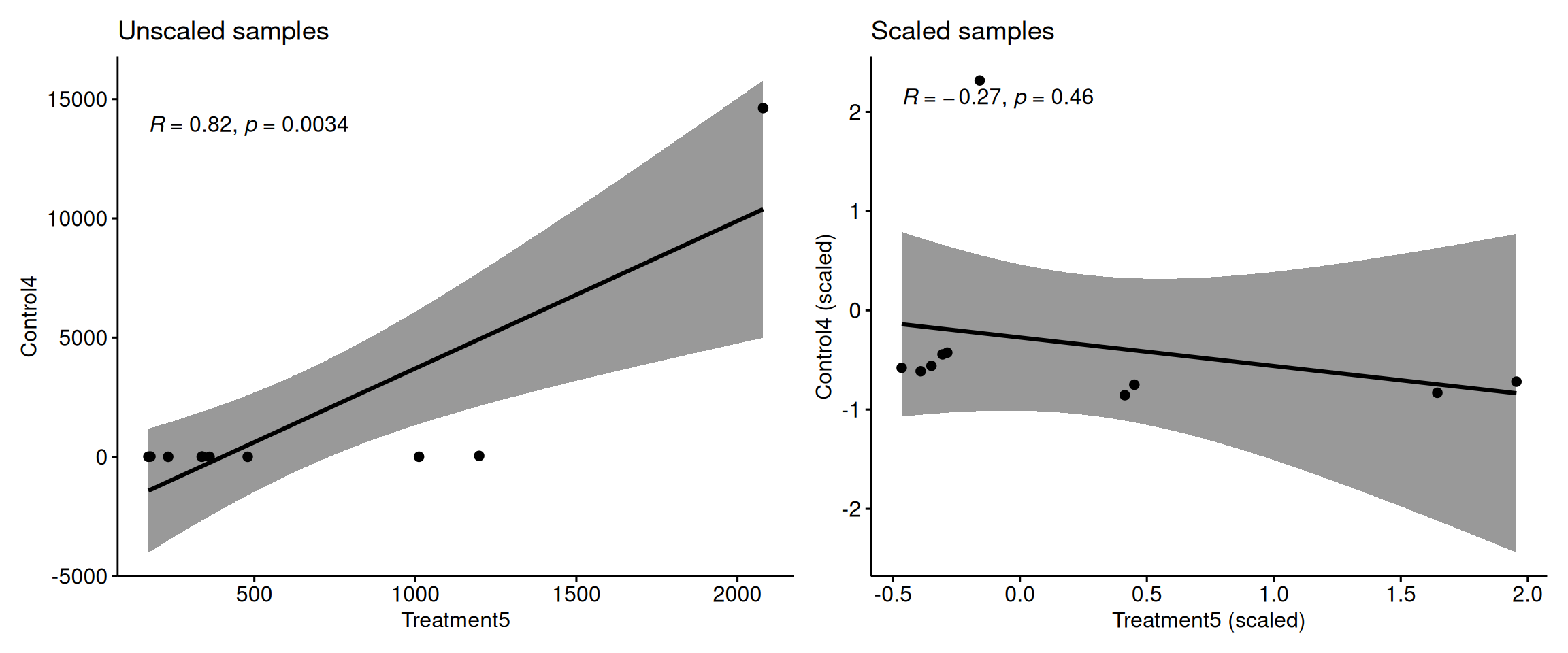
Key point: Without scaling, high-variance metabolites completely dominate the correlation calculation between samples!
Scaling ensures all metabolites contribute equally to sample clustering.
The massageR package provides heat.clust() which handles scaling and dendrogram calculation correctly in one step!
Key advantages:
library(massageR)

# Convert tibble to matrix for heat.clust
expr_matrix <- expr_data %>% column_to_rownames("Sample") %>% as.matrix()

# Use heat.clust with robust MAD scaling
z <- heat.clust(expr_matrix,
                scaledim = "column",           # Scale by column
                zlim = c(-3, 3),               # Cap at ±3 MAD
                zlim_select = c("dend", "outdata"),  # Apply to both
                reorder = c(),                 # Reorder dendrograms off for consistency
                distfun = function(x) dist(x),
                hclustfun = function(x) hclust(x, method = "complete"),
                scalefun = scale_mad)          # Use MAD scaling instead of default

max_abs <- max(abs(range(z$data)))
breaks  <- seq(-max_abs, max_abs, length.out = 101)
# Use with pheatmap
p <- pheatmap(z$data,
cluster_rows = as.hclust(z$Rowv),
cluster_cols = as.hclust(z$Colv),
scale = "none",
color = colorRampPalette(rev(brewer.pal(11, "RdBu")))(100),
breaks = breaks,
main = "heat.clust + pheatmap: Properly scaled!",
silent = TRUE)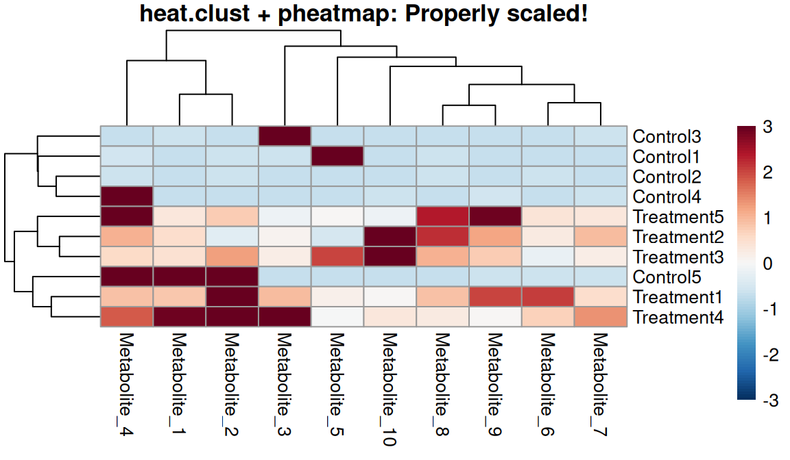
One-step workflow
Attaching package: 'gridExtra'The following object is masked from 'package:dplyr':
combine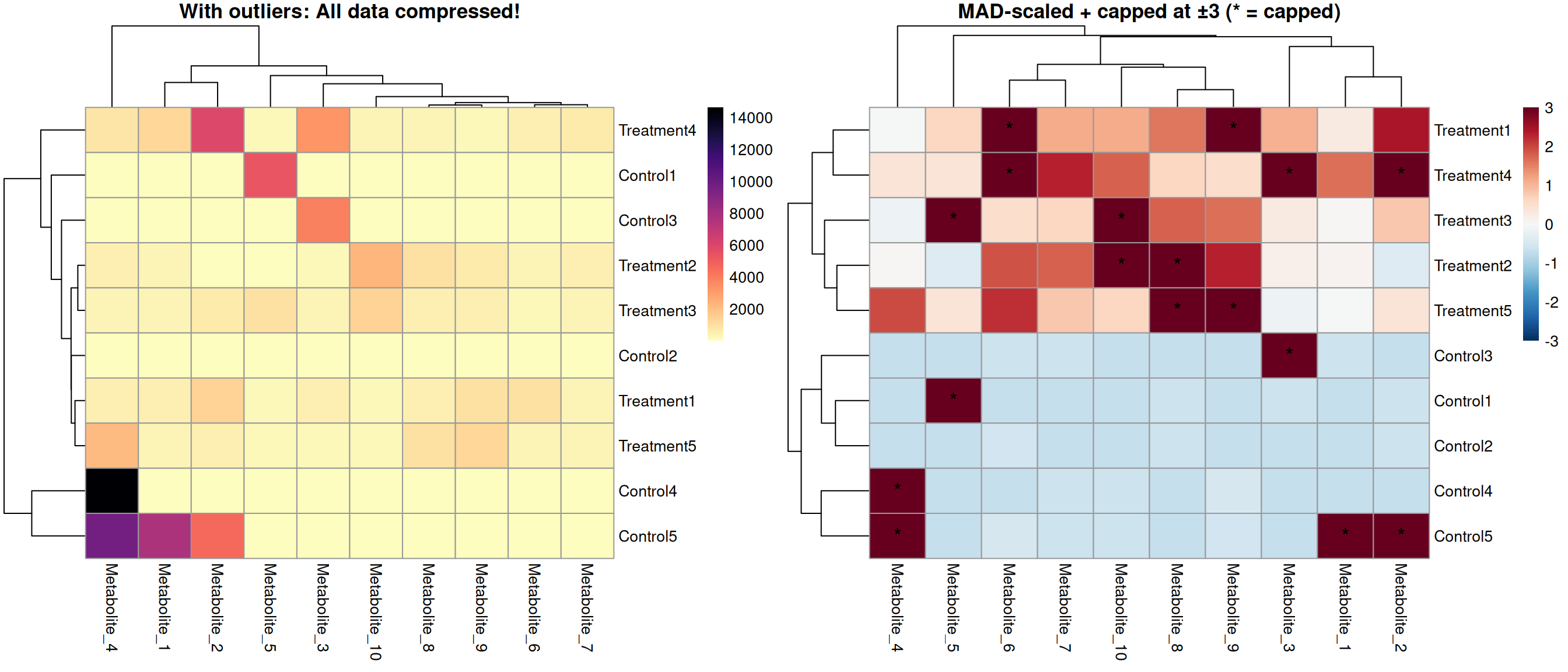
(x - median(x)) / mad(x)scale(x)massageR::heat.clust() for automatic proper scaling workflow(x - median(x)) / mad(x) is not affected by outliersmassageR::heat.clust() - handles scaling and dendrograms correctly in one steprnorm() plus a few extreme values)pheatmap(..., scale = "row")scale_mad() function and capping at ±3massageR::heat.clust() and verify it produces consistent resultsheat.clust() function